Cast Study
Building a design system with Luxtripper
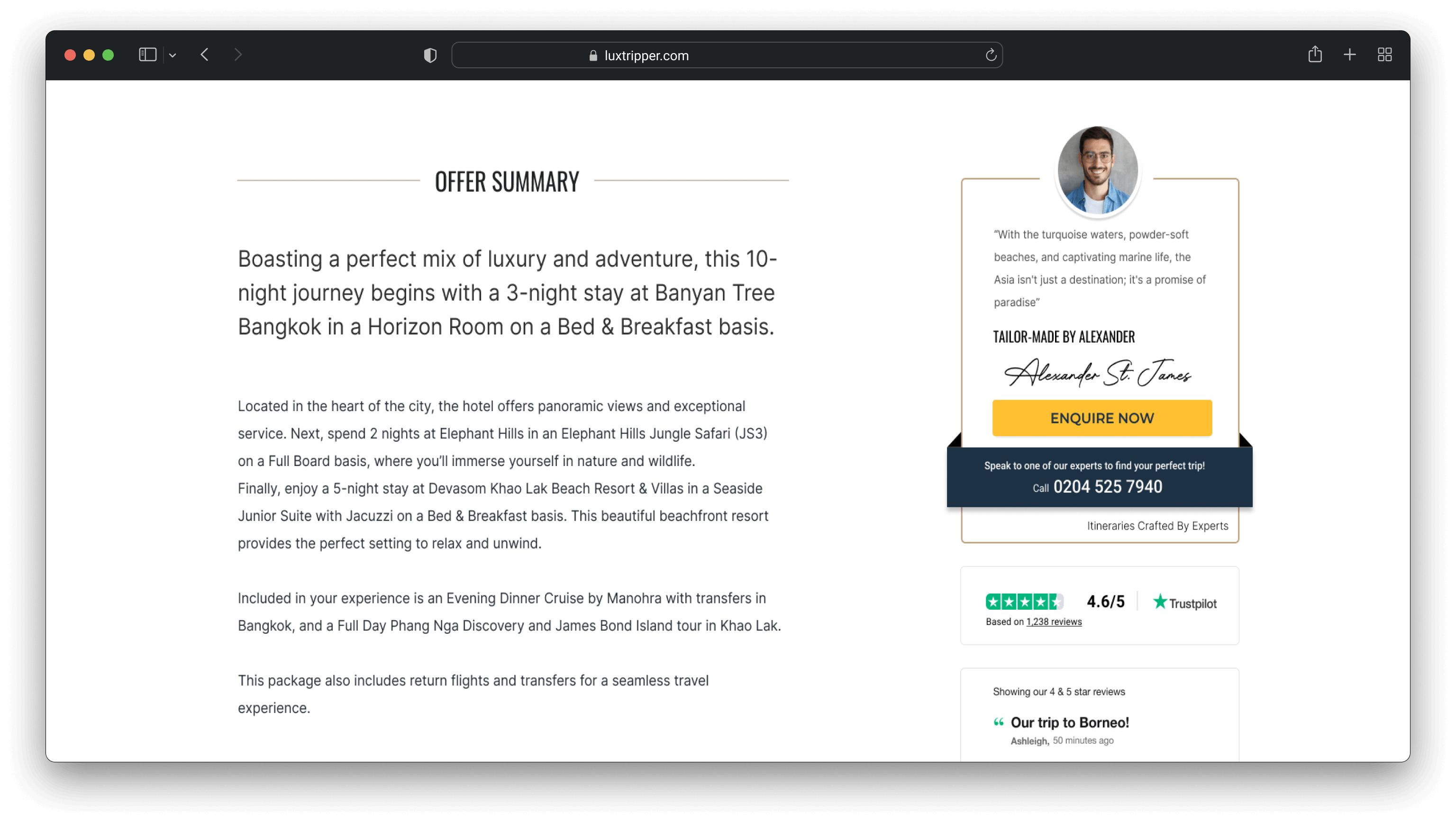
A design system is not just a collection of components, but a framework that fosters alignment, scalability, and a seamless user experience across every touchpoint
Problem
Upon joining Luxtripper, it became clear we lacked a single source of truth.
The absence of standardised design guidelines led to inconsistencies, such as varying grids, excessive colour options, inconsistent buttons, and mixed font styles. These issues spanned digital platforms, including the website, back-office systems, and marketing emails. For a luxury brand, this misalignment undermined the polished image we aimed to project.
Solution
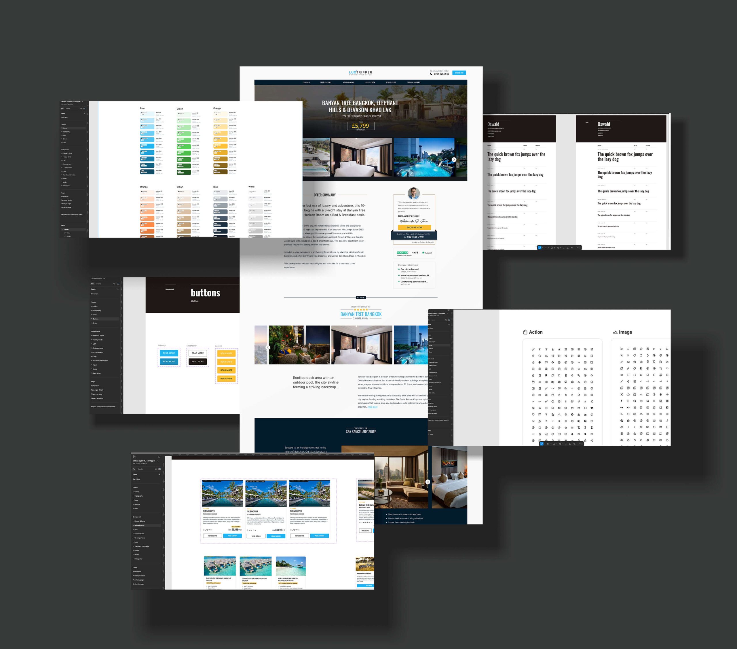
To address these challenges, I developed an MVP design system tailored to Luxtripper’s needs.
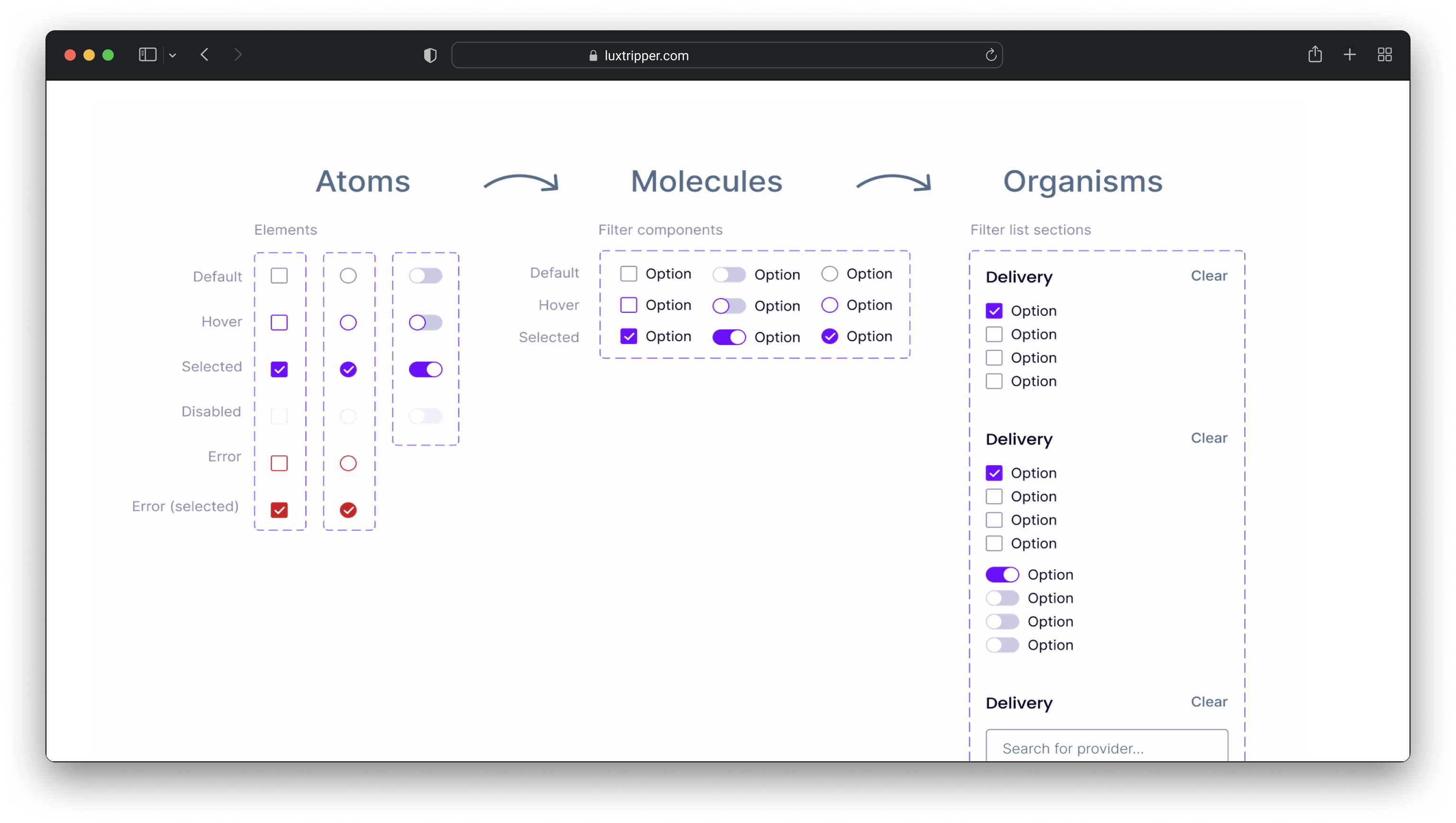
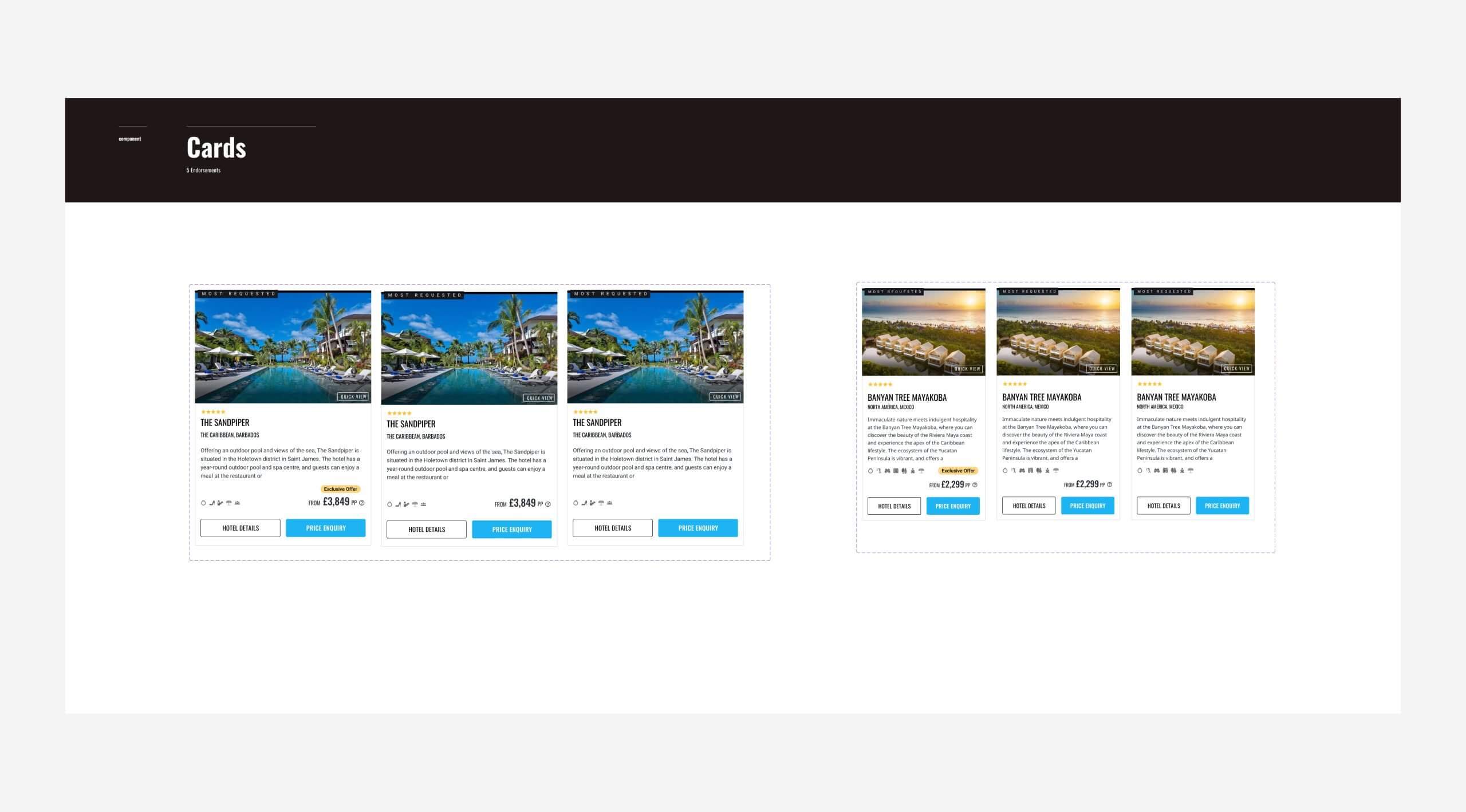
• UI Components: A reusable library of buttons, forms, and cards adhering to brand guidelines.
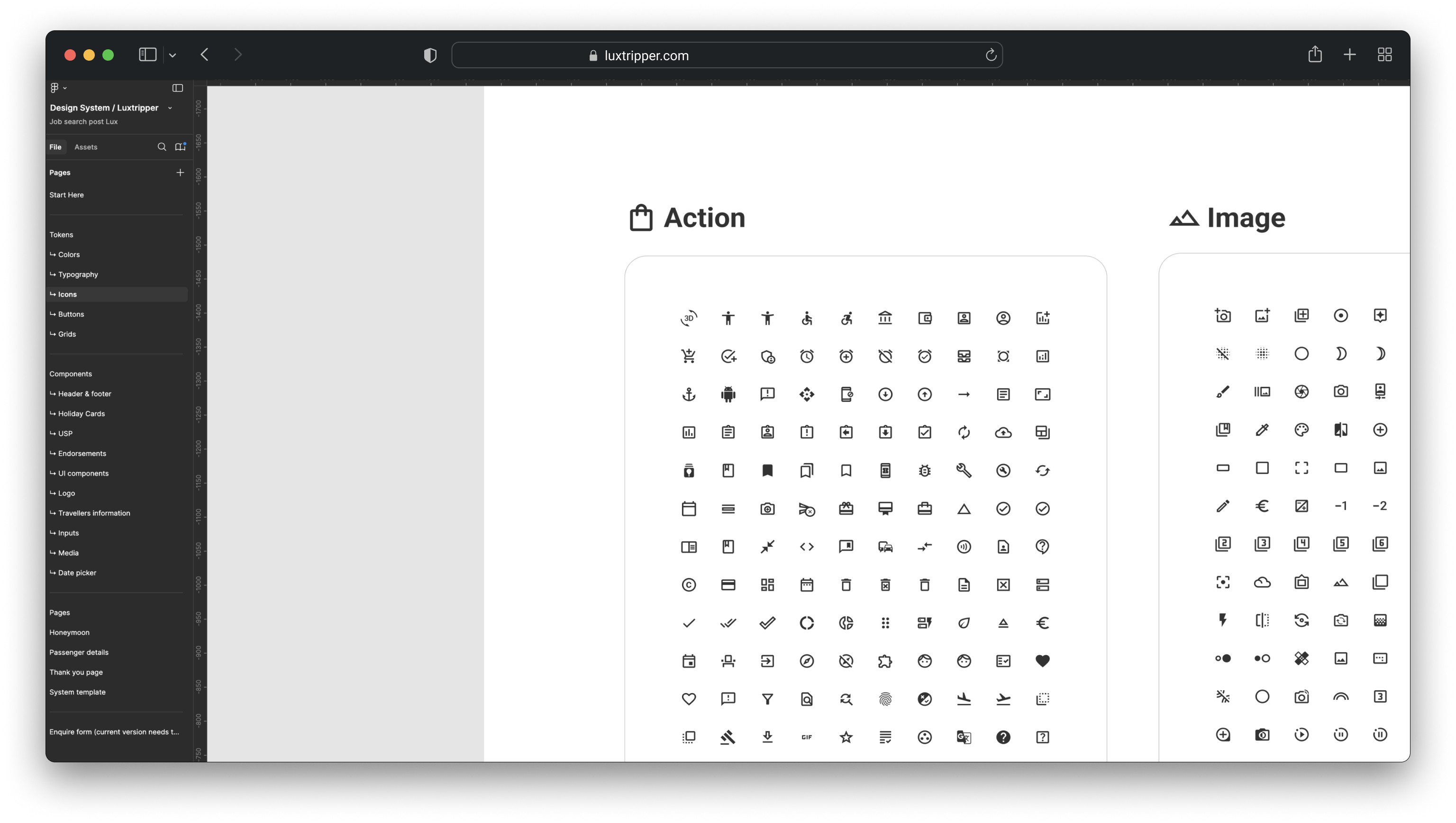
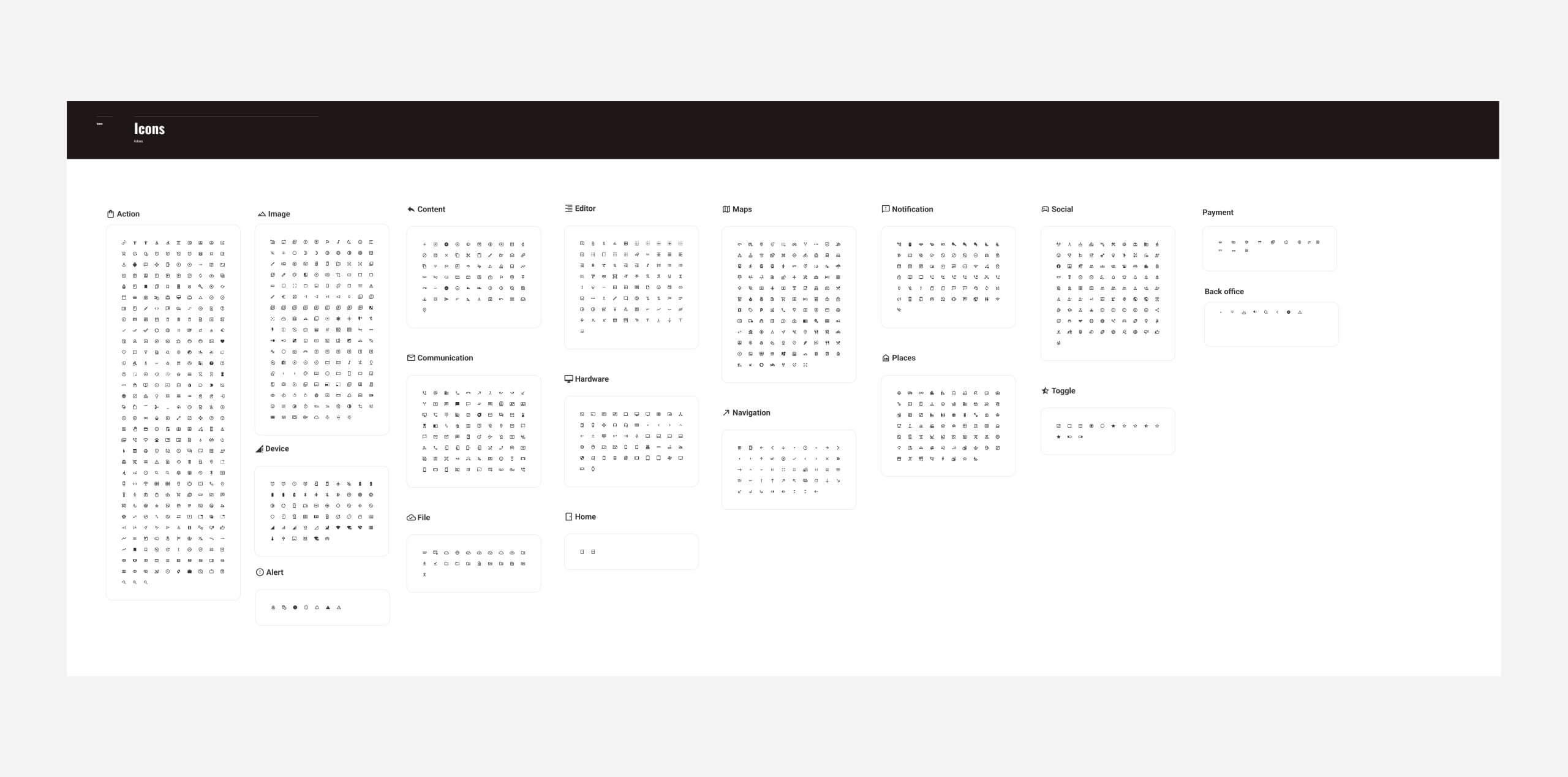
• Visual Guidelines: Clear instructions on typography, colour schemes, and iconography to ensure consistency.
• Documentation: Detailed guides enabling non-designers to produce development-ready visuals aligned with company standards.
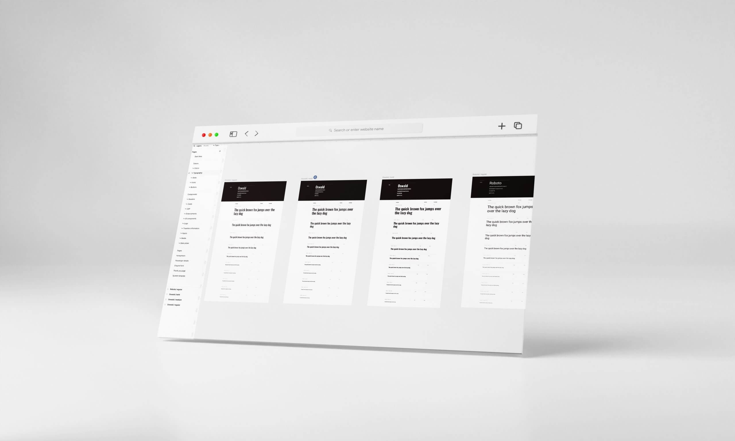
Audit and Organisation
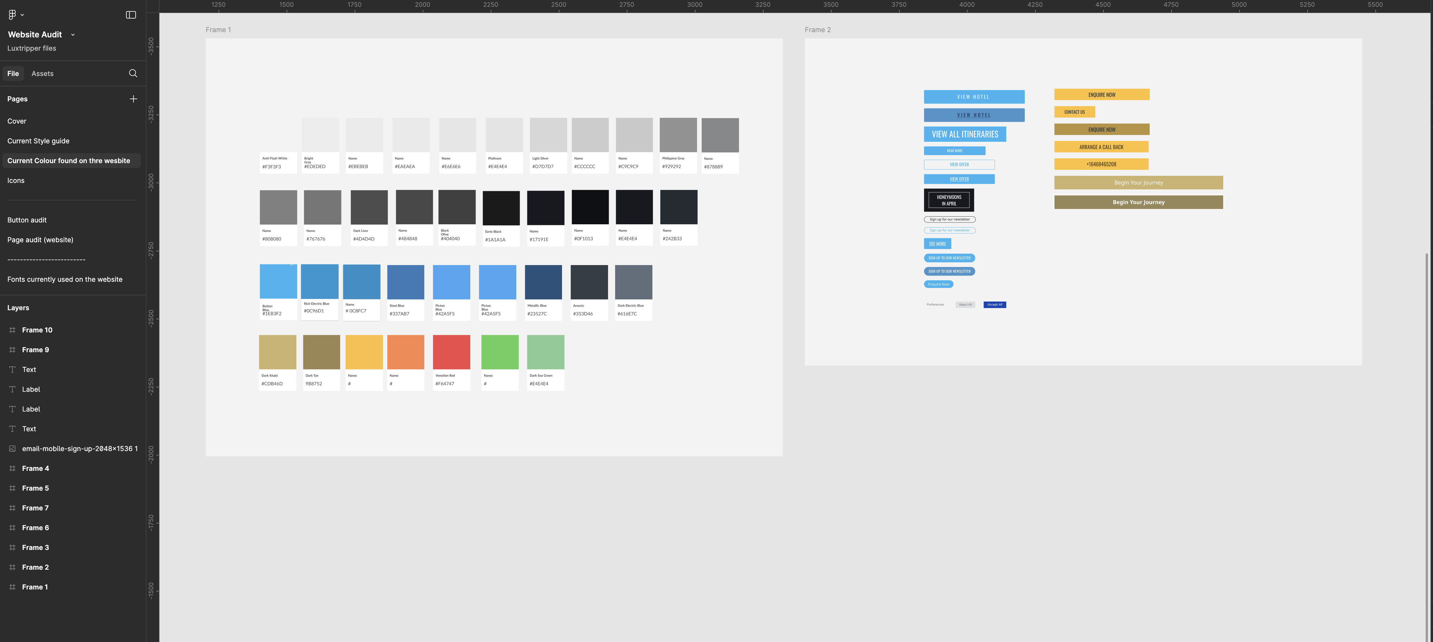
The first step was auditing the existing assets and formalising them, creating a single, centralised resource accessible to all teams.
This MVP established a foundation for both designers and developers, streamlining workflows and improving efficiency.
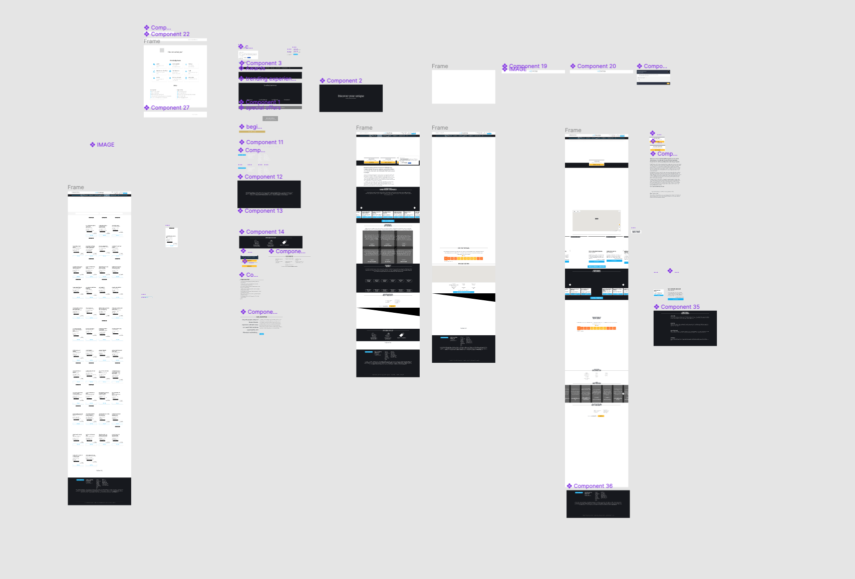
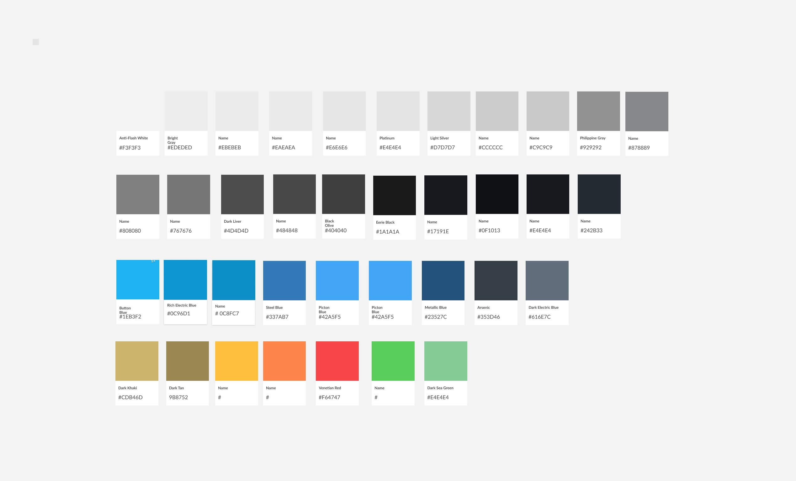
Existing Colour Palette
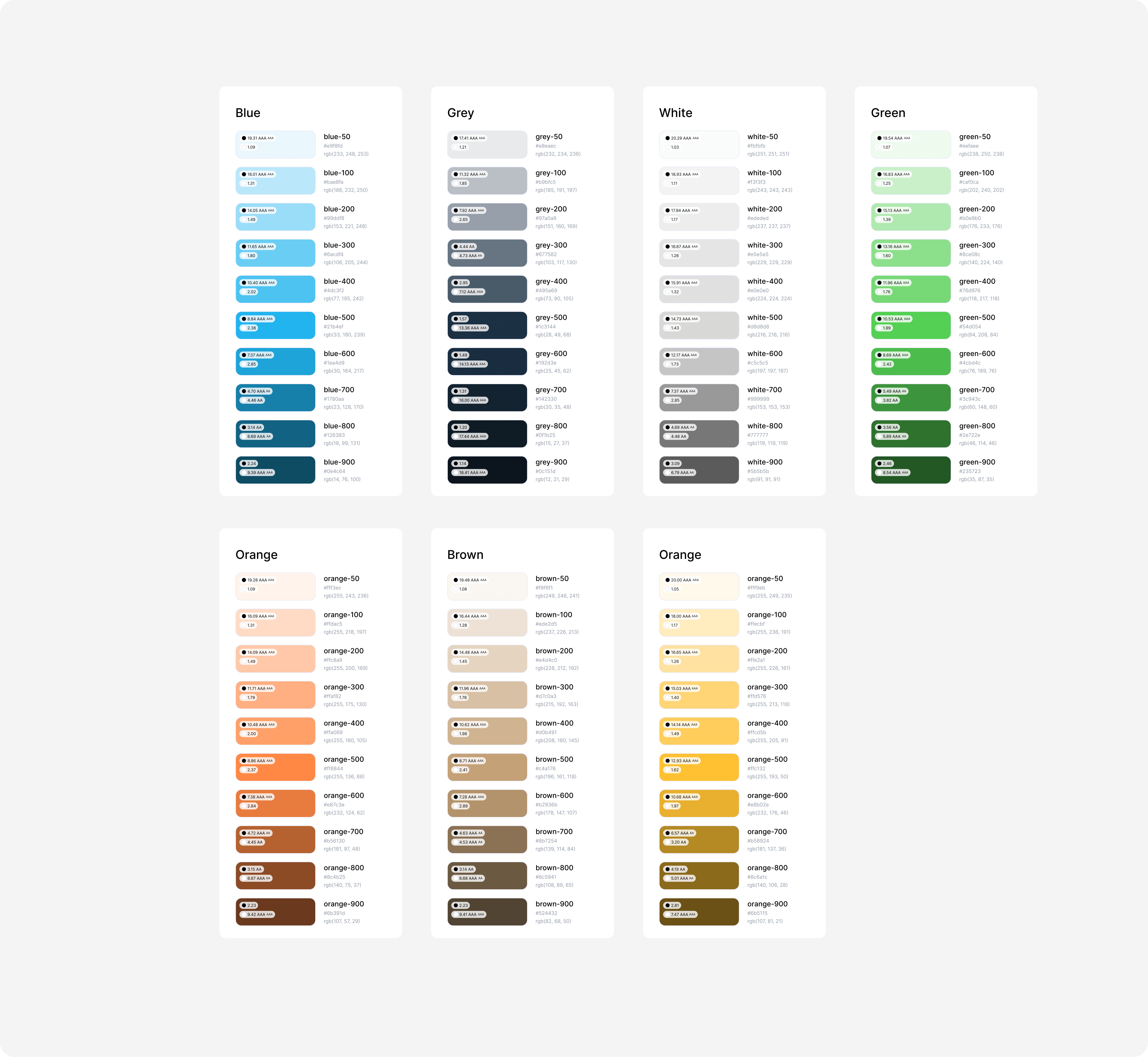
The original palette was overly complex, with excessive shades of grey. I refined it into a functional, cohesive scheme:
• Use colours sparingly and functionally.
• Prefer shades of navy over grey for a cohesive look.
• Blue for actions, green for payment-related actions.
• Use yellow sparingly on dark backgrounds as a highlight.
Icons
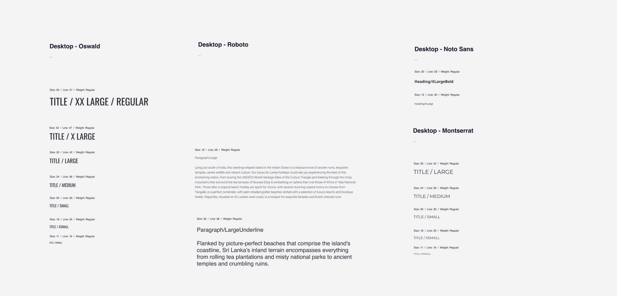
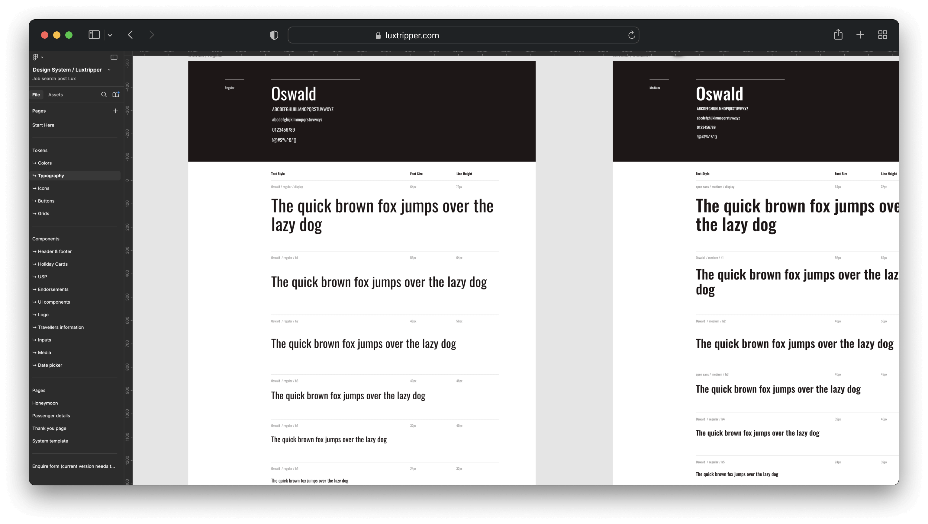
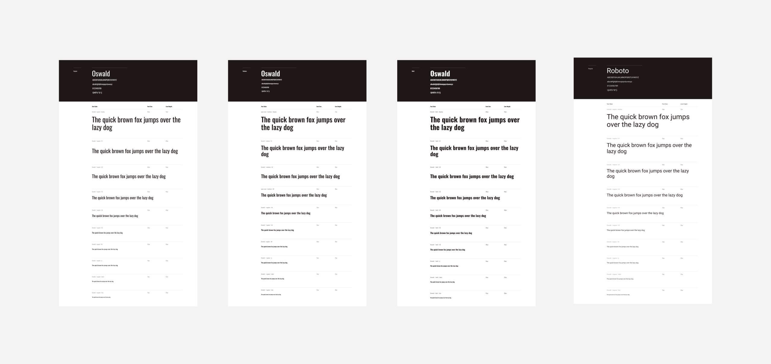
During a font migration, we standardised type scales using Type Scale, creating a consistent reference point for all departments.
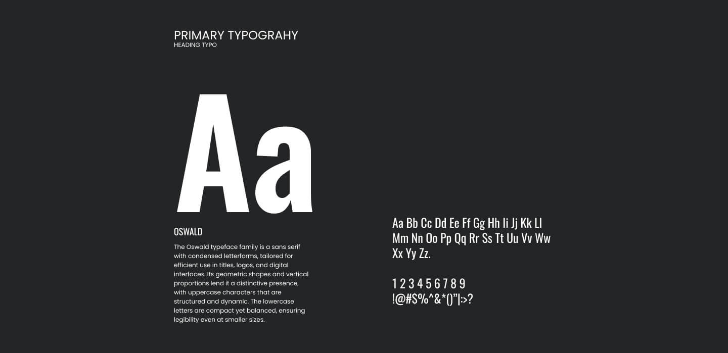
Typeface
Luxtripper was in the middle of a font migration, using different font scales on each page.
We revisited the type scale using Type Scale and chose a scale similar to both our legacy and newer scales, creating a new source of truth for all departments:
Call to actions
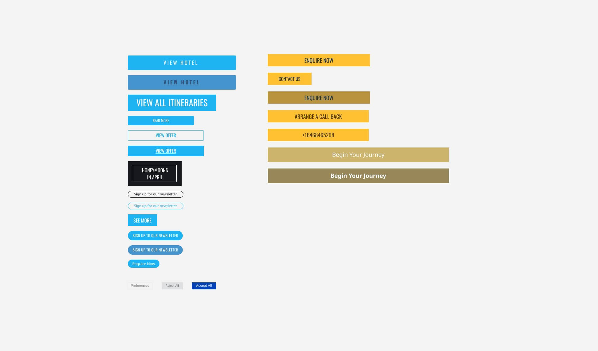
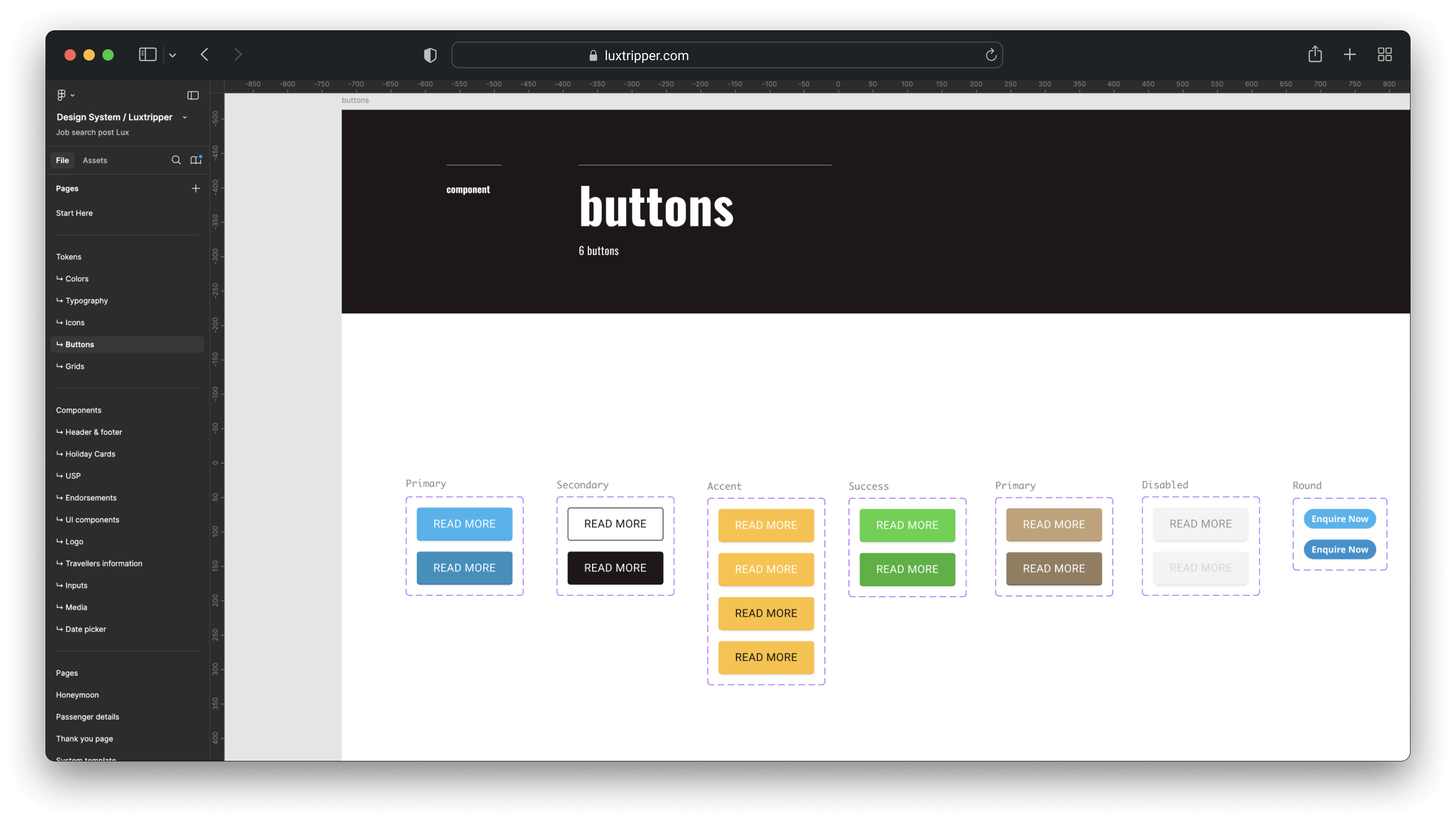
Buttons, Buttons, and More Buttons
An audit of button styles resulted in a functional, streamlined collection, forming a scalable base for future additions.
Building a Component Library
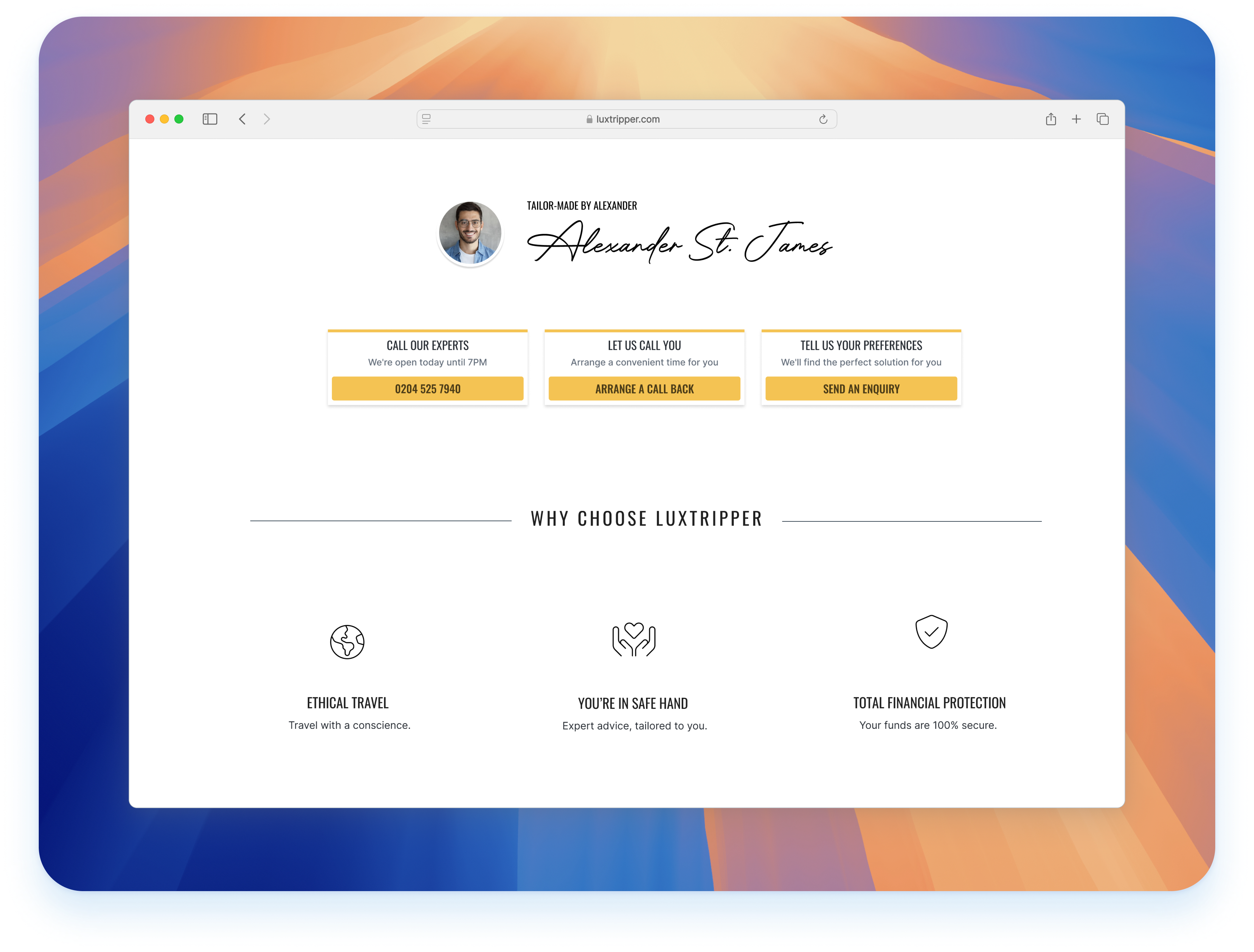
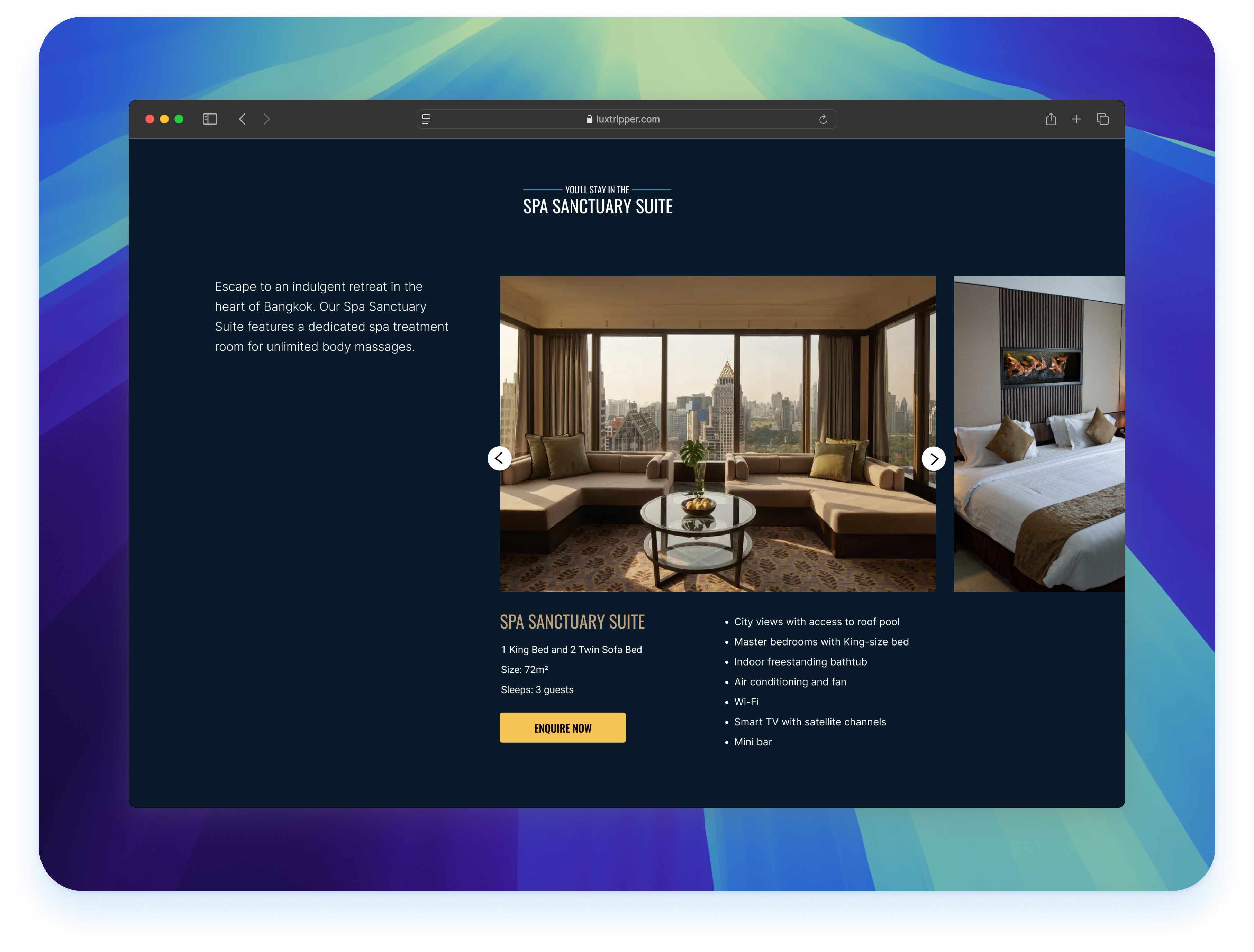
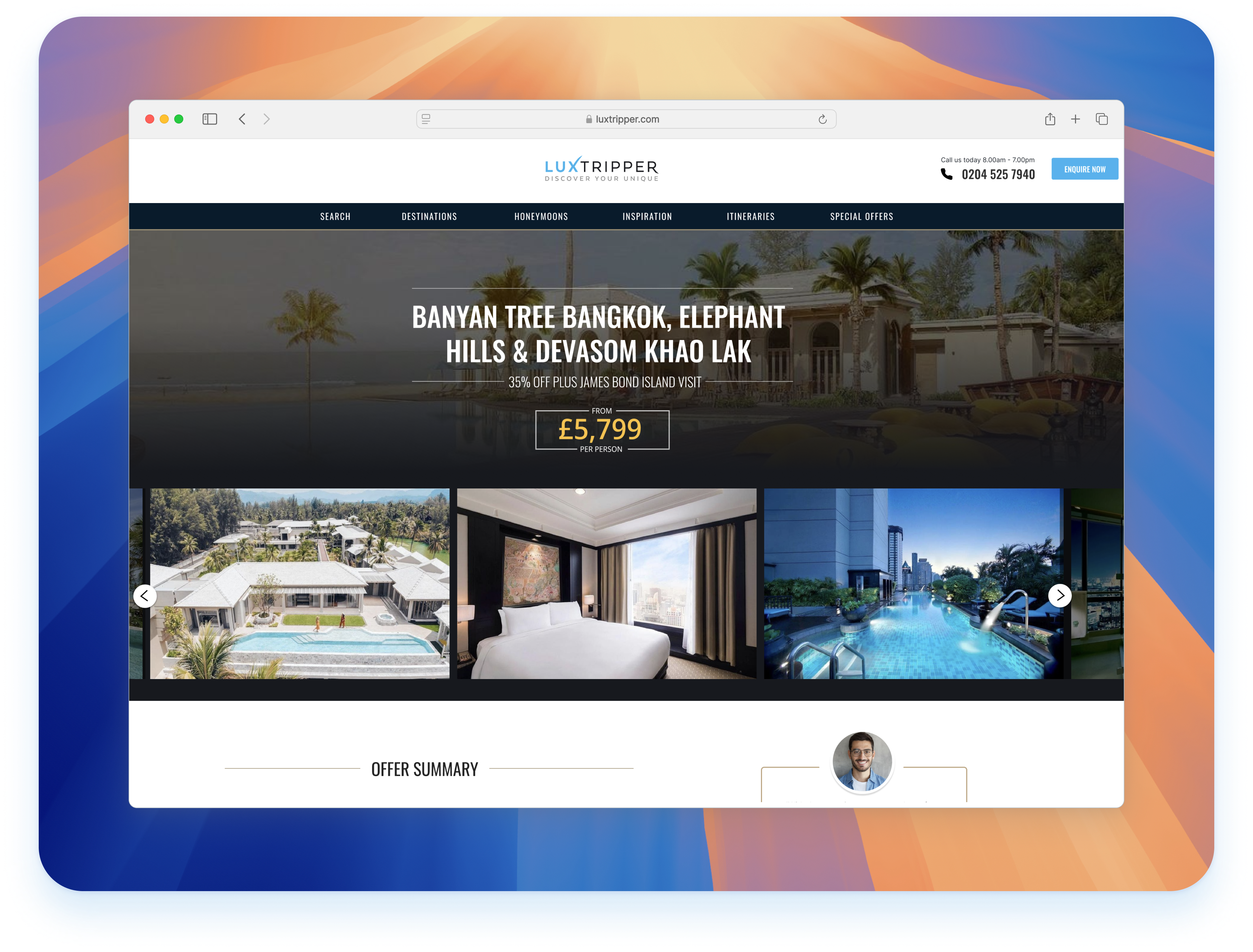
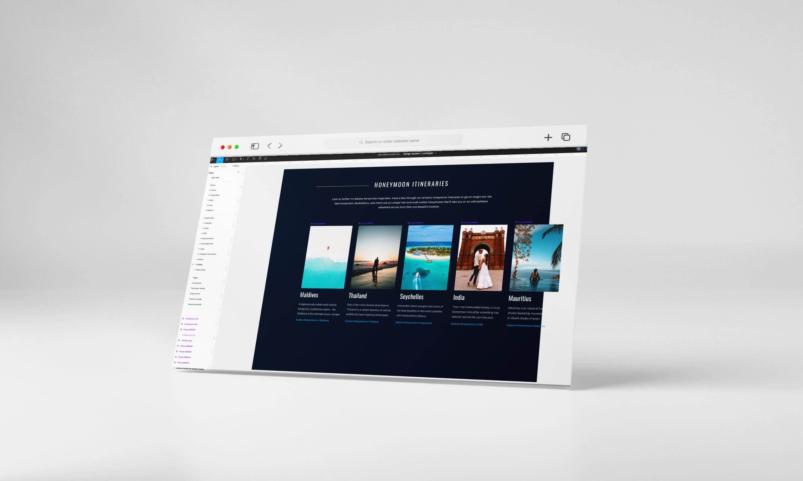
Global style guidelines and component libraries were developed, including templates for main screens.
Given resource limitations, we adopted a phased approach, prioritising high-impact elements like colours, headers, footers, and buttons. This incremental strategy ensured a gradual but consistent improvement in the user experience.
Implementation
To ensure effective implementation, I conducted workshops to promote the design system within the product team.
By synchronising Figma files, developers could easily inspect and apply components. Collaboration between designers and developers during roadmap feature updates facilitated the gradual rollout of new styles.