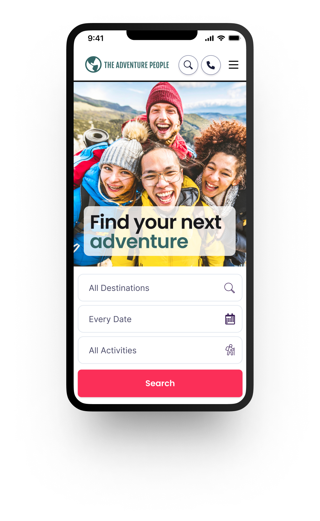
The Adventure People website redesign addressed outdated visuals, inconsistent branding, and a complex user journey.
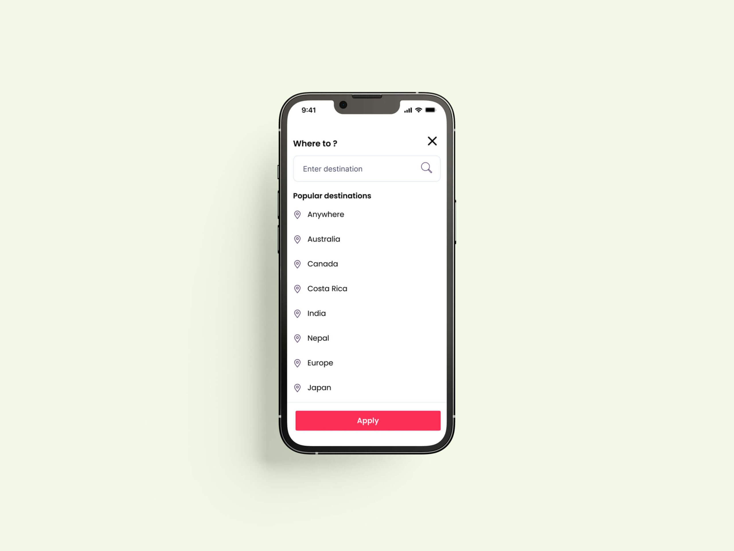
By conducting user research and introducing key features like auto-suggest for search, we achieved a 70% increase in searches.
Client
The Adventure People
Year
2024
Project Scope
Mobile-first redesign
Identifying user hurdles
Comprehensive site refresh
Digital optimisation strategy
Tools
Figma, Userbrain, Figjam, Jira, Slack
My Contributions
User research
UI & UX design
Brand alignment
CRO
Analytics
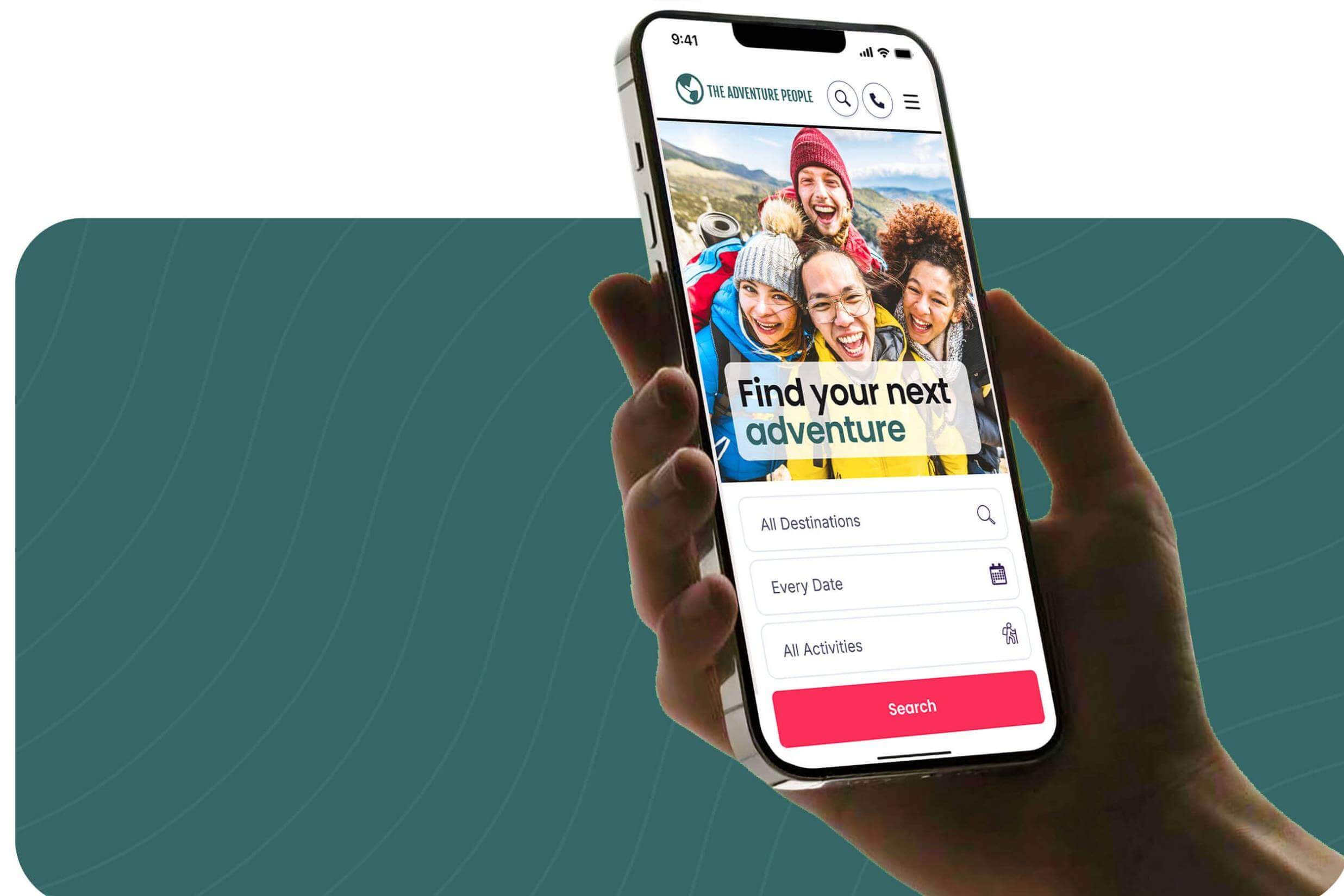
We established an A/B testing framework and ran a robust experimentation program, mobile site redesign, and rebranding.
…
…
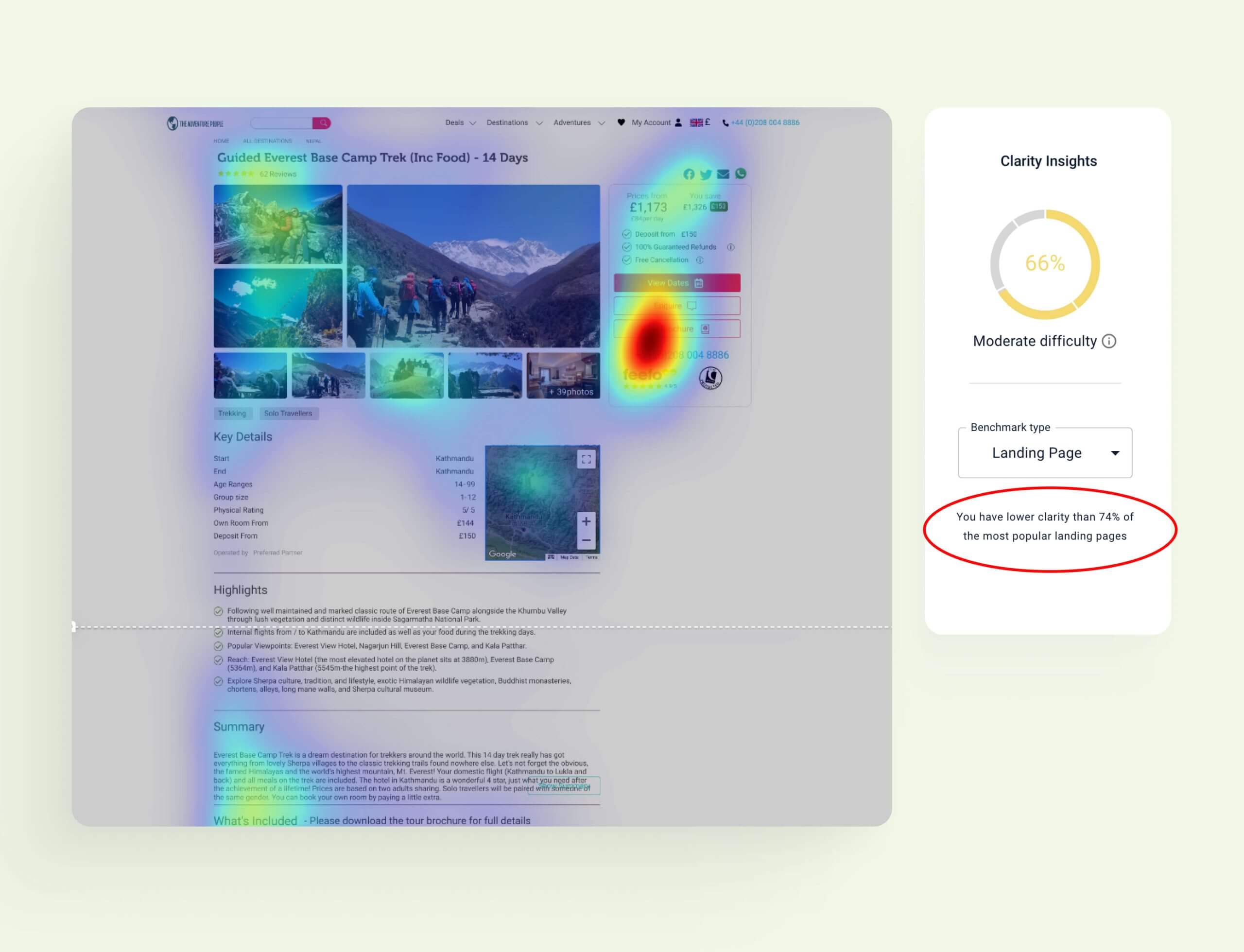
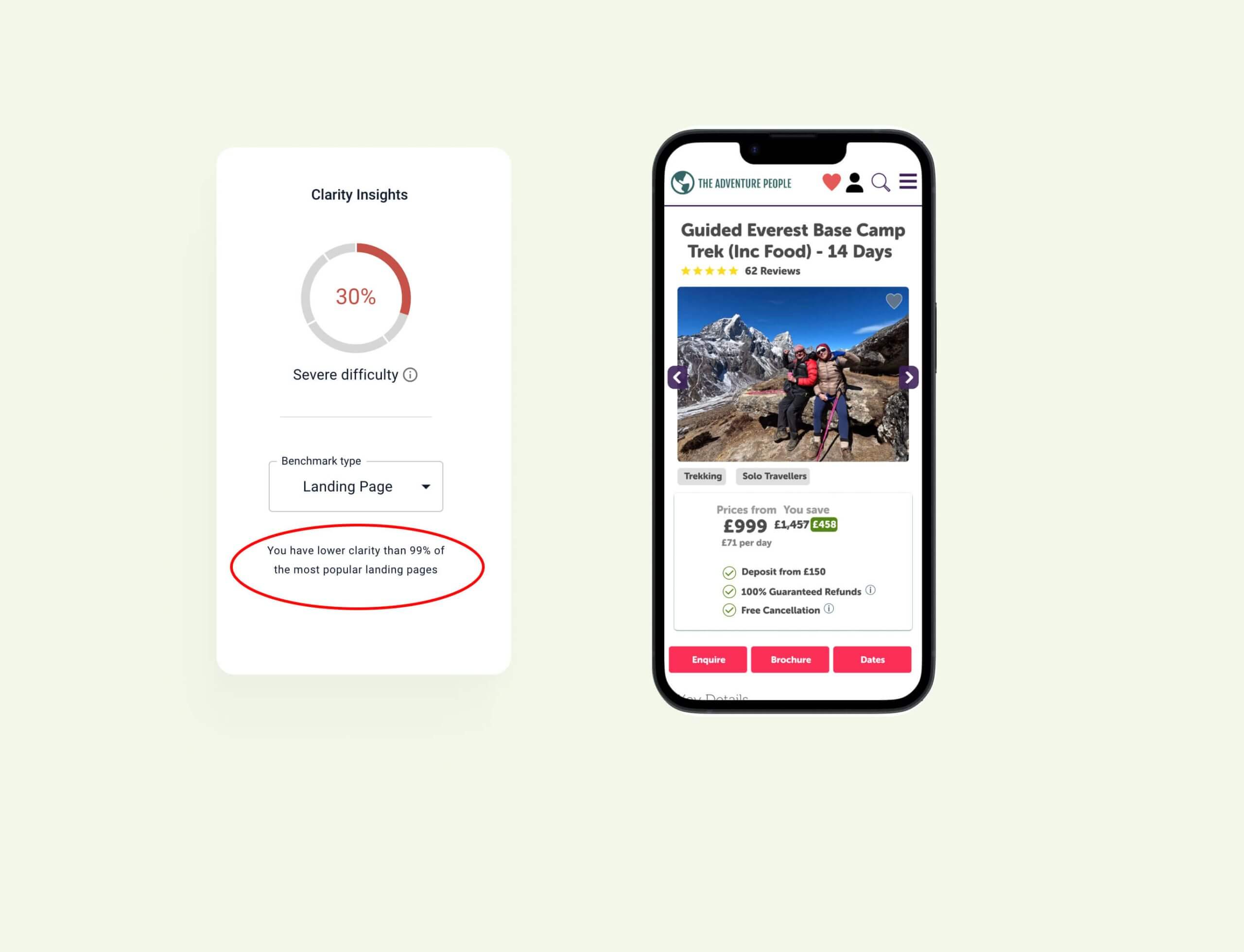
We recorded & reviewed heat maps of the current tour landing pages, the results highlighted these pages were underperforming in comparison to other competitors' landing pages.
The heat maps highlighted that the pages lacked clarity, particularly on mobile where users were confronted with numerous highlighted features which were often in competition with each other, most notably the 3 main CTA’s which all had the same level of prominence.
We conducted a first impressions test to give users a voice internally. Insights revealed that while users appreciated the depth of information provided, they felt overwhelmed by busy pages and unclear navigation.
To understand user pain points and opportunities, we conducted an unmoderated user testing study and gathered first impressions of the site. Insights revealed that while users appreciated the depth of information provided, they felt overwhelmed by busy pages and unclear navigation. Many were unsure whether speaking to an agent was required for booking, leading to confusion. Trust issues also arose, with users questioning the legitimacy of low prices. These findings shaped our focus on simplifying the user journey, improving clarity, and building trust through consistent branding and functionality enhancements.
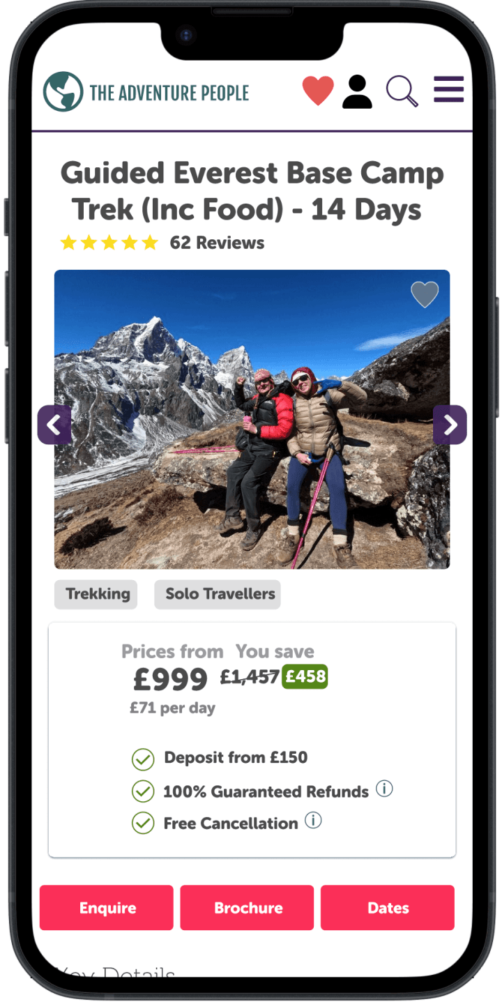
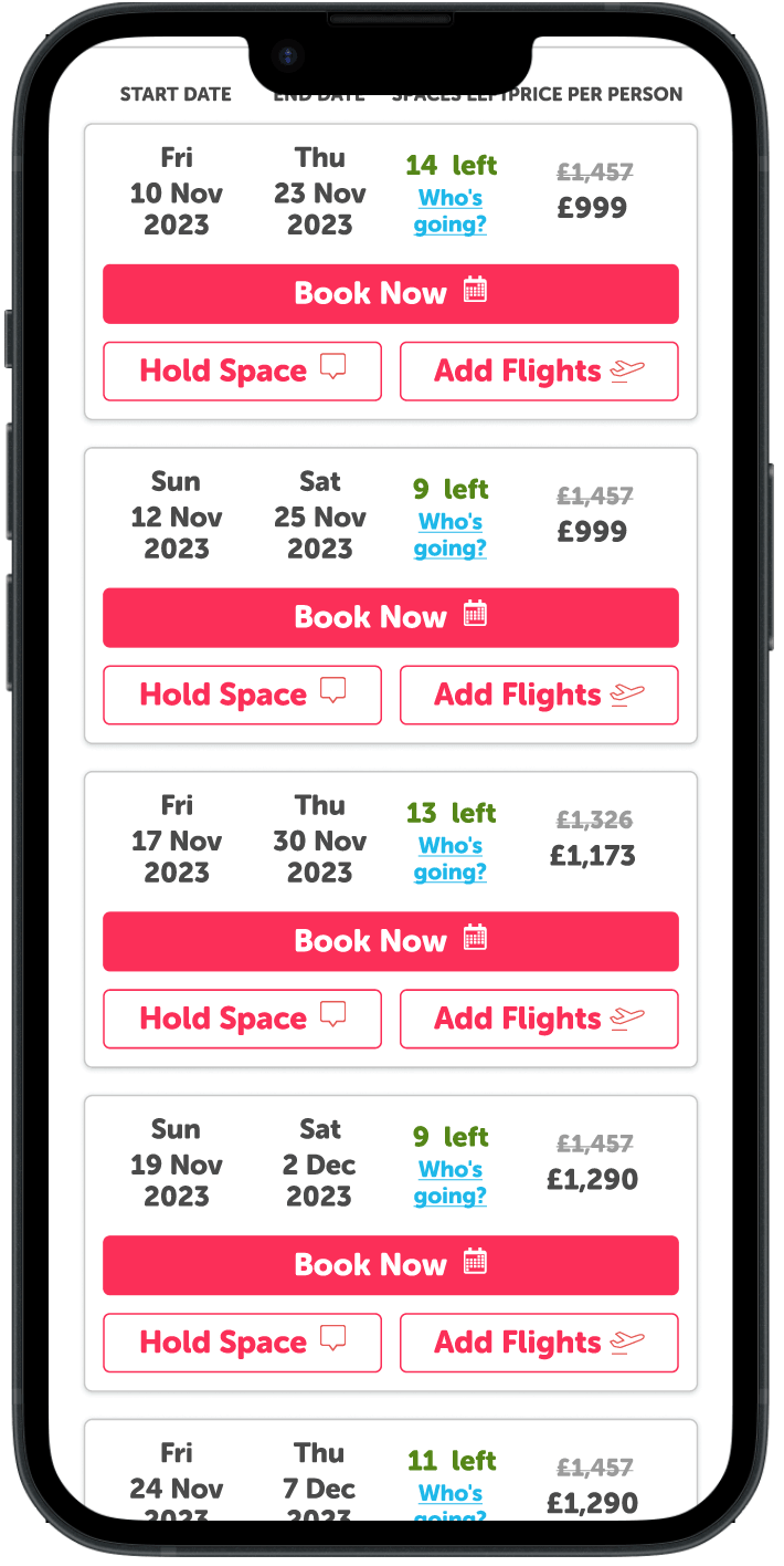
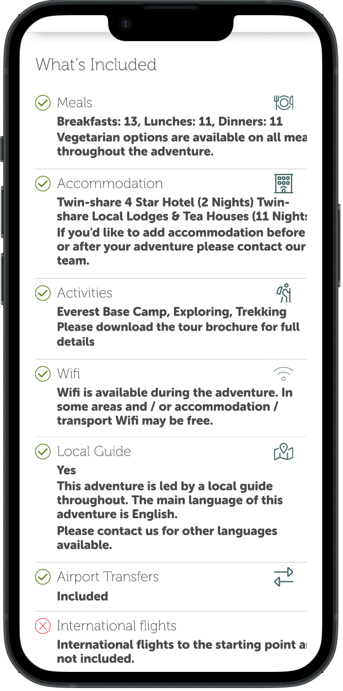
Legacy designs
Outdated and inconsistent branding raised trust issues among users, while a lack of clear booking guidance left users confused about the next steps, the level of information and the way it was displayed left participants feeling overwhelmed.
One of the biggest challenges was balancing the rich detail required on tour pages with the limited space on mobile screens. Additionally, the outdated and inconsistent branding raised trust issues among users, while a lack of clear booking guidance left them confused about next steps. Managing these complexities alongside internal preferences for feature-heavy designs required thoughtful prioritisation, iterative testing, and a strong focus on user feedback to ensure the final solution was both functional and user-friendly.
The study aimed to evaluate the effectiveness of the current mobile design of our tour page, as part of the broader project focused on "Redesigning Tour Pages."
Specifically, the unmoderated test sought to understand how well users comprehended the tour page proposition and recorded their initial impressions. The primary objective was to assess the efficacy of our current mobile design, focusing on user understanding during the consideration stage of their journey.
The research included 10 users encompassing both current and potential customers. Participants were individuals aged 18-44, residing in the UK, who regularly book adventure holidays online using mobile devices. A screener with specific criteria ensured only users meeting the specified criteria were invited to participate.
Understanding of Website Proposition
Users comprehended the website's offerings but experienced confusion regarding the booking process, with some believing they had to submit an enquiry before booking.
Salient Information on the page
Images and prices stood out, conveying a clear travel website identity.
User Sentiment
Overall, users found the website busy and appreciated the information but felt overwhelmed by the presentation on mobile devices.
User Questions and Impressions
Users were impressed with prices but raised concerns about the execution of information, noting spelling mistakes and suggesting a need for more photos.
Significance of ATOL
Users showed limited familiarity with ATOL, highlighting a need for clarification on its benefits.
Booking Process Competence
Users were able to find dates, and prices but deposit information wasn’t always apparent and they struggled to locate detailed information on the cancellation policy.
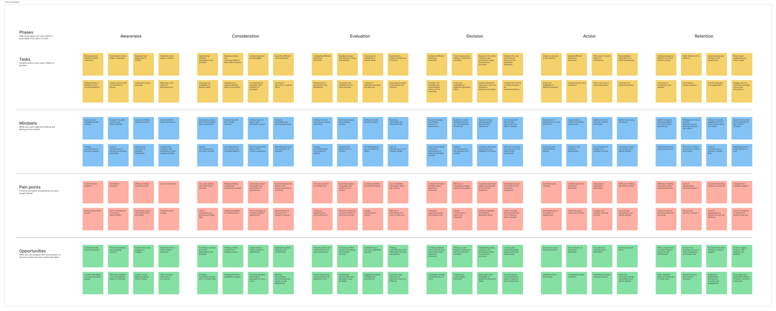
To help understand what users needed to do on this page we created a user journey map, This helped us to understand the mindset of our users, which served as a reference point when helping us to decide the priority of elements on our redesign.
Improving customer trust by defining our brand guidelines
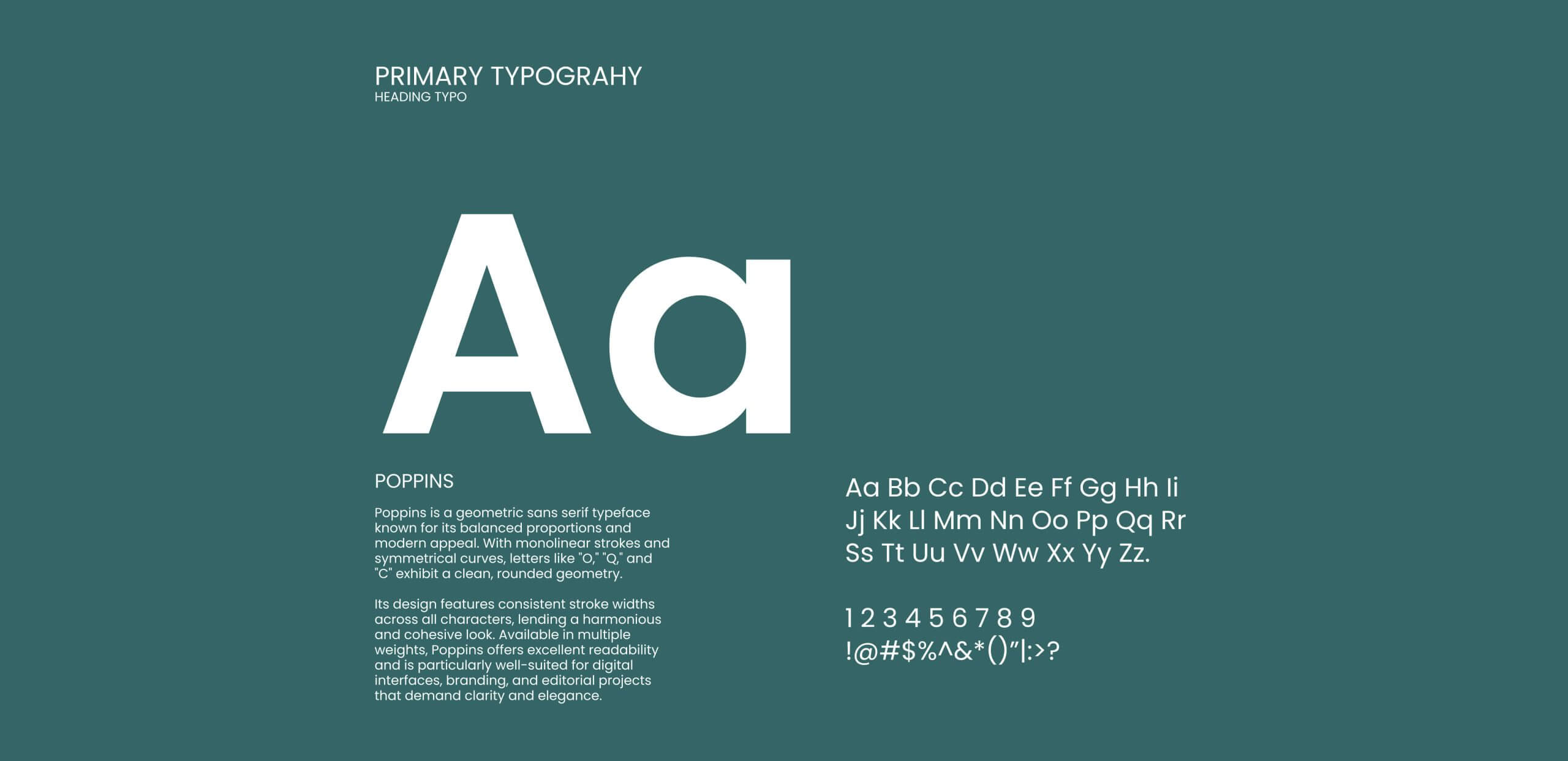
The branding overhaul focused on creating a cohesive and approachable identity that reflected trust and expertise. We introduced a modern colour palette of natural outdoor colours such as dark green, paired with the Poppins typeface for readability and friendliness. Consistent logo usage, typography, and colour guidelines were established to address the previous lack of cohesion, with he aim of enhancing user trust and aligning the brand with its mission of offering expert-led, safe, and group-friendly travel experiences.
Pantone® 626 C
C71 M51 Y102 K1
#336666
Pantone® 032 C
C233 M21 Y74 K1
#E9154A
Pantone® 663 C
C02 M01 Y01 K00
#f7f7f7
Headlines:
Google Font Poppins
A B C D E F G H I J K L M N O P Q R S T U V W X Y Z 1 2 3 4 5 6 7 8 9 0 a b c d ef g h i j k l m n o p q r s t u v w x y z
Paragraphs:
Google Font Poppins
Lorem Ipsum is simply dummy text of the printing and typesetting industry. Lorem Ipsum has been the industry's standard dummy text ever since the 1500s, when an unknown printer took a galley of type and scrambled it to make a type specimen book. It has survived not only five centuries, but also the leap into electronic typesetting, remaining essentially unchanged. It was popularised in the 1960s with the release of Letraset sheets containing Lorem Ipsum passages.
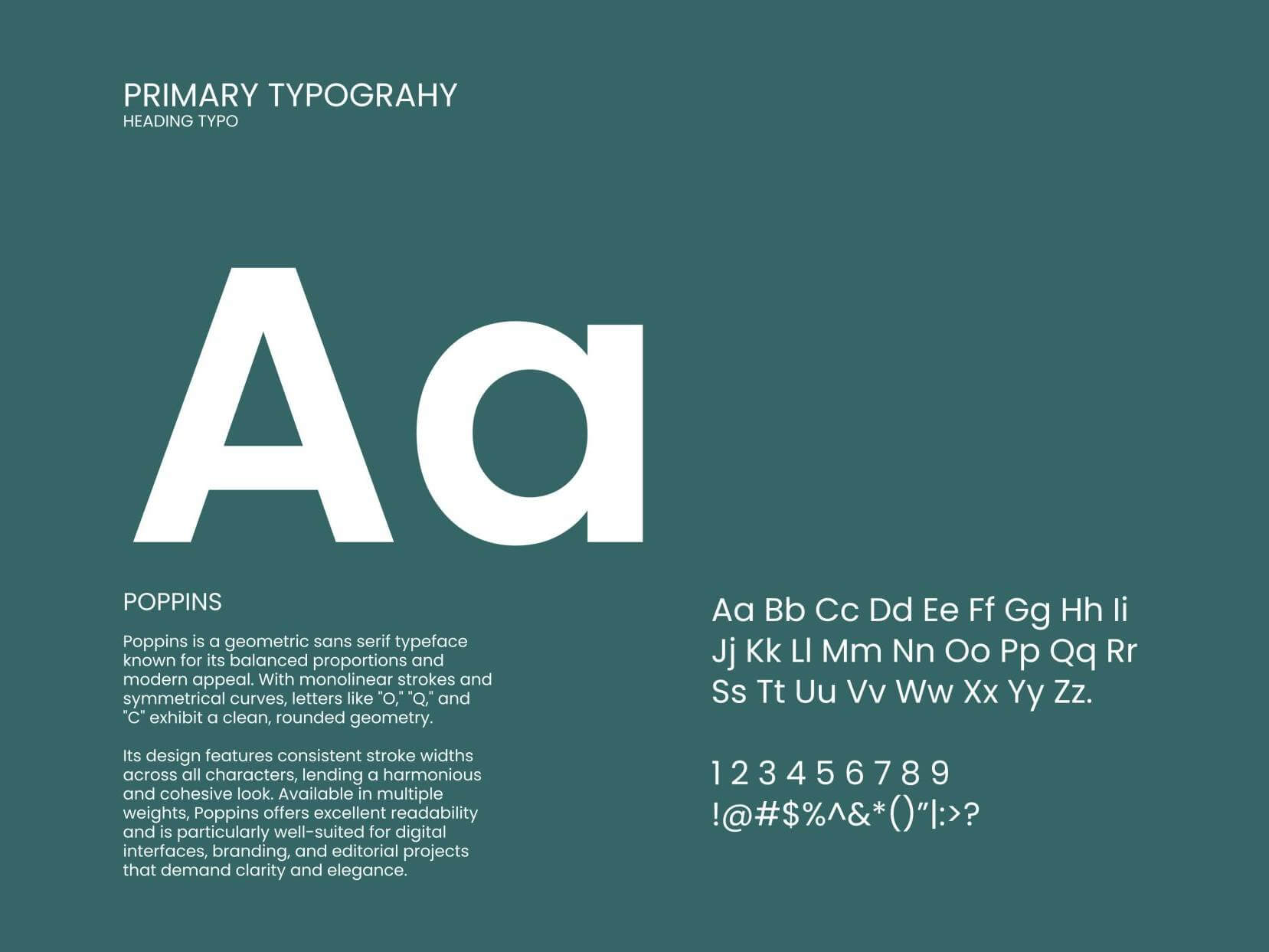
Selecting friendly approachable fonts
We focused on selecting fonts that balance friendliness and readability, ensuring they create an approachable experience while staying true to the brand’s personality and accessibility needs.
Constancy across all customer touch points.
We maintained a consistent look and feel across all customer touchpoints to enhance brand recognition and deliver a cohesive experience.
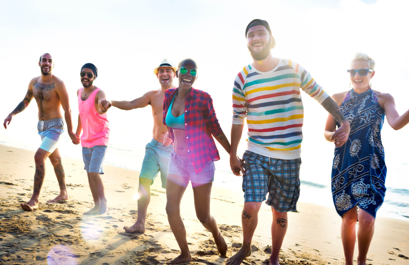
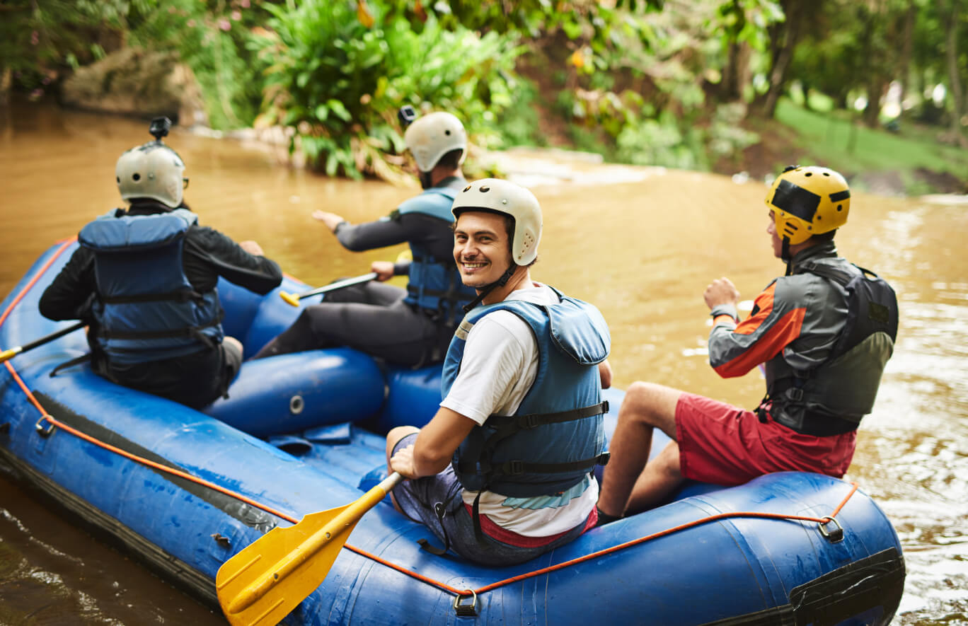
The inclusion of "People" in our business name, "The Adventure People," is crucial as it encapsulates the very essence of our mission and identity.
Our business is not just about facilitating adventures; it’s about curating experiences for individuals – humans, for real people seeking real moments of joy, exploration, and connection.
By placing “People” at the forefront, we underscore our commitment to recognising and celebrating the unique stories, aspirations, and desires of each individual.
Whether it’s crafting personalised travel experiences or fostering a community that shares a passion for adventure, the emphasis on “People” symbolises our dedication to creating meaningful connections and tailoring our offerings to resonate with the diverse and authentic spirit of every person who chooses to embark on an adventure with us. It signifies that our brand is not just about destinations; it’s about the people who make each adventure a unique and memorable journey.
P - Prioritise Authenticity
In all our interactions and endeavours, we prioritise authenticity. We believe in genuine connections and experiences, fostering an environment where authenticity is celebrated.
P - Promote Transparency
Transparency is key to building trust. We are committed to open communication, sharing information openly, and ensuring that our actions align with our values.
E - Embrace Diversity
Diversity is at the heart of our principles. We celebrate and embrace the unique backgrounds, perspectives, and stories of individuals, creating a rich and inclusive community.
L - Lead with Empathy
People are at the core of our business, and empathy guides our interactions. We strive to understand the needs and feelings of individuals, ensuring a supportive and empathetic approach in all we do.
O - Offer Exceptional Service
Our commitment is to provide exceptional service to every person we engage with. We go above and beyond to ensure our offerings exceed expectations, creating memorable and satisfying experiences.
E - Encourage Exploration
Encouraging a spirit of exploration is part of our ethos. Whether it's through travel, personal growth, or new experiences, we inspire and support people in their journeys of discovery.







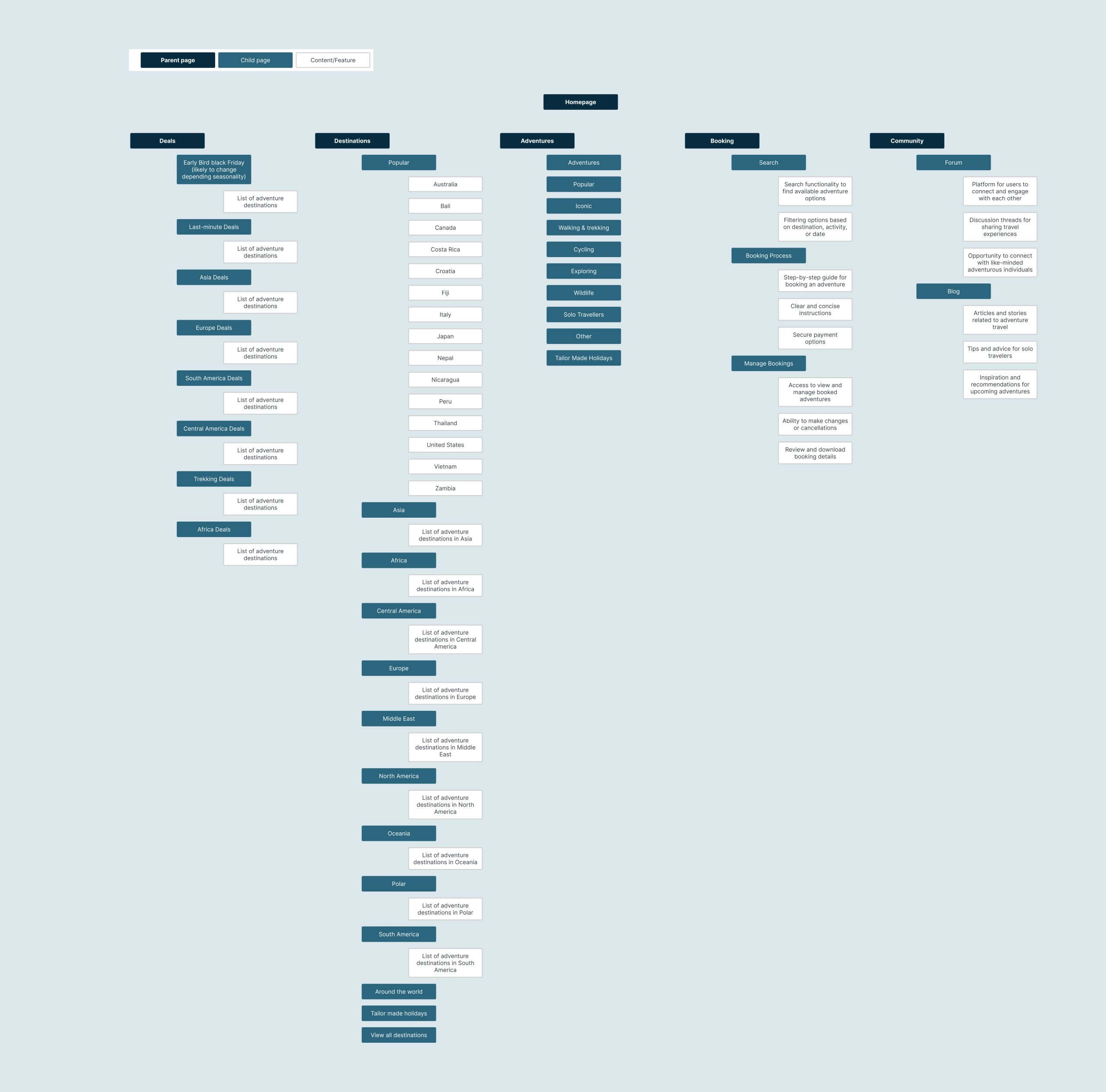
We redesigned our site architecture to enhance usability, streamline mobile navigation, and ensure scalability based on the findings of our user research.
The site architecture was restructured to streamline navigation, prioritise mobile usability, and improve scalability. By simplifying user journeys and aligning the design with SEO best practices, we enhanced performance and search visibility. Collaborating with developers, I ensured seamless integration with backend systems and introduced reusable components for consistency and future scalability. This foundation supported diverse user needs while enabling flexibility for growth.
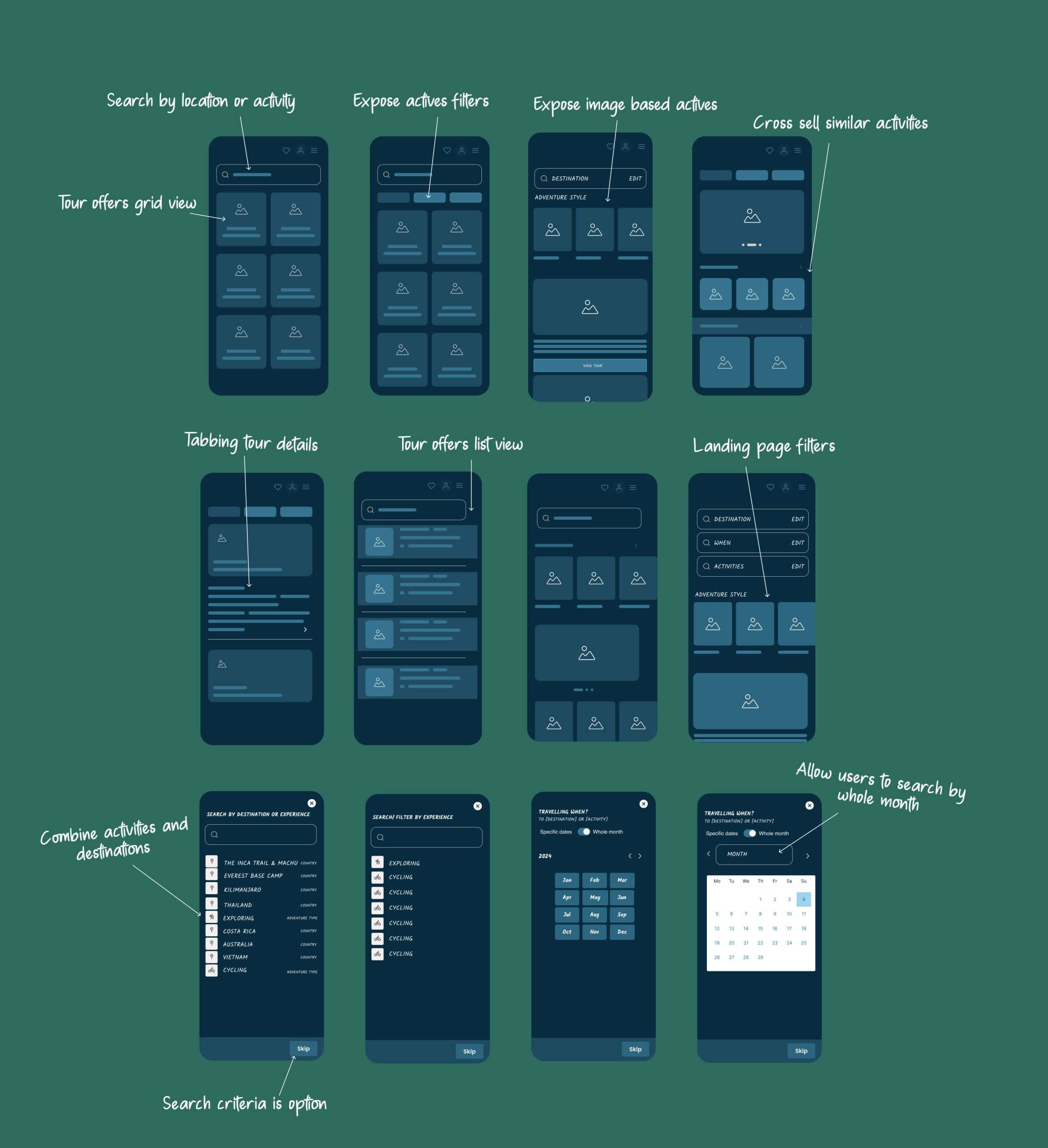
We implemented iterative design enhancements, refining wireframes to optimise usability and align with our understanding of users peoples needs.
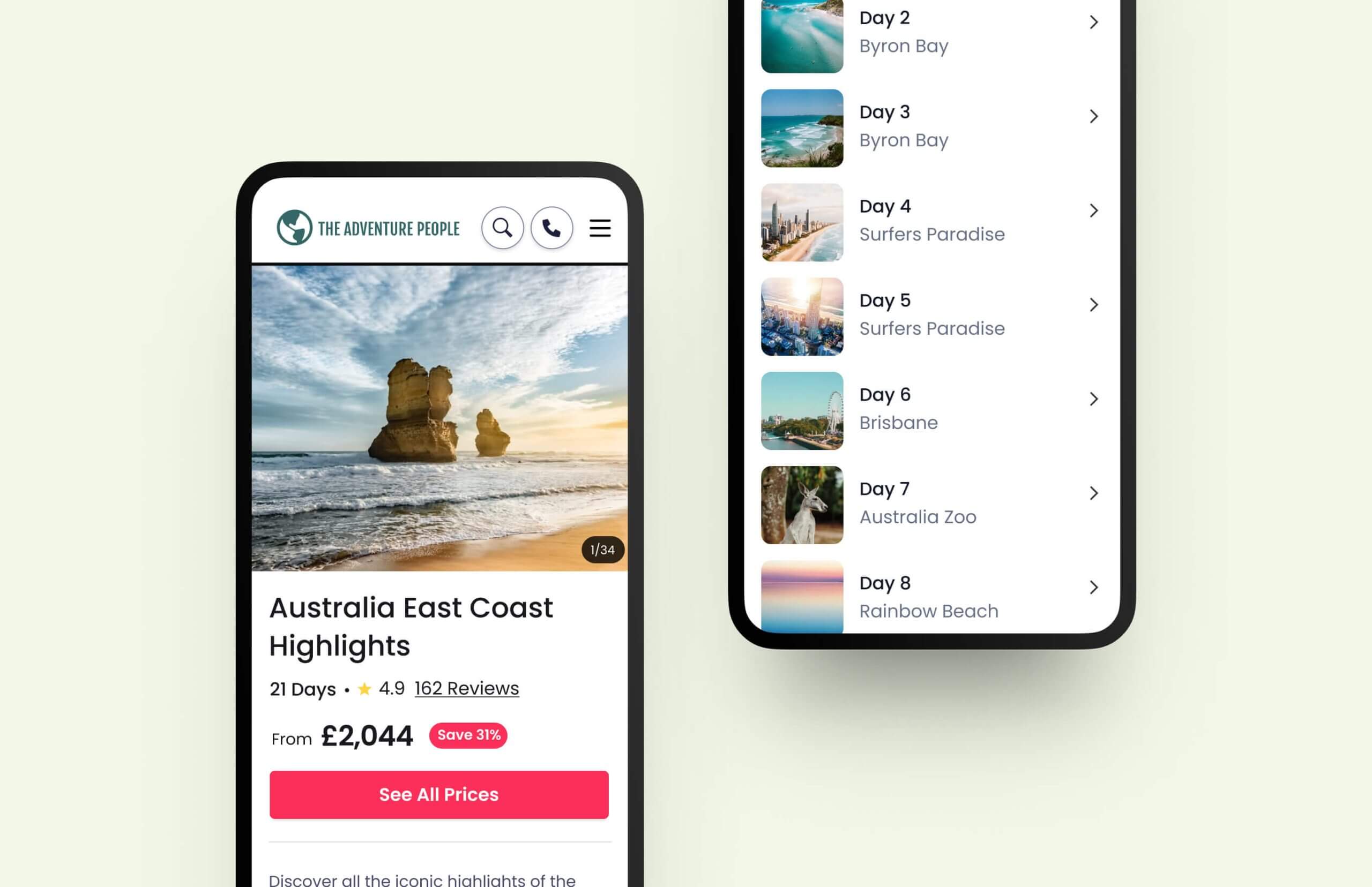
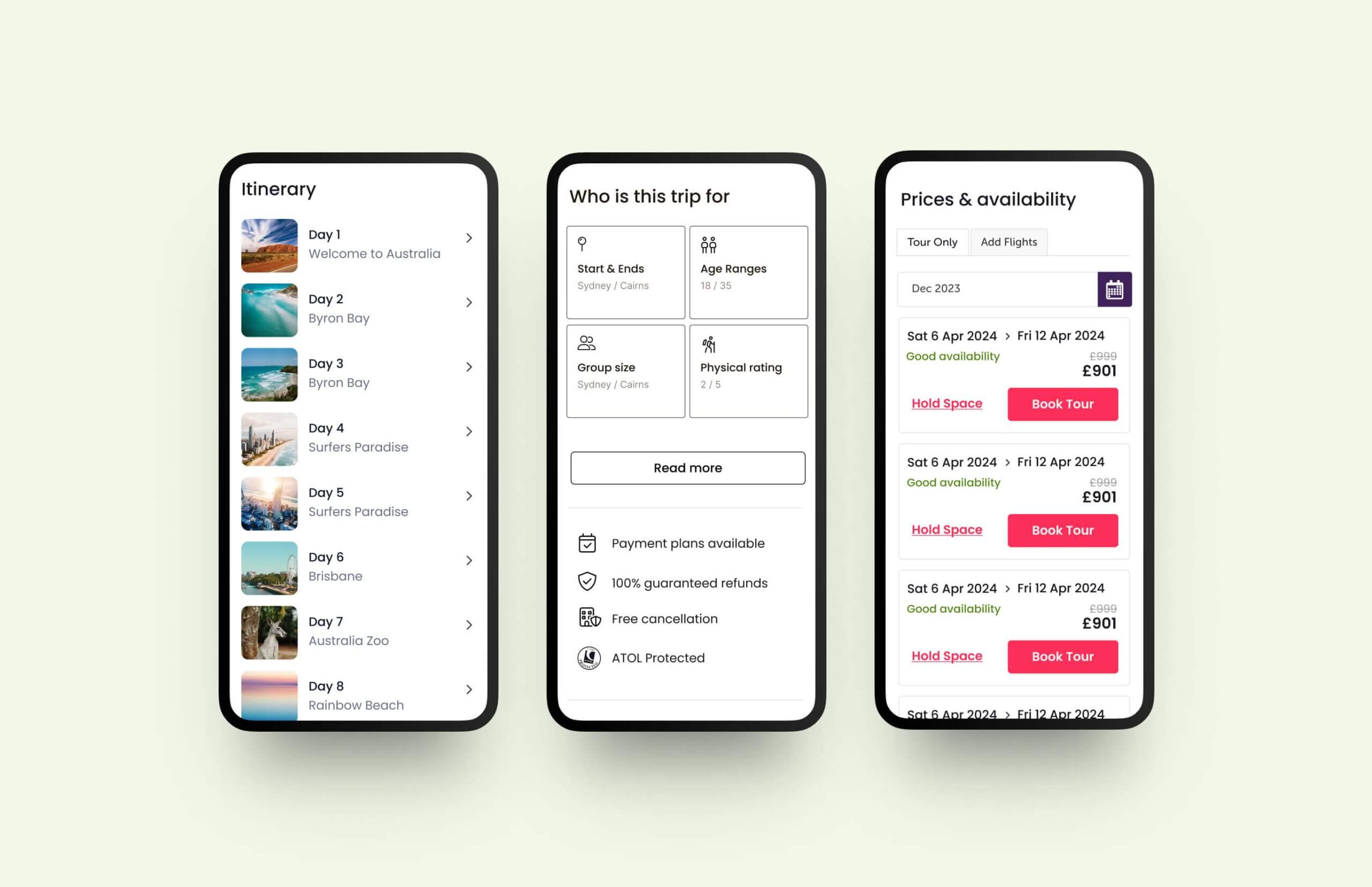
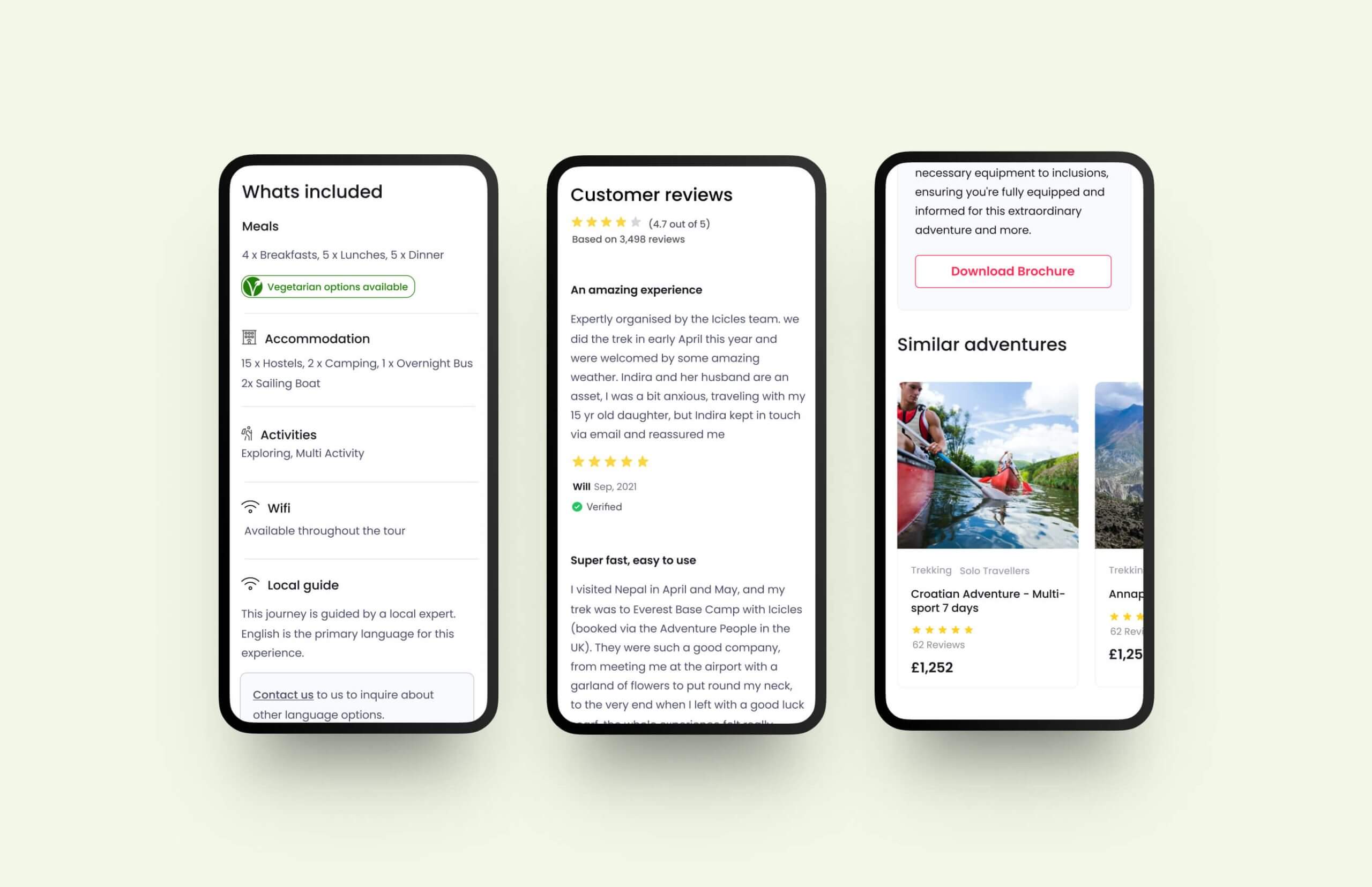
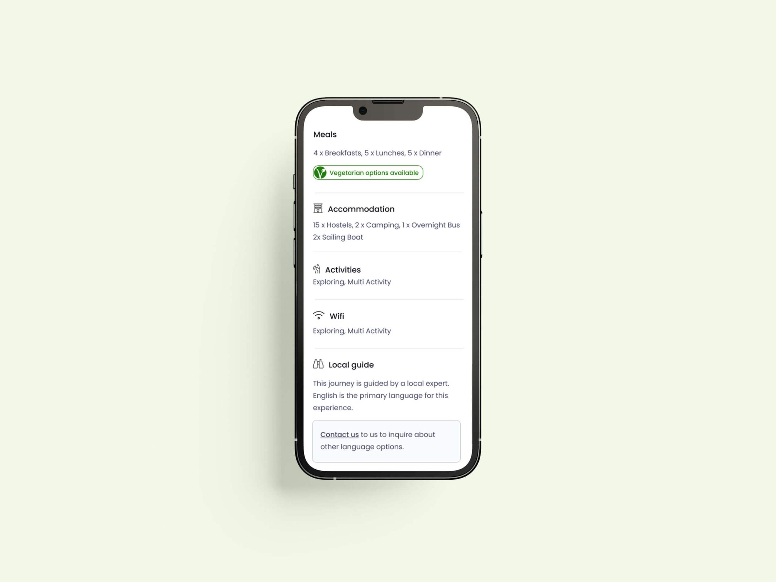
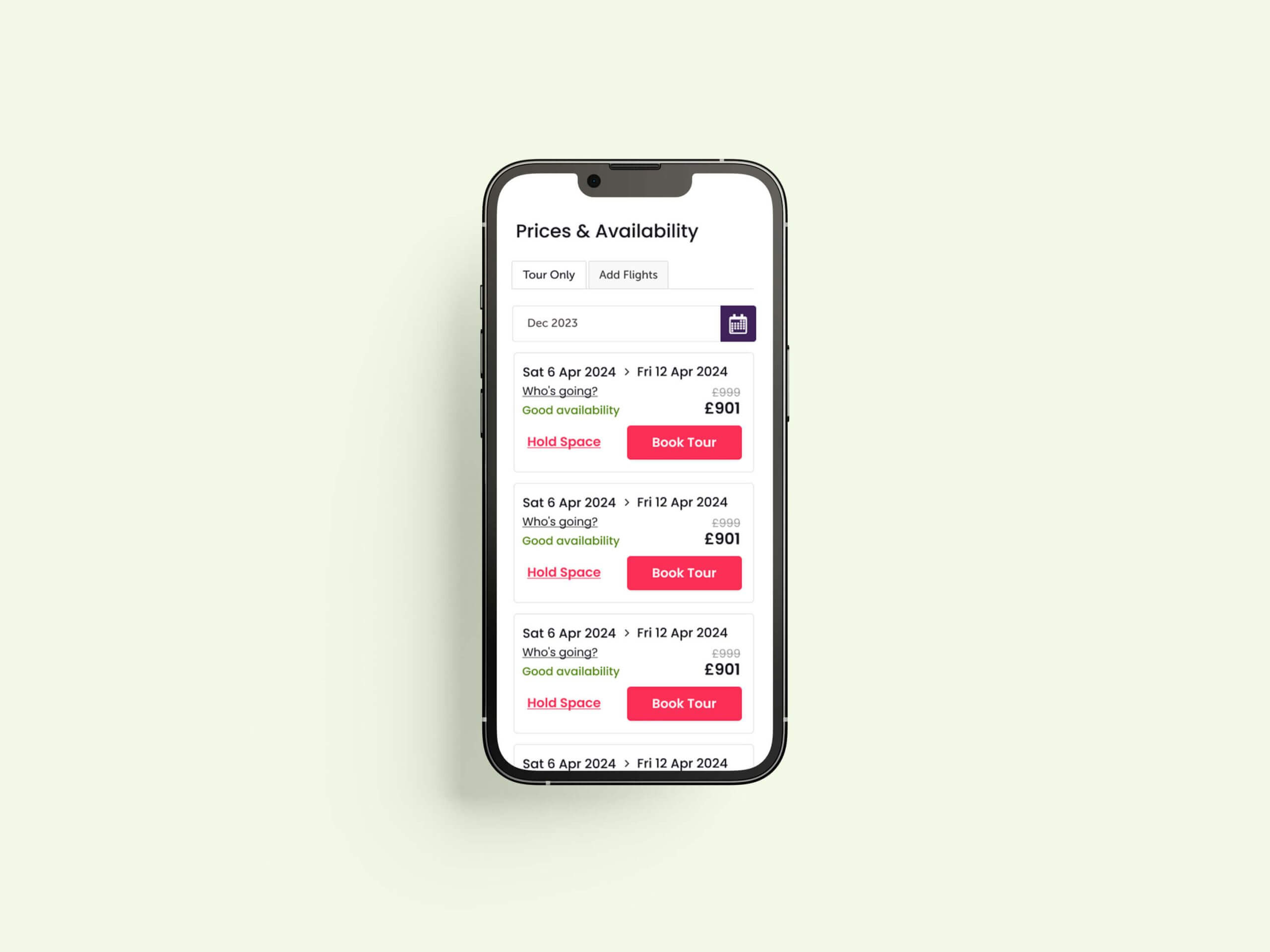
We restructured tour pages to cater to different user needs. Exploratory users received brochure-style content with visuals and day-by-day details. Ready-to-book users accessed streamlined information for quick comparisons. With the use of subpages and “Read more” CTA’s we were able to streamline the page design giving users a high-level view of each tour whilst being able to explore the content they were interested in, in more detail. This was a direct response to users highlighting they felt overwhelmed.
The high-fidelity designs brought the brand to life with a modern aesthetic, leveraging a refined colour palette and Poppins typeface for clarity and approachability.
We crafted mobile-optimised layouts to manage detailed tour information effectively, ensuring readability and functionality. Through collaboration with stakeholders, we balanced user needs with business goals, delivering polished visuals that aligned with the brand’s vision of trustworthiness and expertise.
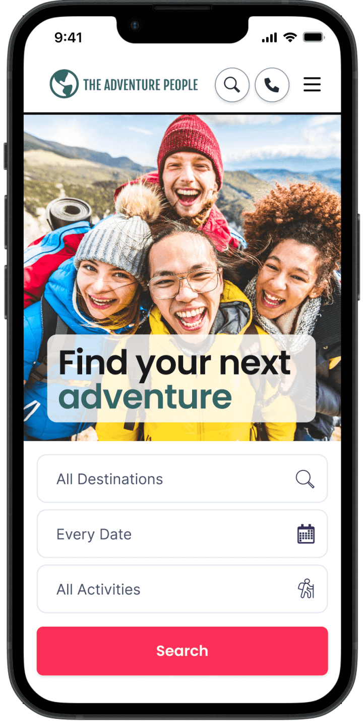
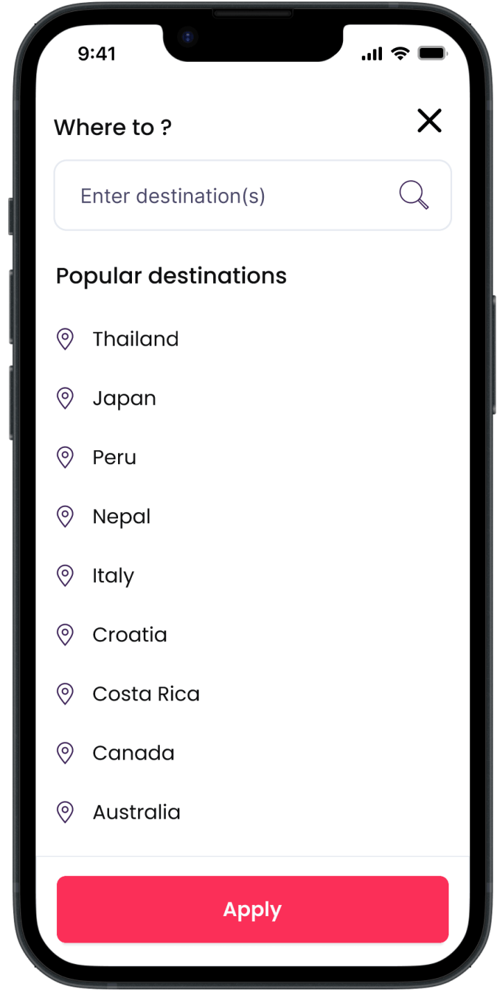
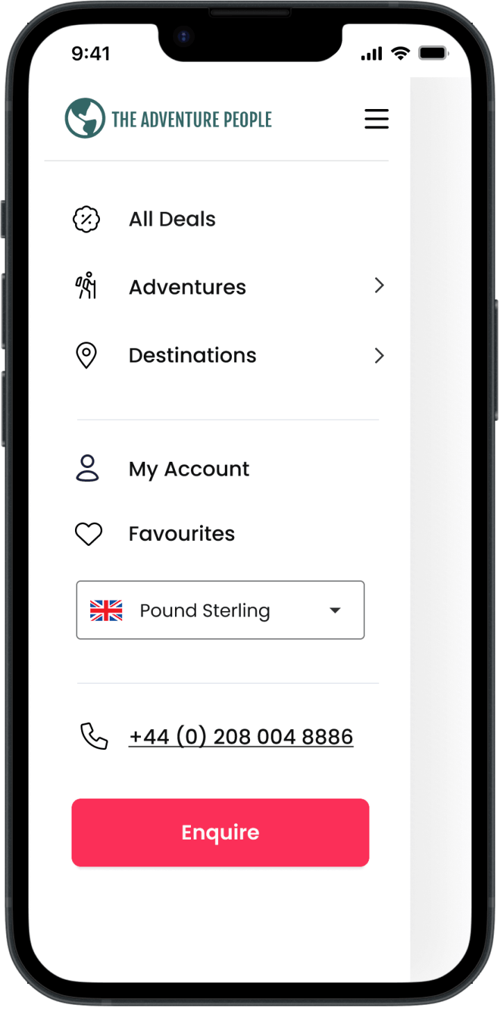
Interactive prototypes were created to validate design decisions and refine user flows before development.
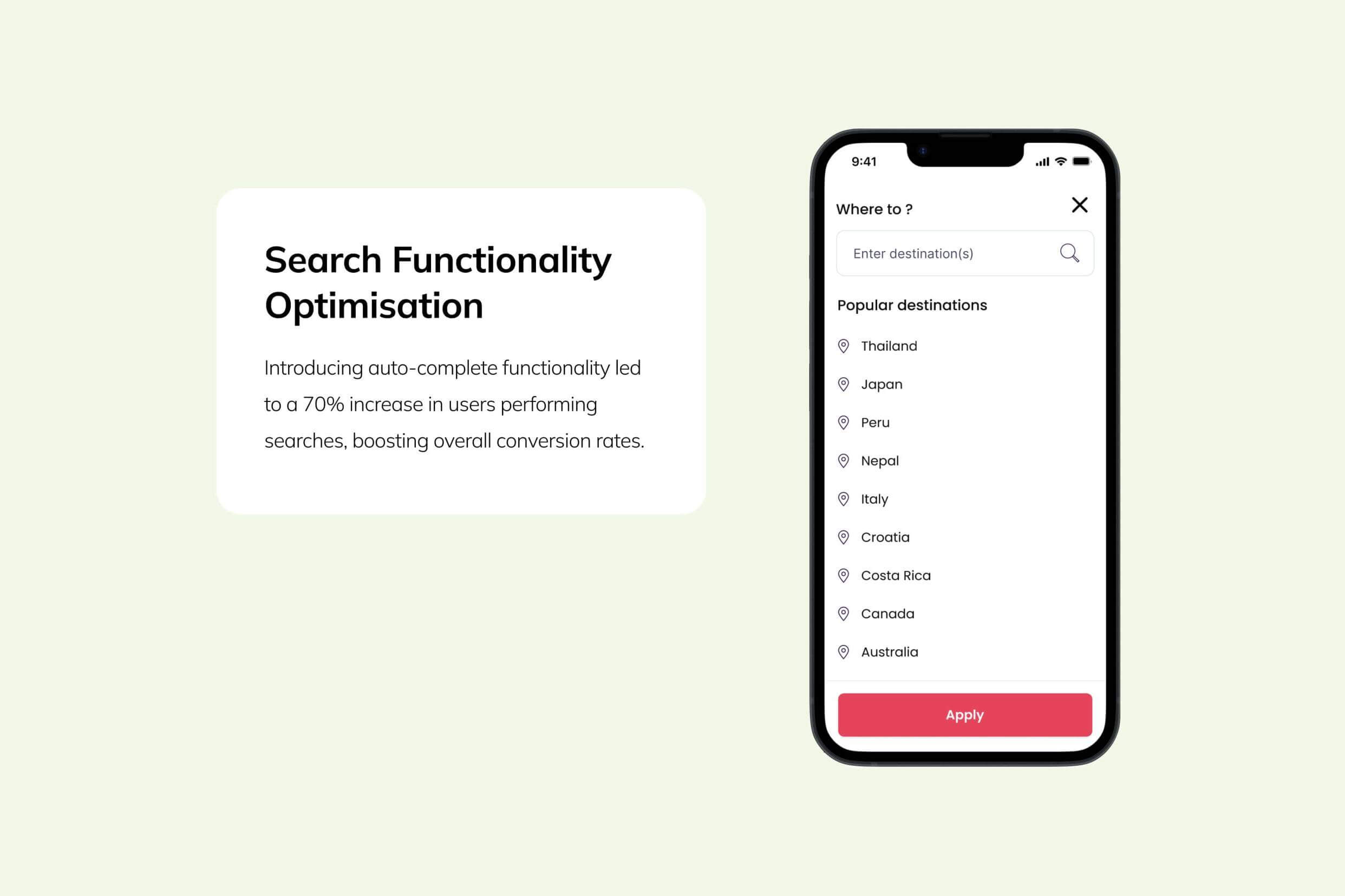
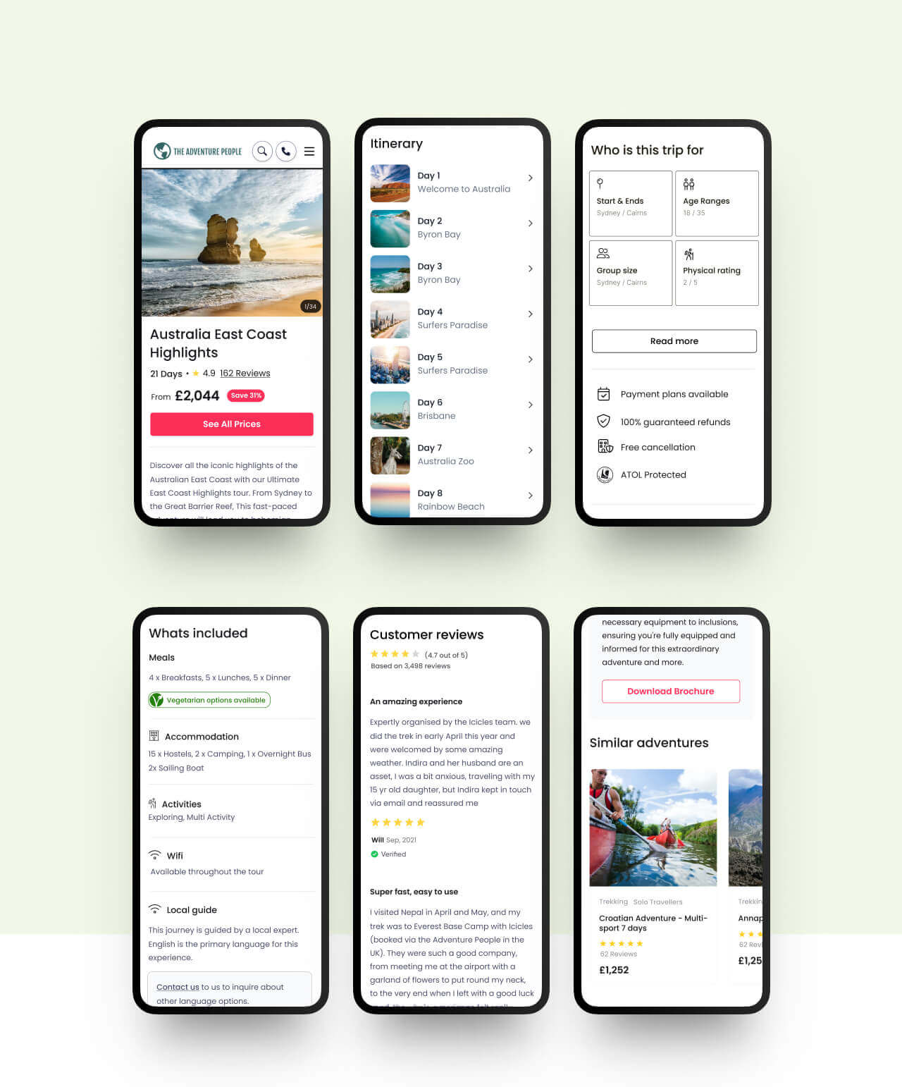
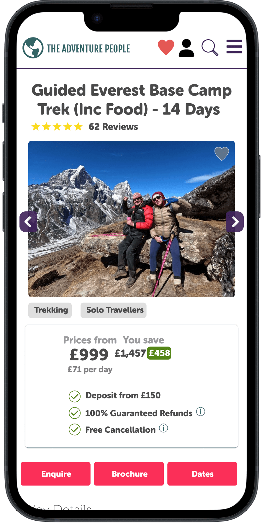
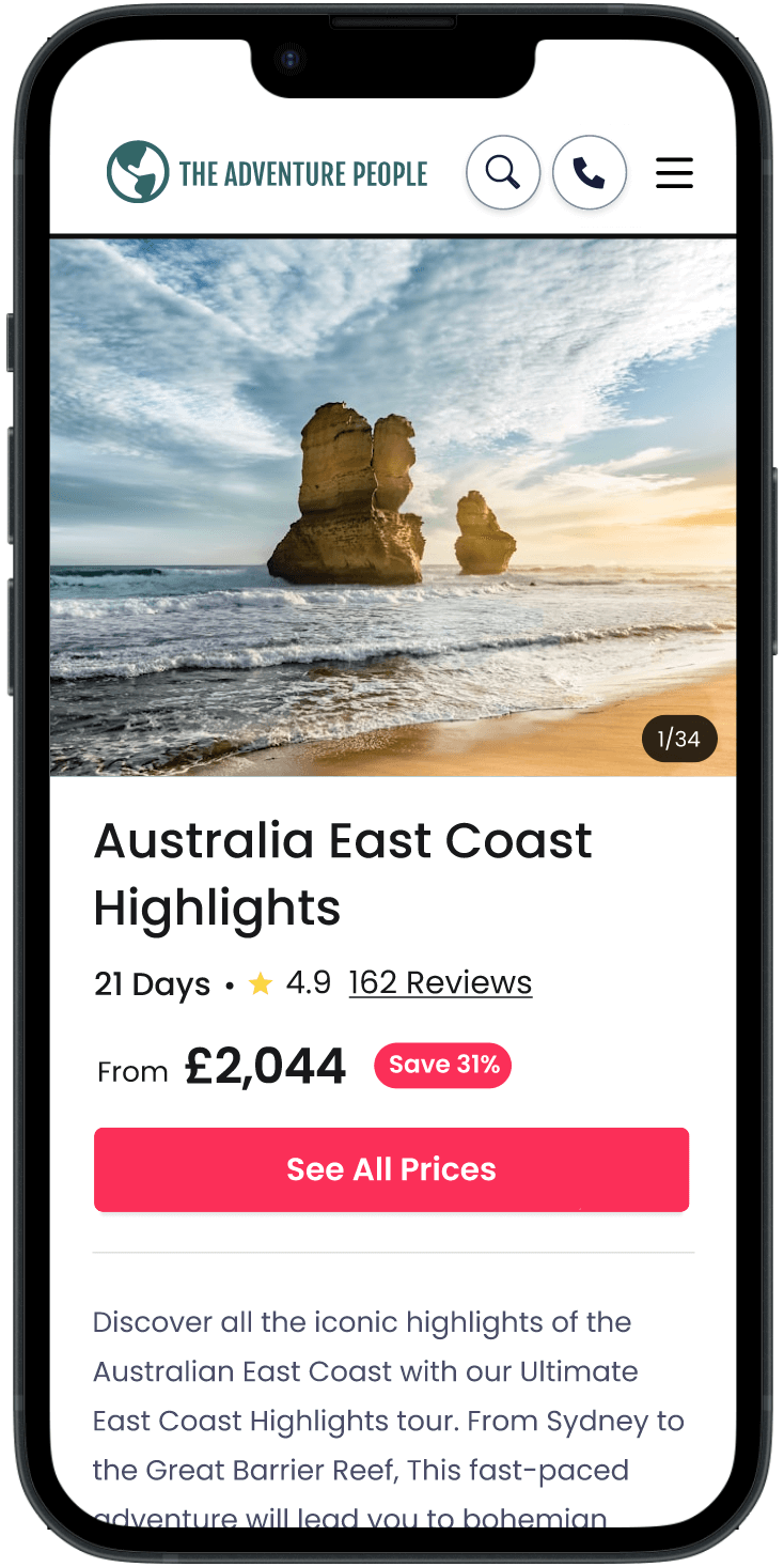
By removing the overwhelming number of buttons and structuring the page into clear sections, we provided users with an overview and allowed them to explore each section in more detail through subpages. This approach helped us maintain a rich level of content in a more structured and user-friendly way.
Desktop destination landing pages prototype