Cast Study
How we achieved a massive 357% conversion uplift
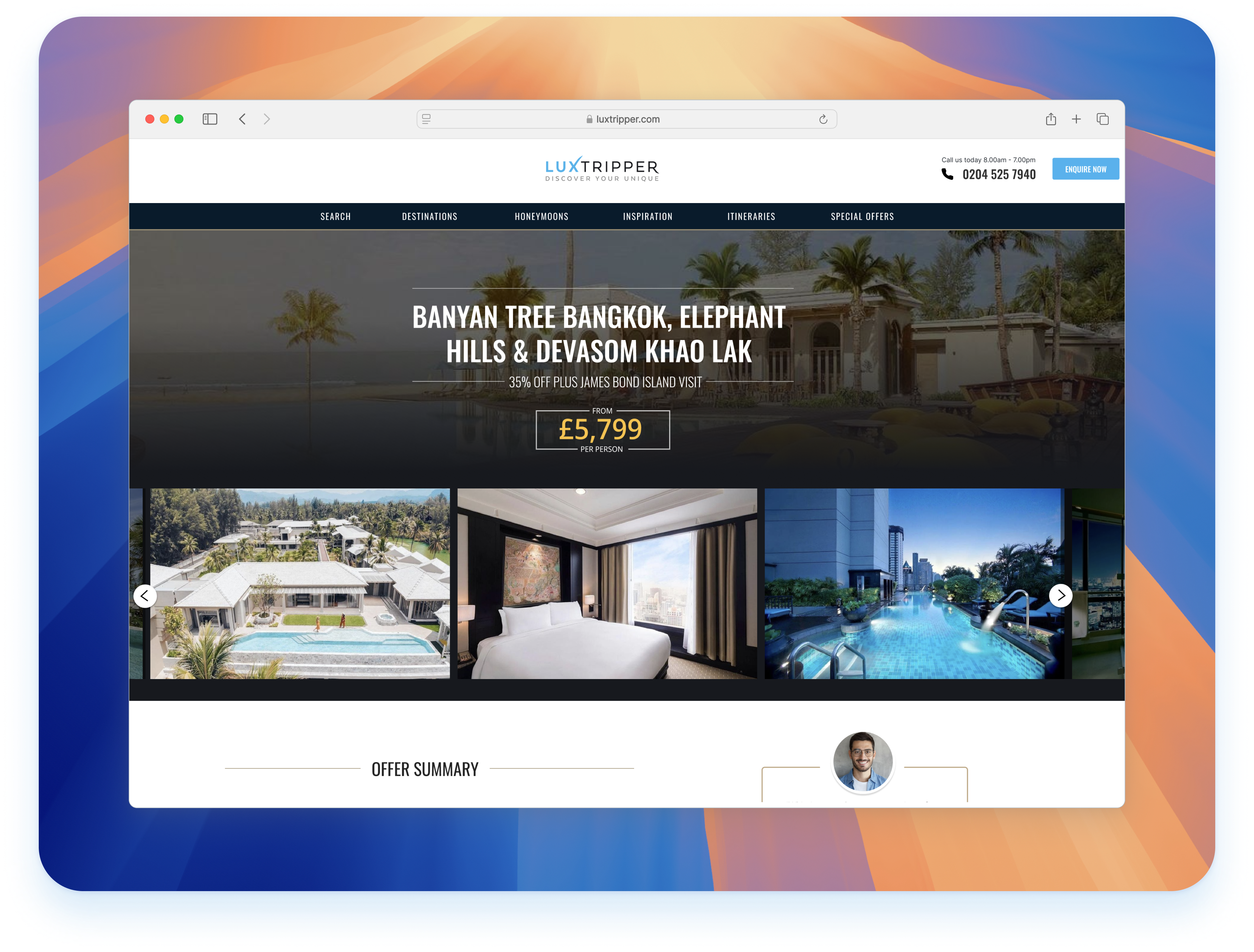
With an 80% bounce rate on a key Luxtripper Landing page, we identified the cause and delivered swift, impactful design solutions.
My Role
My role was to guide the team, lead the problem definition, conduct user research, test hypotheses, and drive design solutions that could be implemented quickly to maximise impact. With limited design and development resources, we focused on making incremental changes that would have the fastest and largest business value.
My Contributions
UX designer
User research
CRO implementation
Analytics
Product owner to implement
Project Scope
Design resource 1 week
One developer for 3 days
Client
Luxtripper
Team
Design resource 1 week
One developer for 3 days
Product owner to implement
Tools
Figma, Userbrain, Mixpanel
One developer for 3 days
Product owner to implement
Year
2023
357%
Uplift in customer bookings
120%
Improvment of users requesting quotes
18%
More users finding an suitable offer
Business context
Navigating Evolving Travel Market Dynamics
The travel industry is undergoing a profound transformation marked by shifting consumer preferences, technological advancements, and regulatory changes. This dynamic landscape presents strategic opportunities for innovation in personalised experiences, sustainability initiatives, and digital solutions. However, intense competition from both traditional players and disruptive startups poses challenges in capturing market share and maintaining profitability. Key drivers for our business include enhancing customer engagement, optimising operational efficiency, and expanding into new markets to drive growth. Despite our strong brand reputation and customer loyalty, resource constraints and outdated processes hinder our agility and ability to capitalise on emerging trends. Failing to adapt swiftly to these market shifts risks losing market relevance, missing growth opportunities, and falling behind competitors.
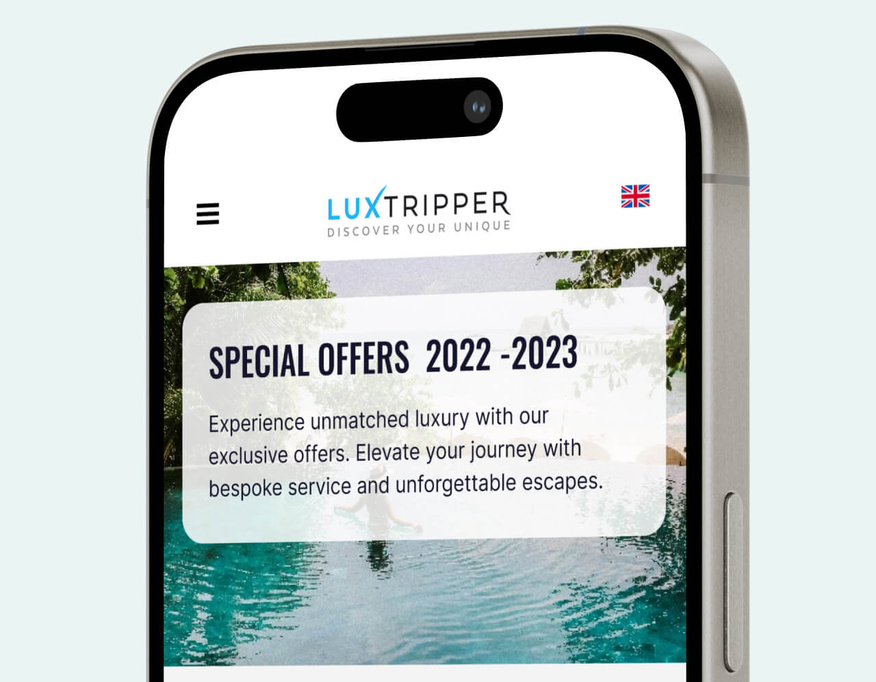
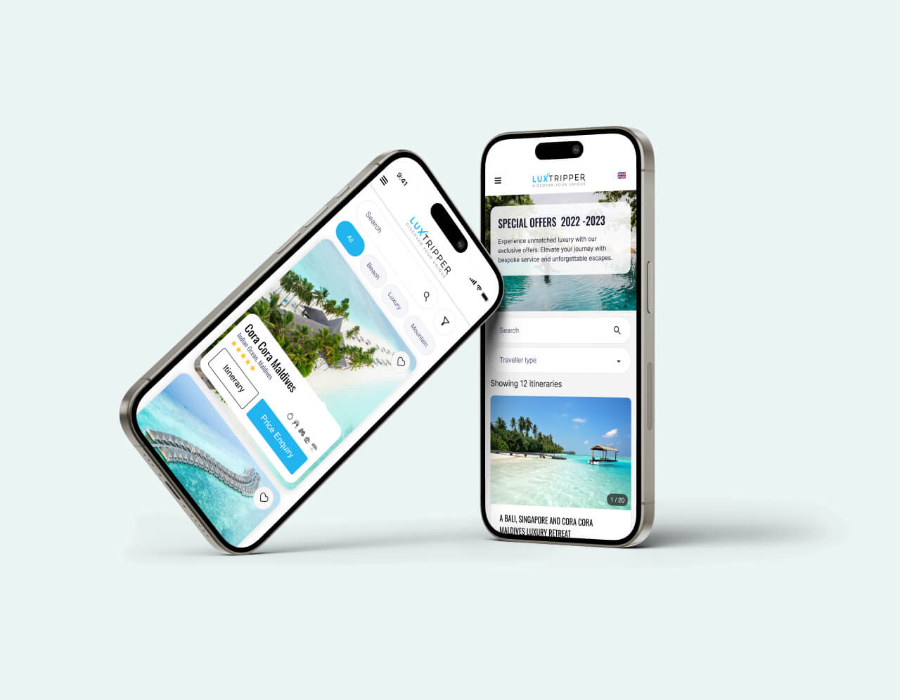
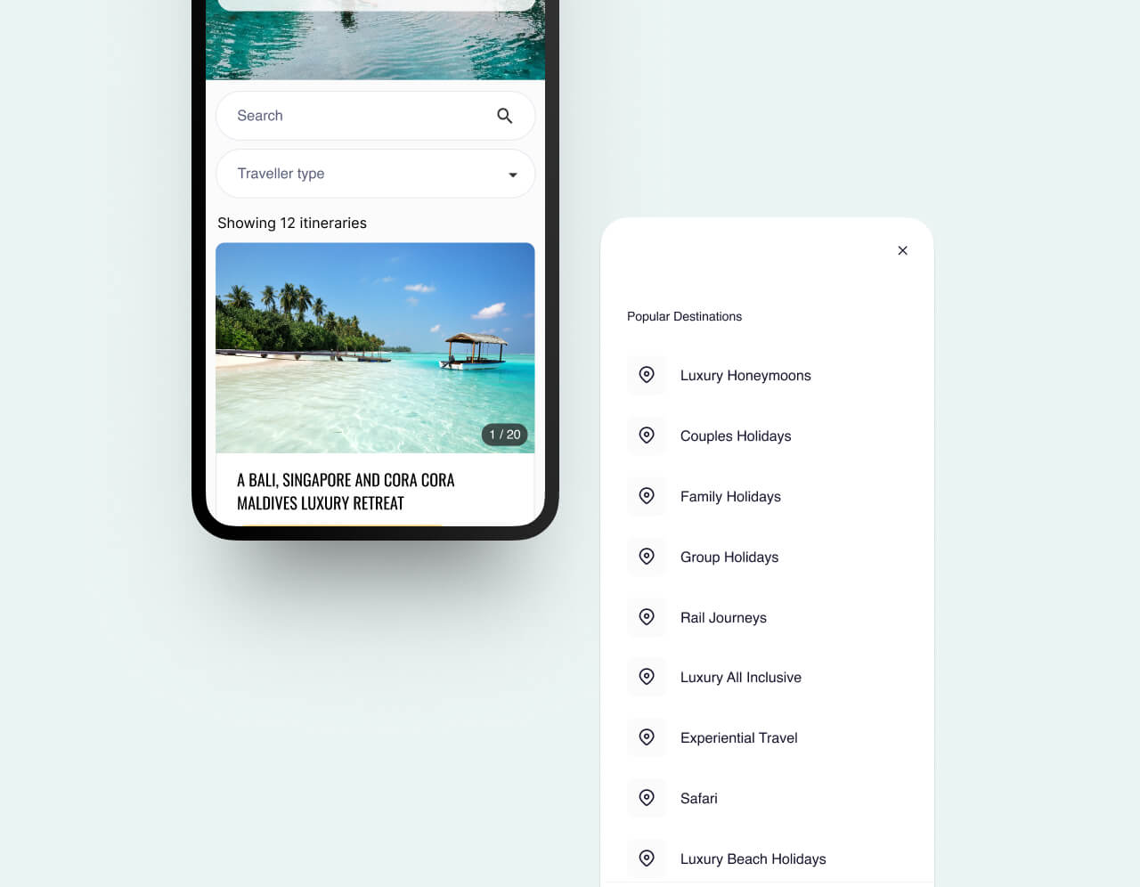
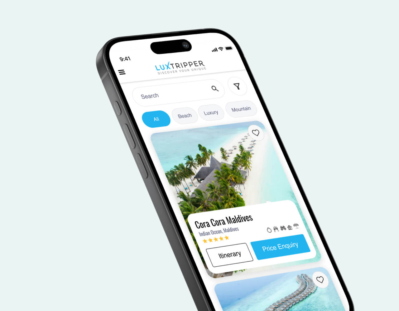
01
Finding opportunity
By analysing user behaviour through Google Analytics, we pinpointed that a significant portion of users were leaving the page without engaging. Key patterns emerged that suggested users were not perceiving sufficient value on the offer pages. Our hypothesis was that the offers lacked clarity and were failing to communicate the value of the package particularly the inclusions such as flights and transfers.
02
Defining problems
Our audience primarily sought luxury experiences but valued transparency regarding what was included in the offers. Despite high budgets, many users were cautious and desired clear, upfront communication regarding the full scope of the offers. This understanding became crucial in shaping the design approach, which needed to reassure users of the value they would be receiving.
03
Understanding our users
To gather insights rapidly, we conducted unmoderated user tests, allowing us to observe first impressions and identify pain points. These tests revealed that users found the offers confusing, particularly around the inclusions such as flights and transfers. This lack of clarity contributed to users’ reluctance to engage further with the offers.
Finding opportunity
We conducted a series of first-impression unmoderated tests with ten users to gather their opinions on the current execution, an area where we previously had little concrete data and only anecdotal insights into user expectations.
This study aimed to evaluate the effectiveness of our current user experience. Were we truly meeting user needs? An 80% bounce rate strongly suggested that users were not finding what they were looking for. Our research sought to uncover the reasons behind this: were we bidding on the wrong terms, or were we simply failing to meet user expectations?
We conducted a study with ten users, using the user-brain application for speed of delivery. We asked screeners to recruit users who book luxury holidays with a budget of our average booking value and who typically book holidays online.
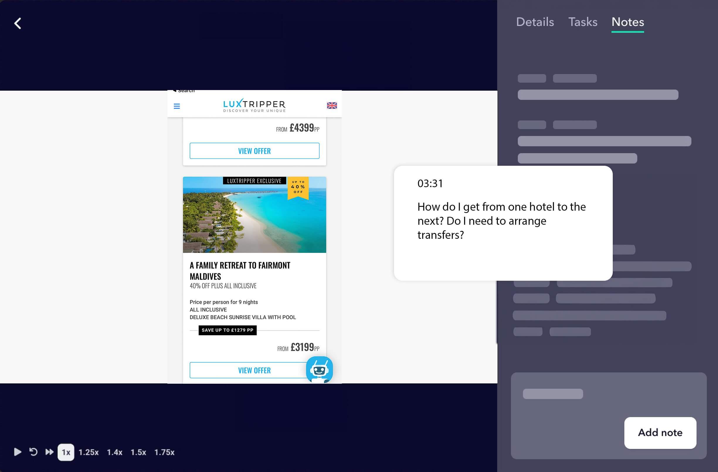
We gathered feedback from users across all devices, simulating the typical journey they would take to reach our pages. This included conducting first-impression tests that assessed visual appeal, clarity of information, and overall usability.
Users encountered issues understanding what was included in the offers. Key details, such as flights and transfers, were not clearly communicated, leading to questions about how to travel between locations, a service we provided and included in the overall price.
This feedback was instrumental in refining our problem statement, ensuring we had a comprehensive understanding of user expectations and needs.
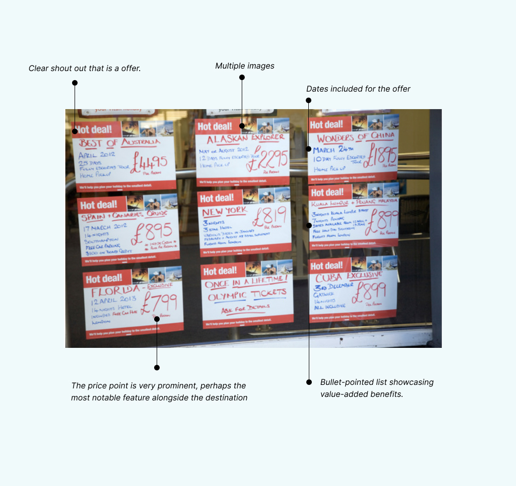
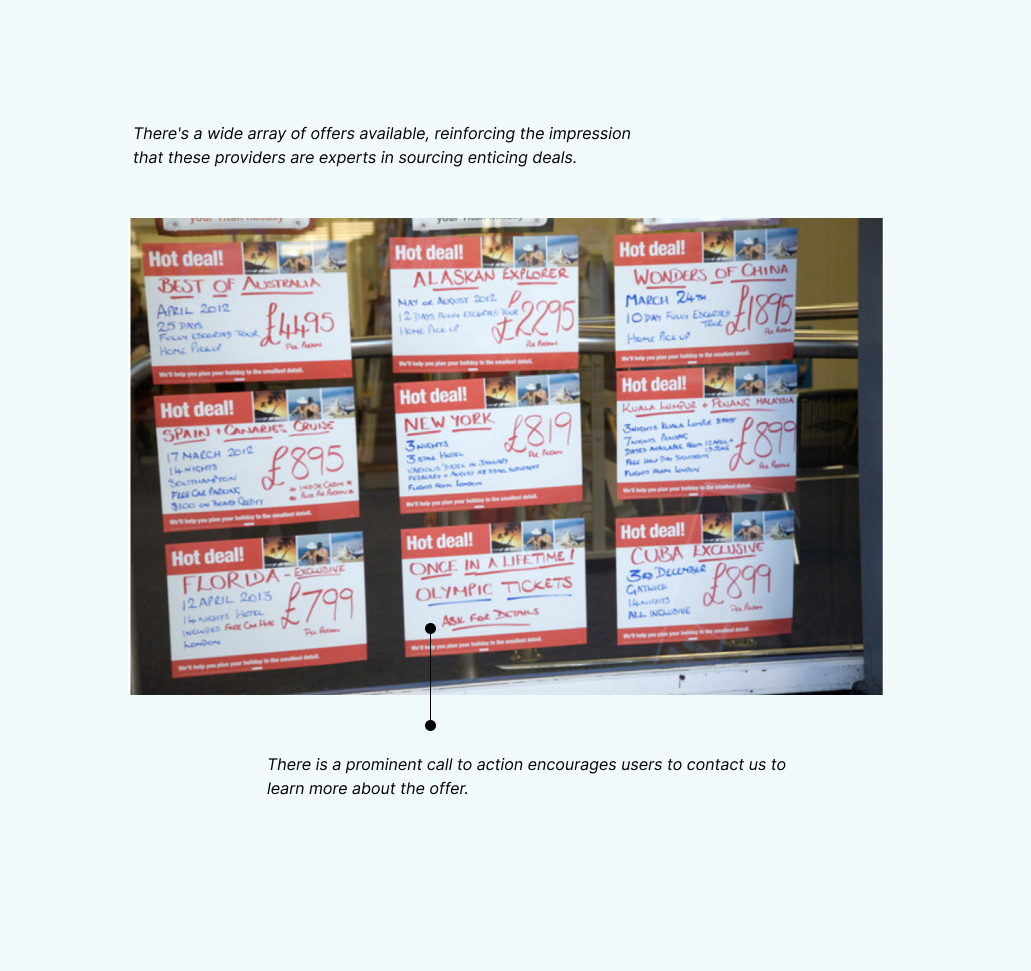
Finding inspiration on the high street.
To discover the best ways to demonstrate value, we examined attention-grabbing deals commonly used by high-street travel agents, seeking lessons we could apply to our own approach.
…
…
Research
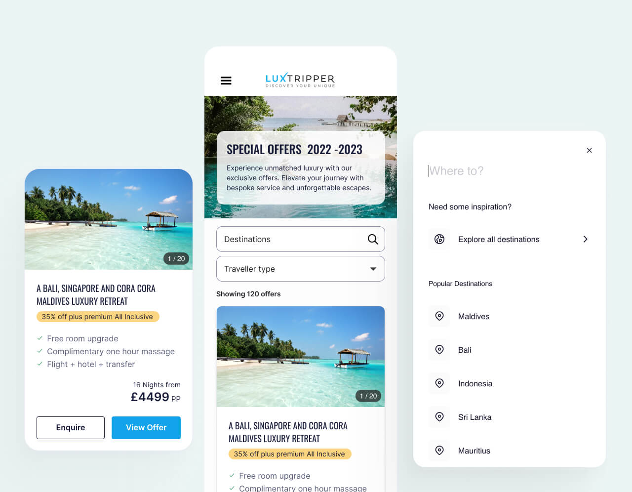
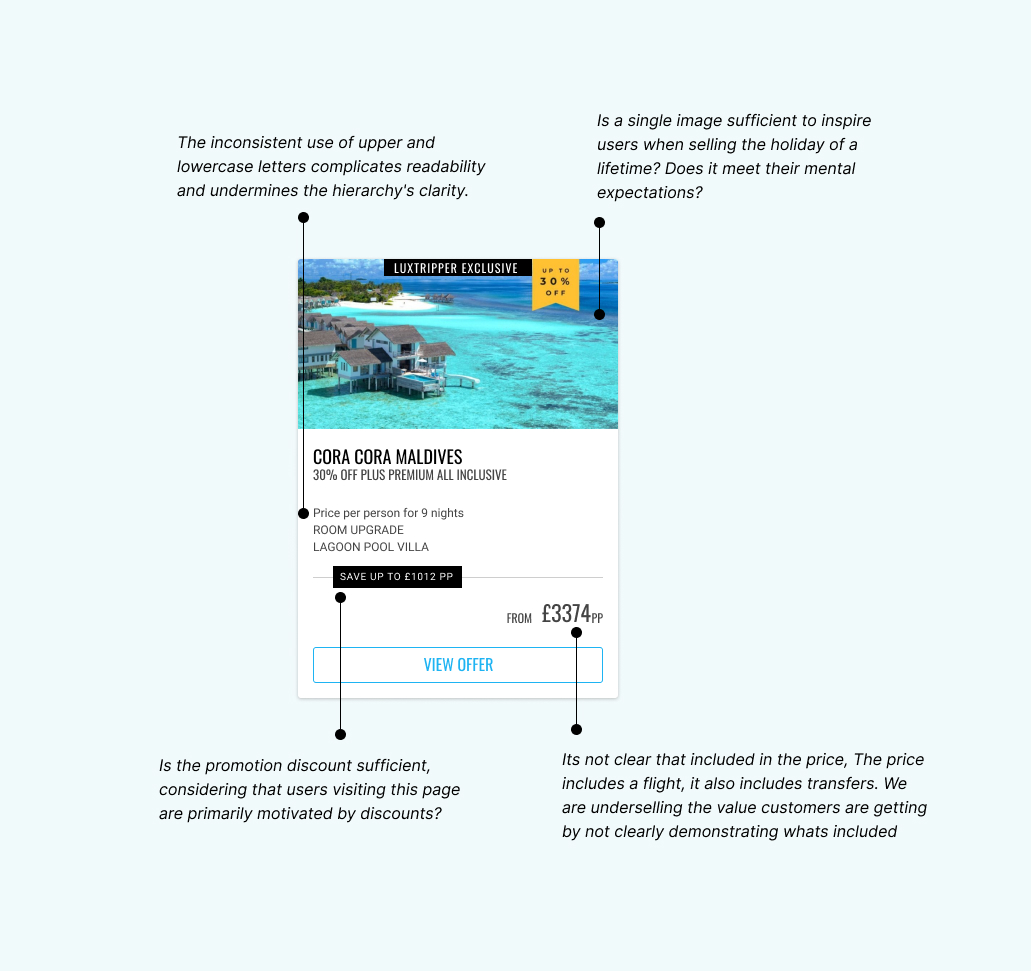
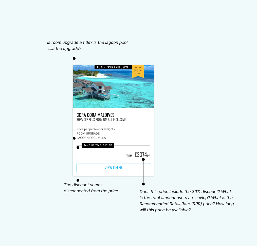
To understand why our current offer cards were underperforming, we did a tear-down of the current cards. The offer cards lacked clarity and were not effectively communicating the value of the offer.
Users encountered issues understanding what was included in the offers. Key details, such as flights and transfers, were not clearly communicated, leading to questions about how to travel between locations a service we provided and included in the overall price.
This feedback was instrumental in refining our problem statement, ensuring we had a comprehensive understanding of user expectations and needs.
Defining our problem
Drawing on the insights from our research, we recognised the need to redesign the offer cards to enhance user engagement and improve conversion rates.
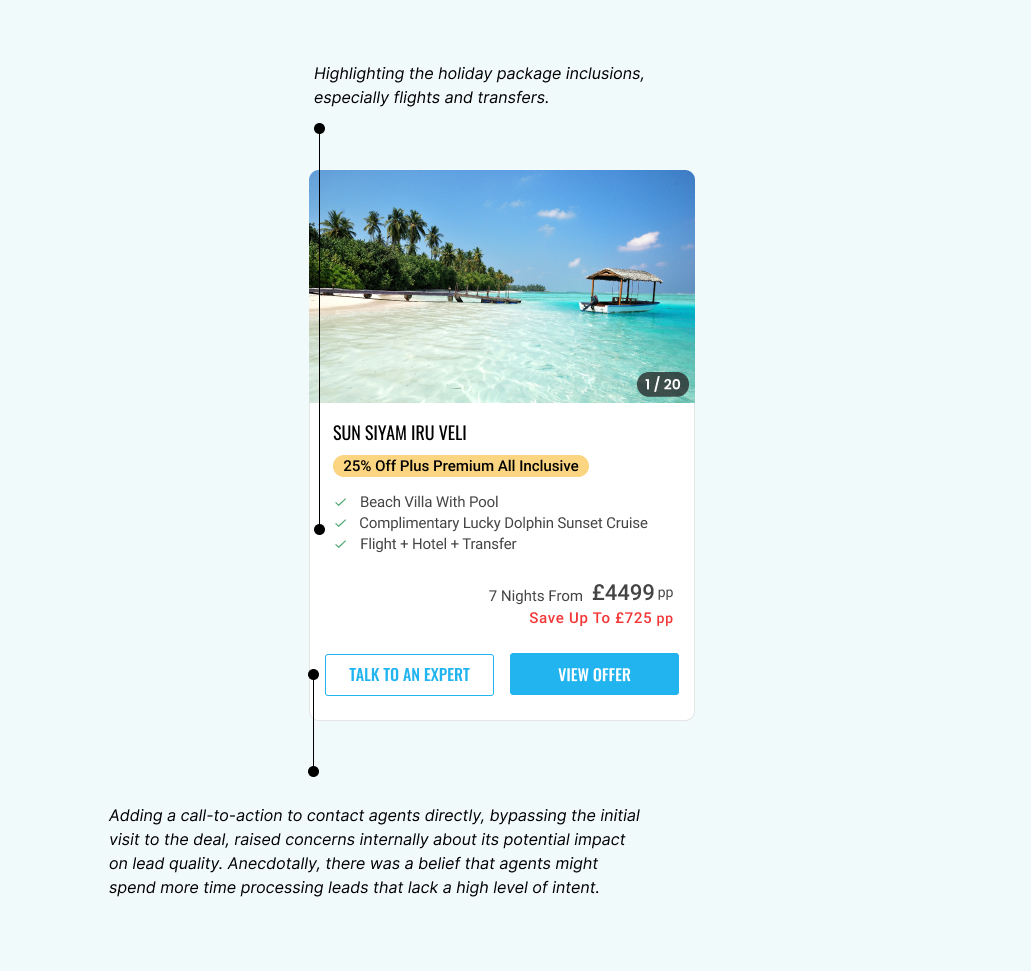
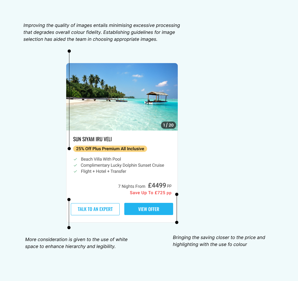
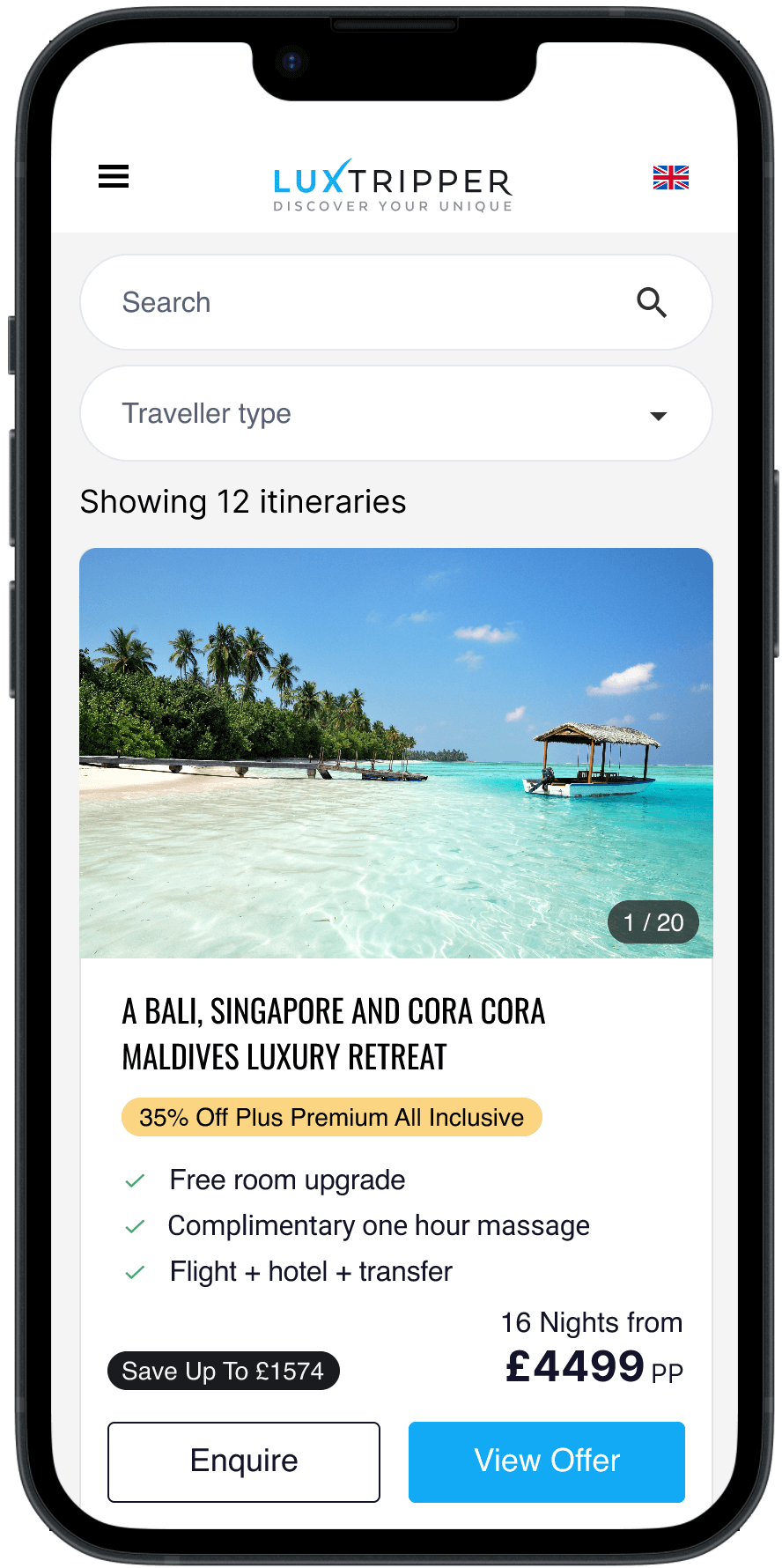
Our approach would involve creating cleaner layouts, featuring captivating hotel images, highlighting exactly what’s included by highlighting the level of value users receive, enlarging savings information, and making CTA’s to enquire more prominent.
We also aimed to standardise formatting and clearly present flight and transfer details. With these elements in mind, we developed a better understanding of where our cards were falling short of user expectations. This helped us develop a strong hypothesis.
Hypothesis
We believe that redesigning the offer cards to feature cleaner layouts, captivating hotel images, highlighting the value proposition, larger savings, prominent CTAs, consistent bullet-point formatting, and explicit flight and transfer details will enhance user engagement and drive better conversion rates.
Understanding
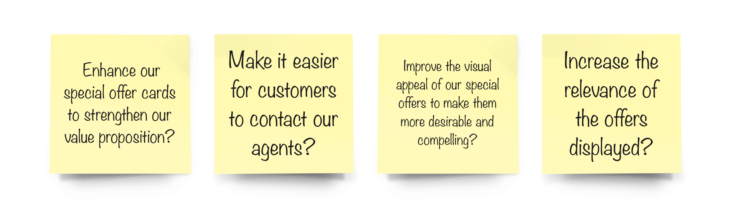
How might we…
…
Design
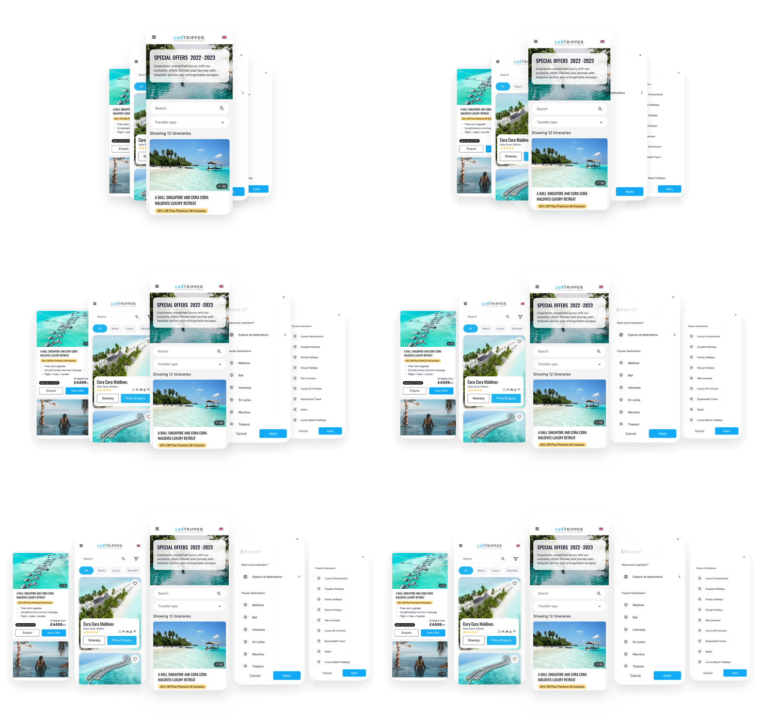
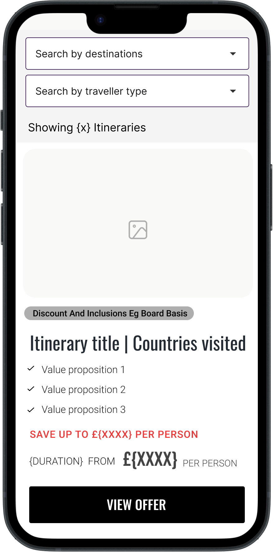
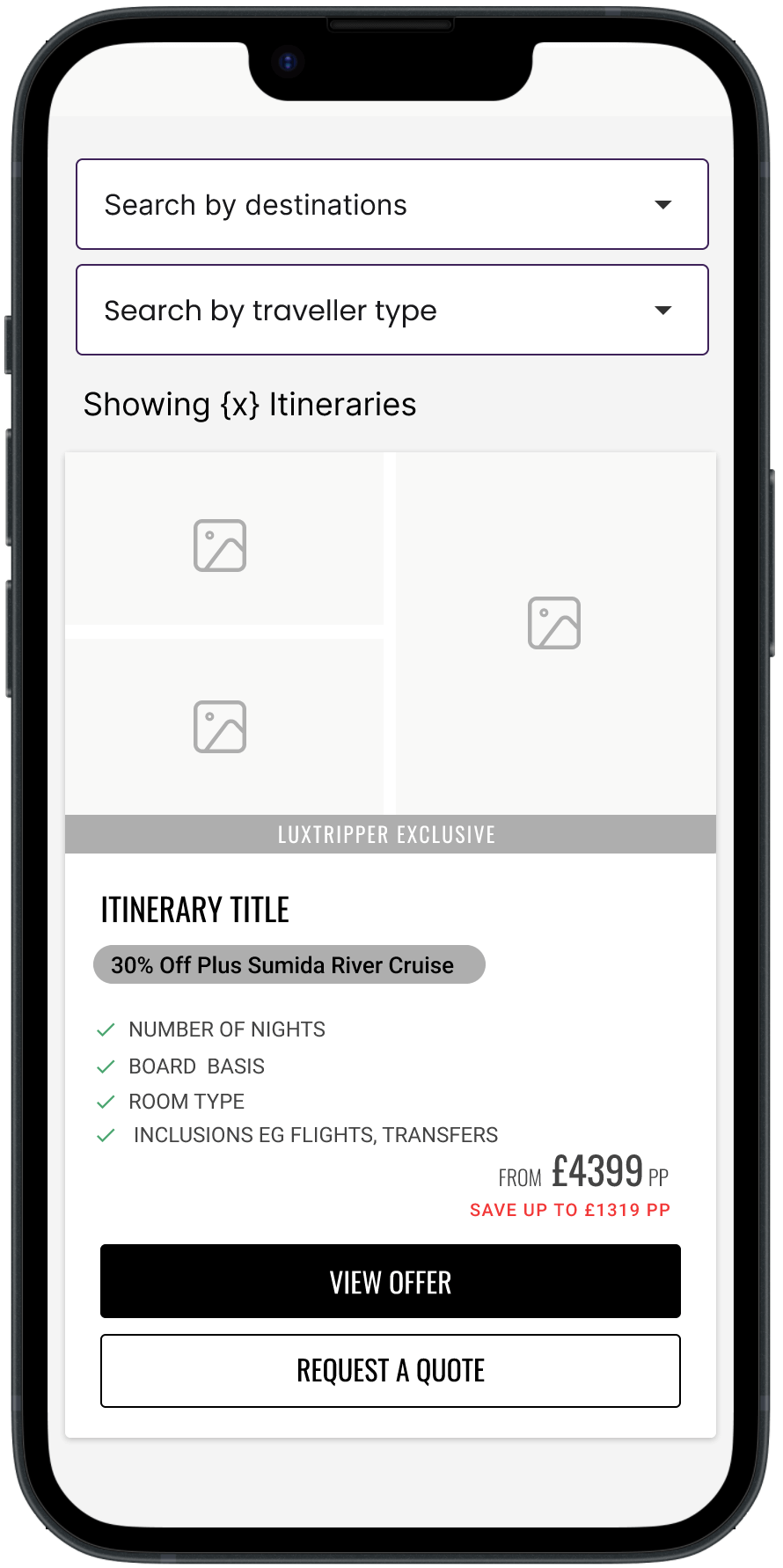
The wireframes focused on creating a clear visual hierarchy, with larger images, more prominent savings text, and easy-to-find CTAs
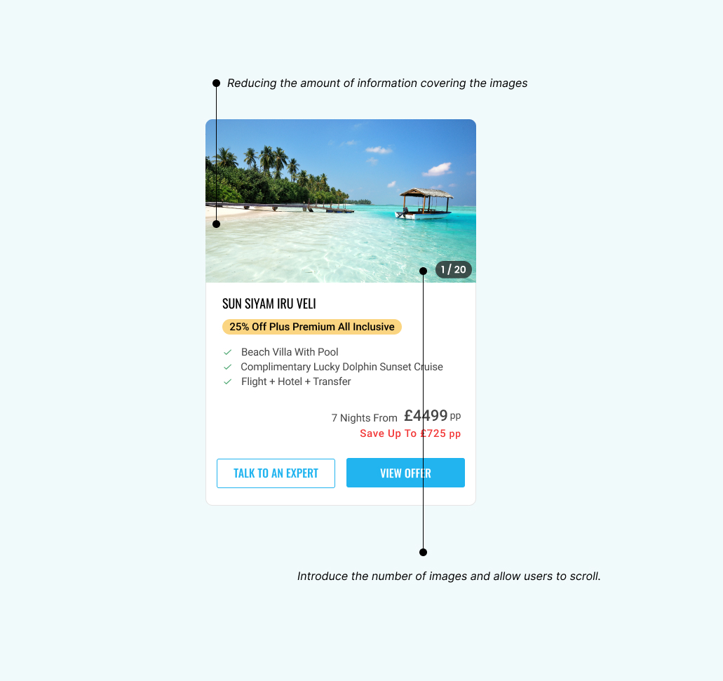
We experimented with adding an enquiry button earlier in the journey to reduce friction and increase user interaction. Additionally, we ensured that hotel images were unobstructed to “sell the dream” of the destinations.
…
Clearly highlight the value proposition
Although flights and transfers are included in the price, this information is not clearly communicated to users. Adding a bullet point to explicitly highlight that transfers are included will better showcase the value of the offer.
Adding an enquiry button earlier
There was an internal belief that it might be too early for users to contact us about an offer at this stage. However, by reducing barriers and emphasising the level of customer support and care we offer, placing an enquiry button earlier in the process encourages engagement and builds trust. Users know we are there to provide support and great customer service.
Sell the dream with unobstructed images
High-quality, unobstructed images are key to capturing the attention and imagination of potential customers. By ensuring that images of the destinations and hotels are not covered by text or other design elements, we allow users to immerse themselves in the visual appeal of the offer fully. This approach helps to evoke the dream-like experience of the holiday, making it more desirable and engaging. Clear, unobstructed visuals convey the luxury and exclusivity of the experience, creating an emotional connection with the users.
High-fidelity
We conducted 5-second tests to capture initial user impressions and validate that the new designs effectively addressed the issues identified in our research.
We experimented with adding an enquiry button earlier in the journey to reduce friction and increase user interaction. Additionally, we ensured that hotel images were unobstructed to “sell the dream” of the destinations.
Data-driven validation
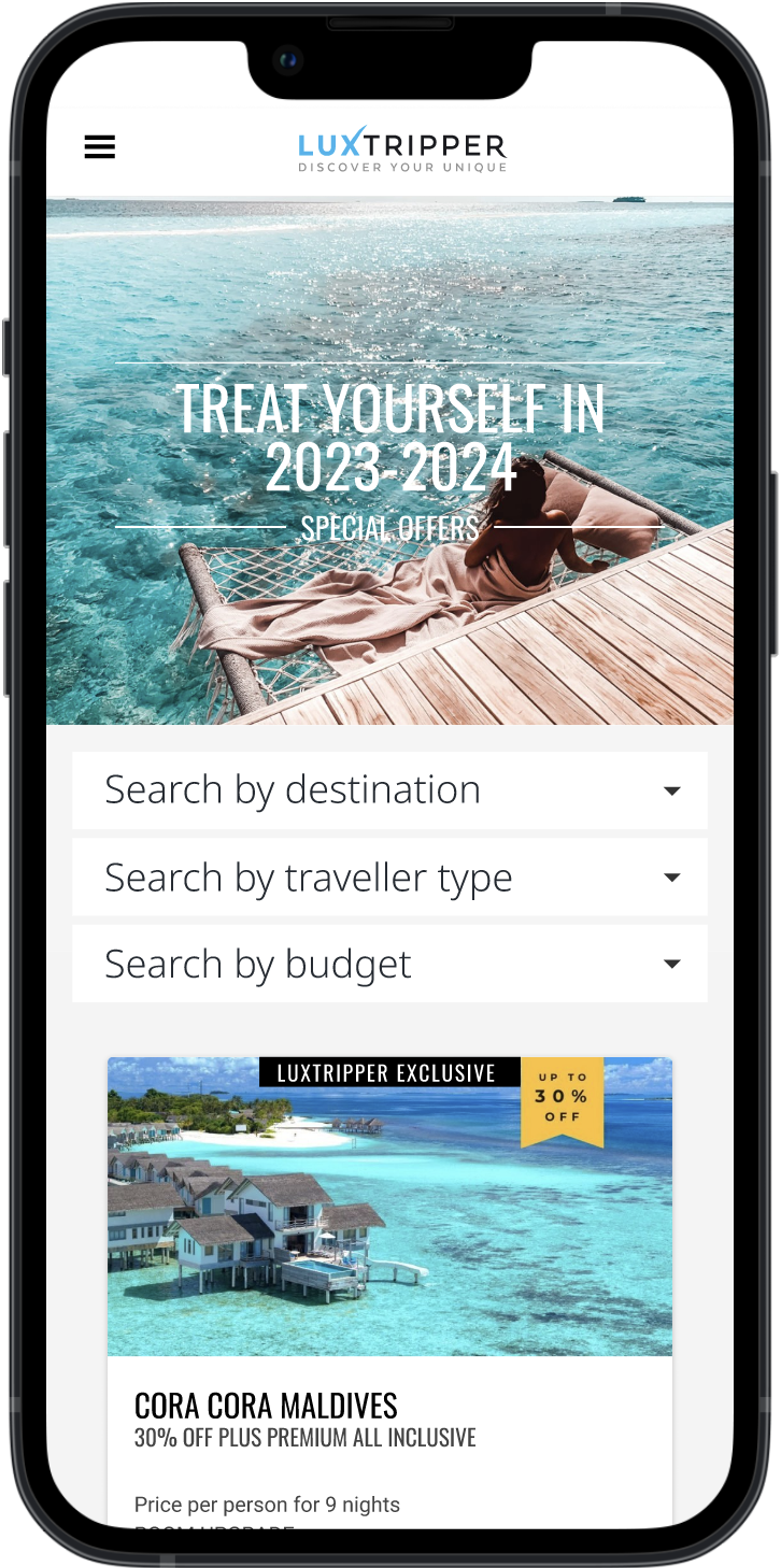
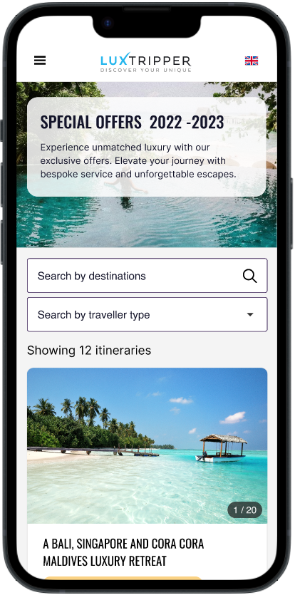
We ran an A/B test across all devices with a 50% traffic slipt between the orinigal and the variant.
Results
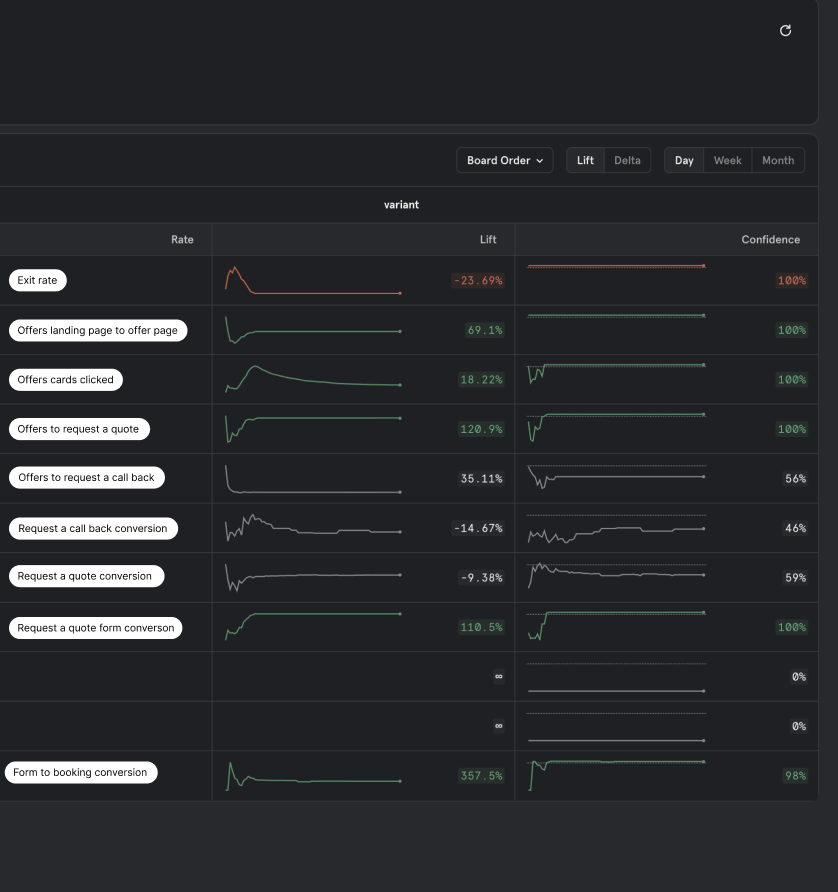
There was a remarkable 120% rise in the number of users requesting quotes, reflecting heightened interest in the presented offers. The redesigned offer cards, now effectively highlighting the value of the offers, had a cascading effect on conversion metrics. Conversions surged, with a striking 110% increase in overall form submissions. The impact on the booking conversion rate was extraordinary, skyrocketing by an impressive 357%.
Following the redesign of the special offer cards, the impact was profound. The exit rate, which had previously posed a challenge, decreased by a substantial 23%, indicating a more engaging and appealing user experience. Notably, the number of offers explored by users increased significantly, aligning with our goal of enhancing user interaction with the available offerings.
This comprehensive improvement across various conversion metrics demonstrated the significant success of the redesign in driving user engagement, interest, and, ultimately, conversions.