
Cast Study
Boosting Quote Submissions: Modernising the User Journey
Discover how we identified user hurdles and transformed the quote engine platform to streamline the experience.
Business context
Capitalising on Growing Demand for Pet Insurance
Amid a surge in pet ownership and increasing pet healthcare costs, the pet insurance market presents a significant growth opportunity. With 25% year-on-year industry growth driven by a growing awareness of pet insurance benefits, there is a clear strategic imperative to capitalise on this trend. However, intense competition from both traditional insurers and new entrants poses challenges in differentiating offerings and capturing market share. As the Head of Digital Product Design, aligning digital capabilities with evolving customer expectations was critical to unlocking this market potential and establishing a competitive edge.
My Role
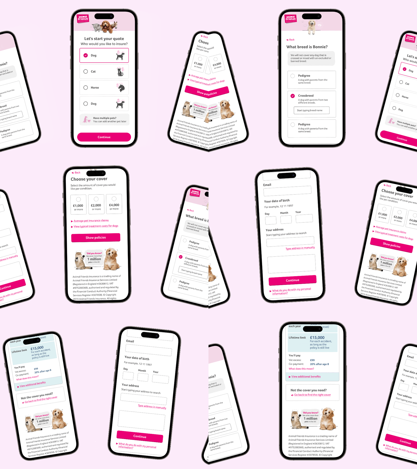
As the Head of Digital Design, my responsibility was to lead the redesign of Animal Friends’ legacy quote engine (QE), overseeing a cross-functional team responsible for user research, wireframing, and UI design. I guided the team in delivering a mobile-first, user-centric solution that addressed the needs of diverse user groups while aligning with business goals.
As the primary liaison between stakeholders and technical teams, I ensured design decisions balanced user needs, technical feasibility, and brand alignment. By driving strategy, refining deliverables, and fostering collaboration, my team transformed a legacy system into an intuitive modern platform that elevated the user experience.
Project outcome
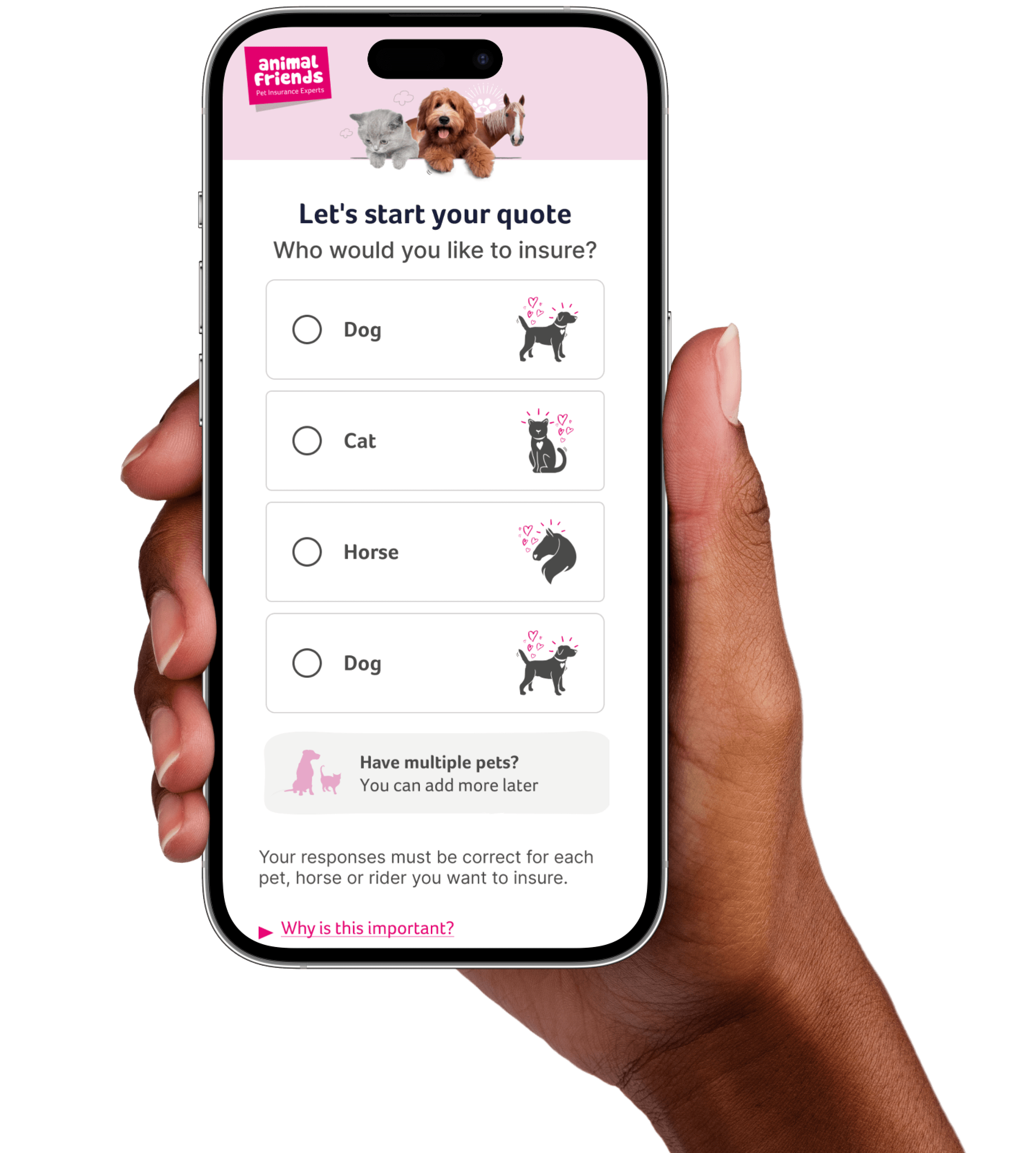
Our objective was to enhance the user experience by pioneering a mobile-first approach to our legacy quote engine, aligning with evolving consumer preferences.
Client
Animal Friends
Project Scope
Mobile-first redesign
Identifying user hurdles
Delivery for peak traffic
Tools
Figma, Adobe CC, Trello, Miro, Axure, Jira, Teams
Key Achievements
...
User research
Utilising a mixed-methods approach involving surveys, interviews, and usability tests, we engaged with pet owners, insurance agents, and customer service representatives to delve into their experiences.
Key discoveries revealed a strong desire for simplified claims processes, personalised coverage options, and transparent communication. Emerging patterns highlighted the importance of mobile accessibility and seamless digital interactions for users.
Empathise
In the first stage of the Design Thinking process, we focused on developing empathy for our users. This involved understanding their needs, behaviours, and pain points, particularly when navigating insurance options. Our goal was to understand how users interact with our products and the emotions they experience, enabling us to design a journey that genuinely supports them.

Aggregators
Many users arrive from aggregator sites, where they’ve already compared various providers. These users want to confirm our credentials and find the best offers without unnecessary barriers.

Direct
Direct users tend to need more guidance in understanding the nuances of our policies. They seek clarity on coverage and ease in finding the right options without feeling overwhelmed.

Multi pet
Many users inquired about multi-pet policies and had difficulty understanding if we offered them and how to add them. This issue affected both direct and aggregator traffic.
Overwhelmed
Many users find insurance choices complex and time-consuming, often feeling paralysed by the amount of information available. Our focus was to simplify their journey and provide clarity at each step.
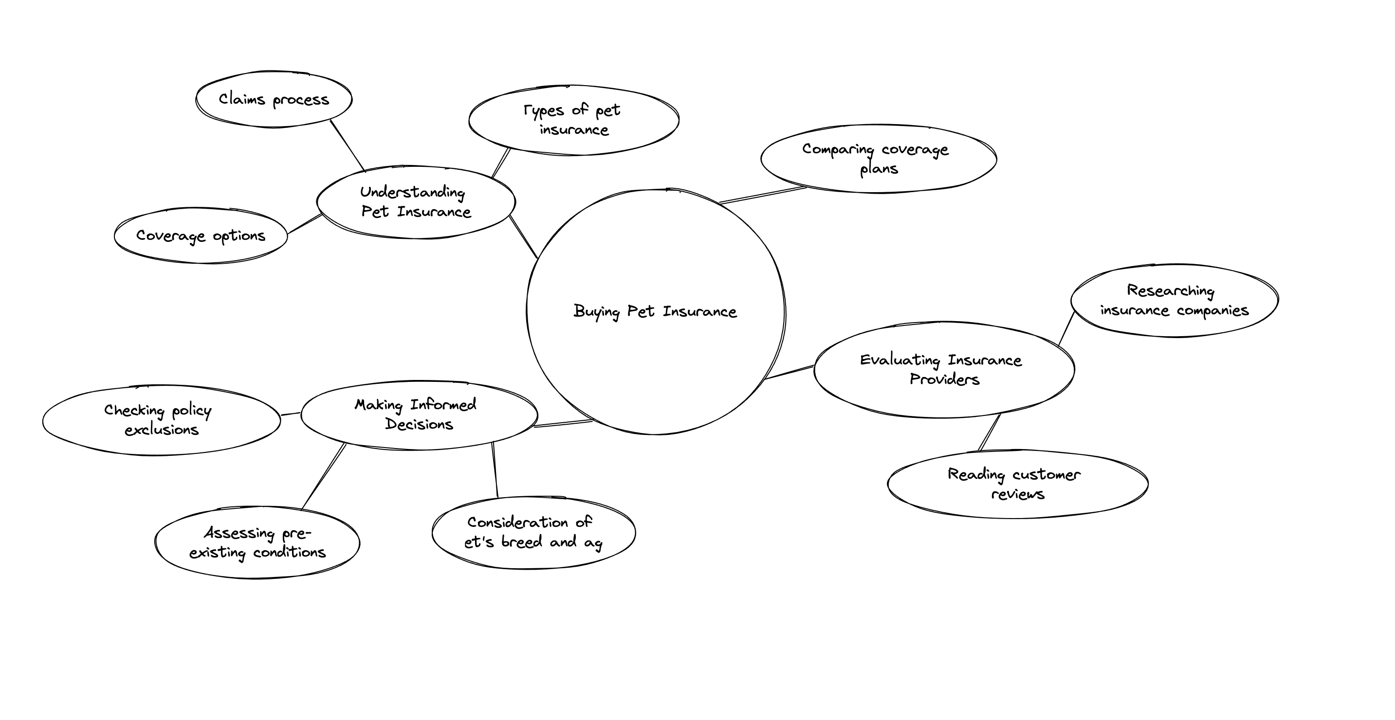
User research
We framed problem statements for user cohorts and their journeys by aligning project objectives with organisational goals and regulatory requirements through stakeholder consultations. Multiple rounds of usability testing helped identify current challenges user were facing.
Finding opportunity
"Deciding on the most suitable policy can be paralysing". Moving into our first cross-functional workshop, we refined high-level goals into specific user jobs. This helped us align with the engineering team and identify any potential technical constraints.
We synthesised key pain points highlighted in our research phase and clarified our focus on delivering an MVP (minimum viable product) that addressed users’ needs while remaining feasible within our resource constraints.
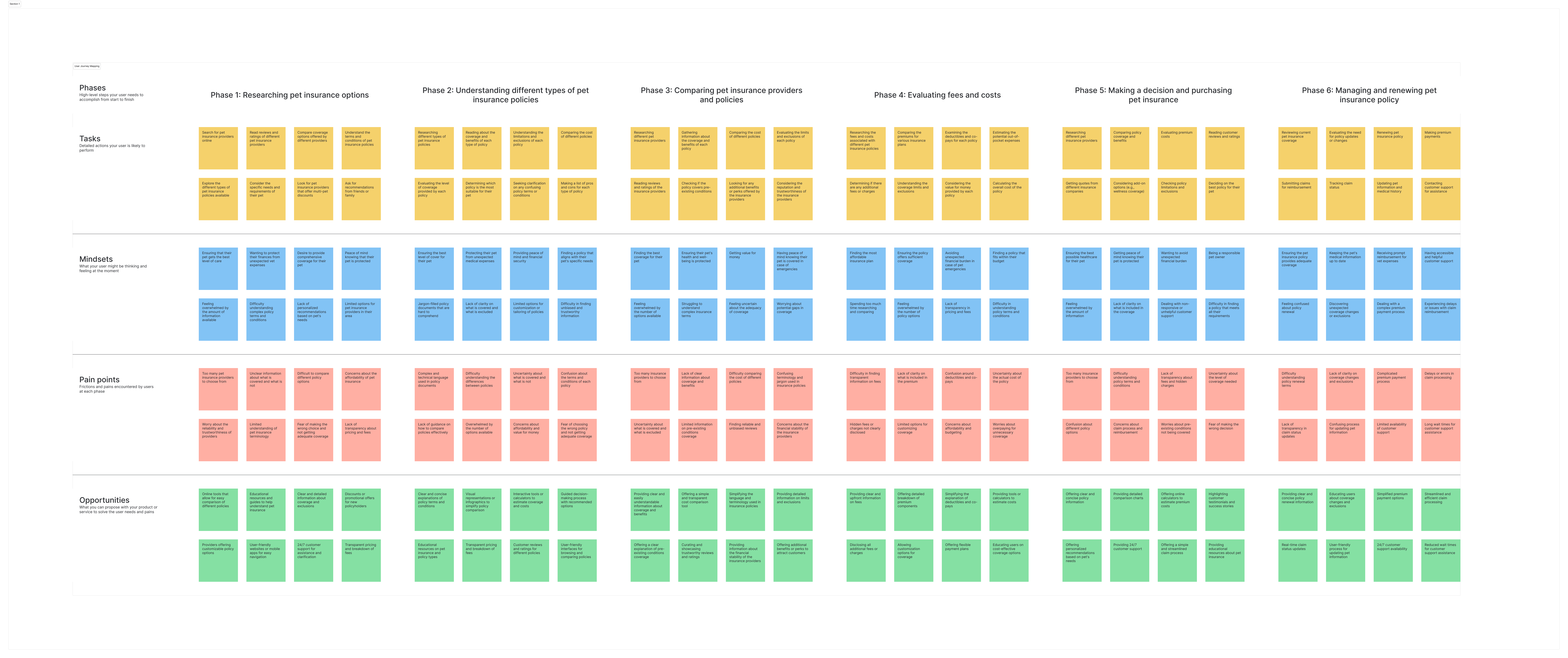
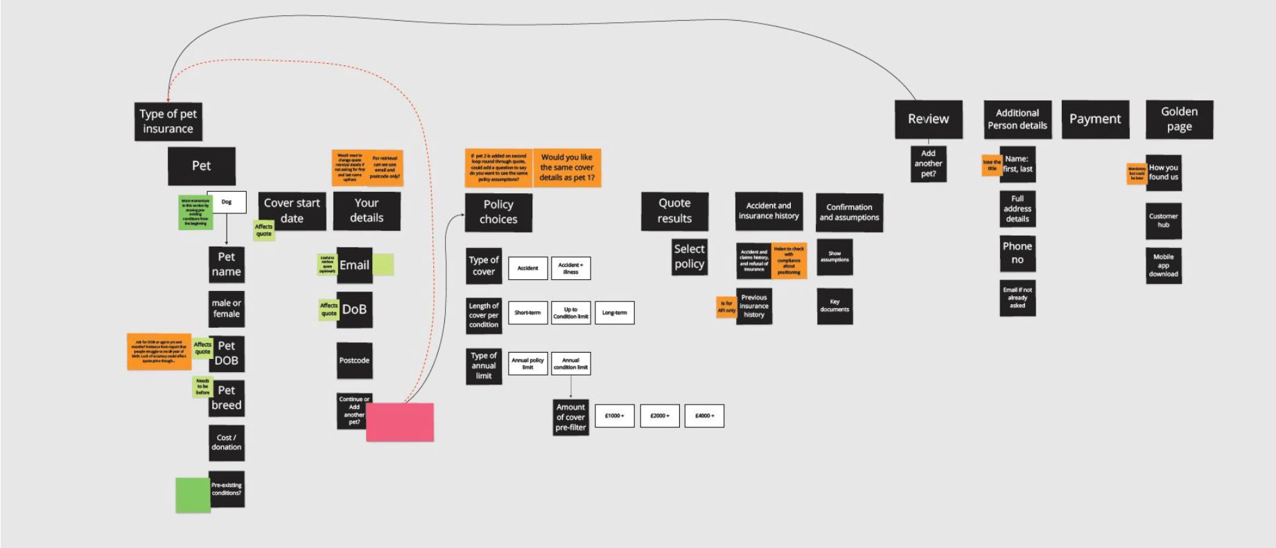
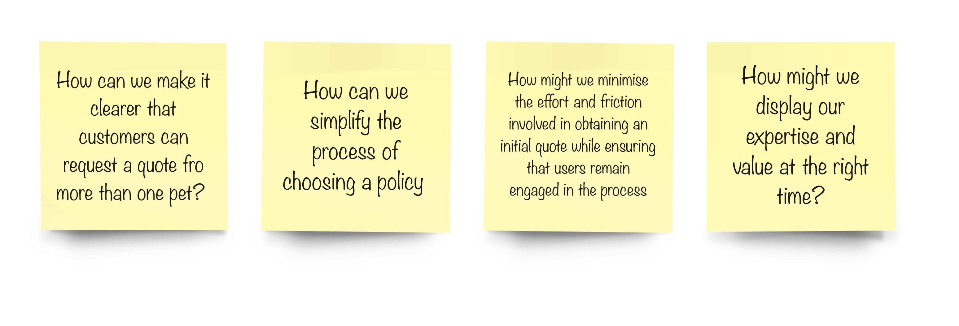
In the exploring phase, we mapped the existing user journey and conducted desk research to understand the current landscape and competitors. During the conception phase, we explored various possibilities through “How Might We” (HMW) questions.
Legacy design review
Using the insight we learned from our user research we began to review our current implementation and created tasks based on the needs of those personas.
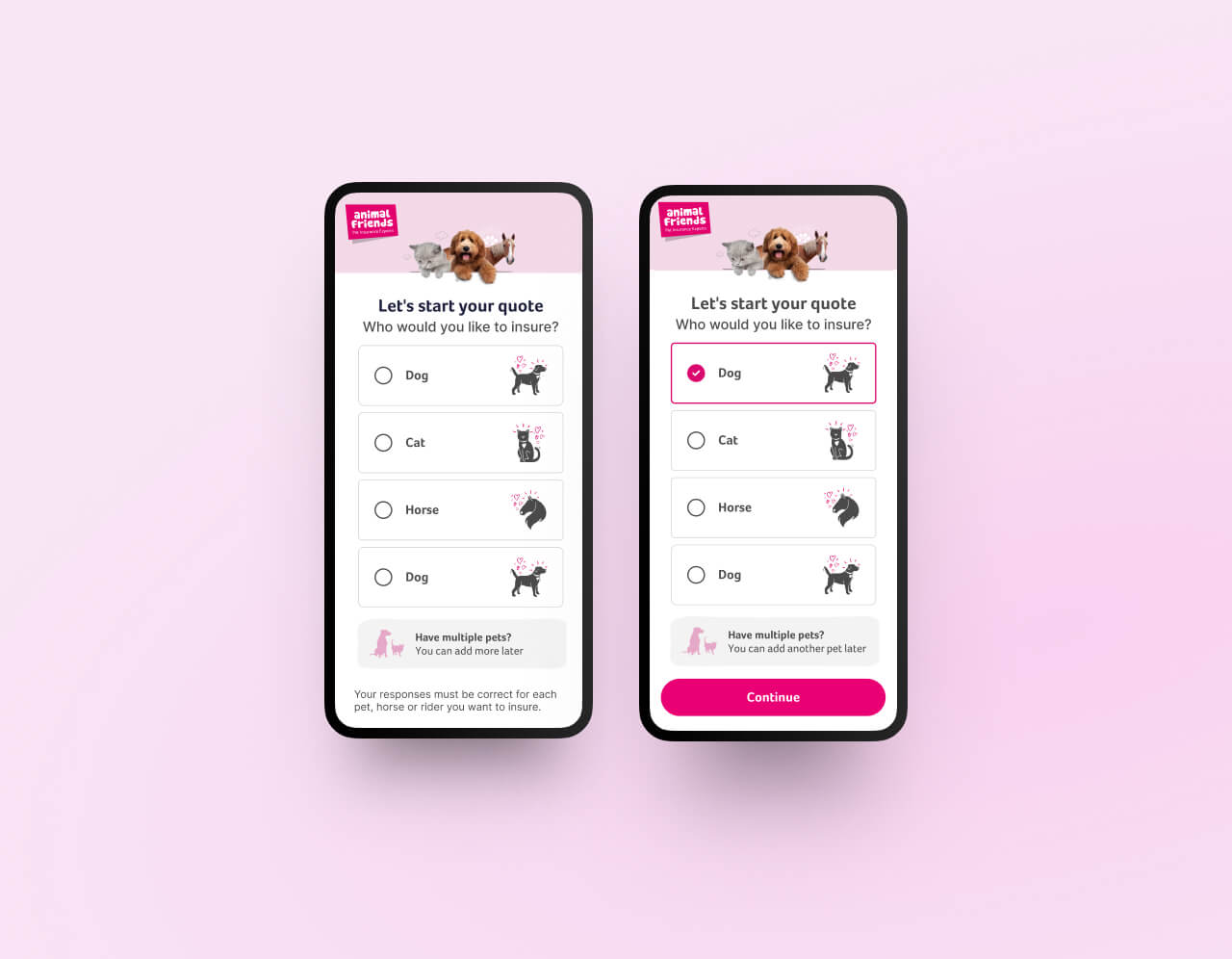
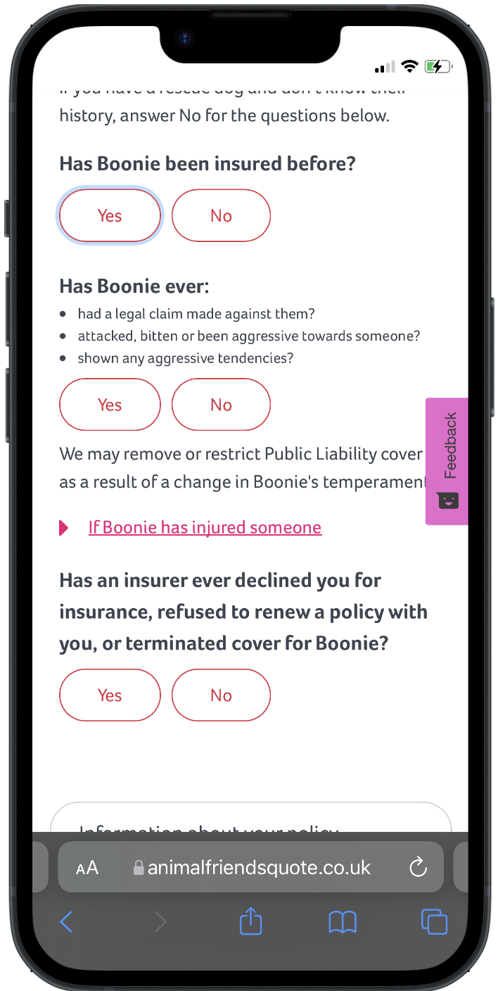
- Users struggled to understand which options were selected due to poor visual indicators.
- Users were unable to determine if we offered multi-pet policies
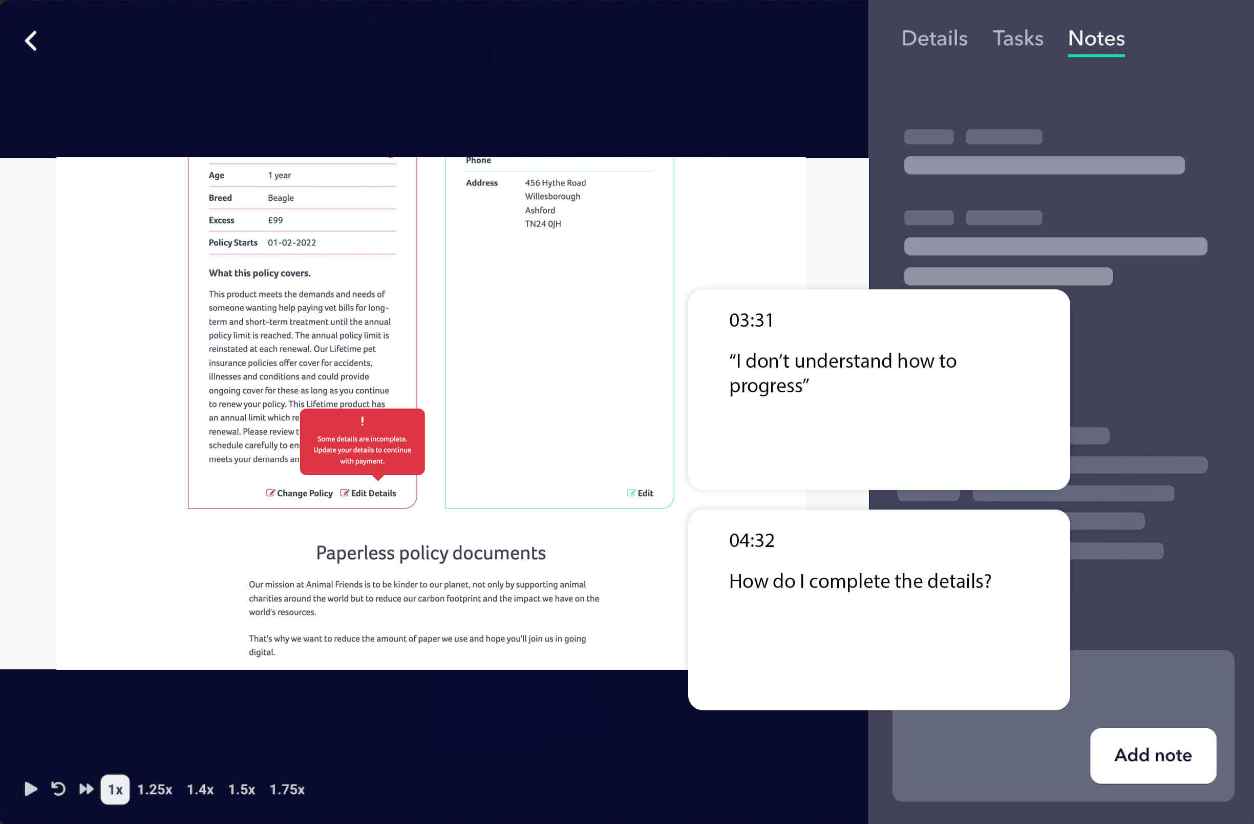
- The way to progress wasn’t always obvious.
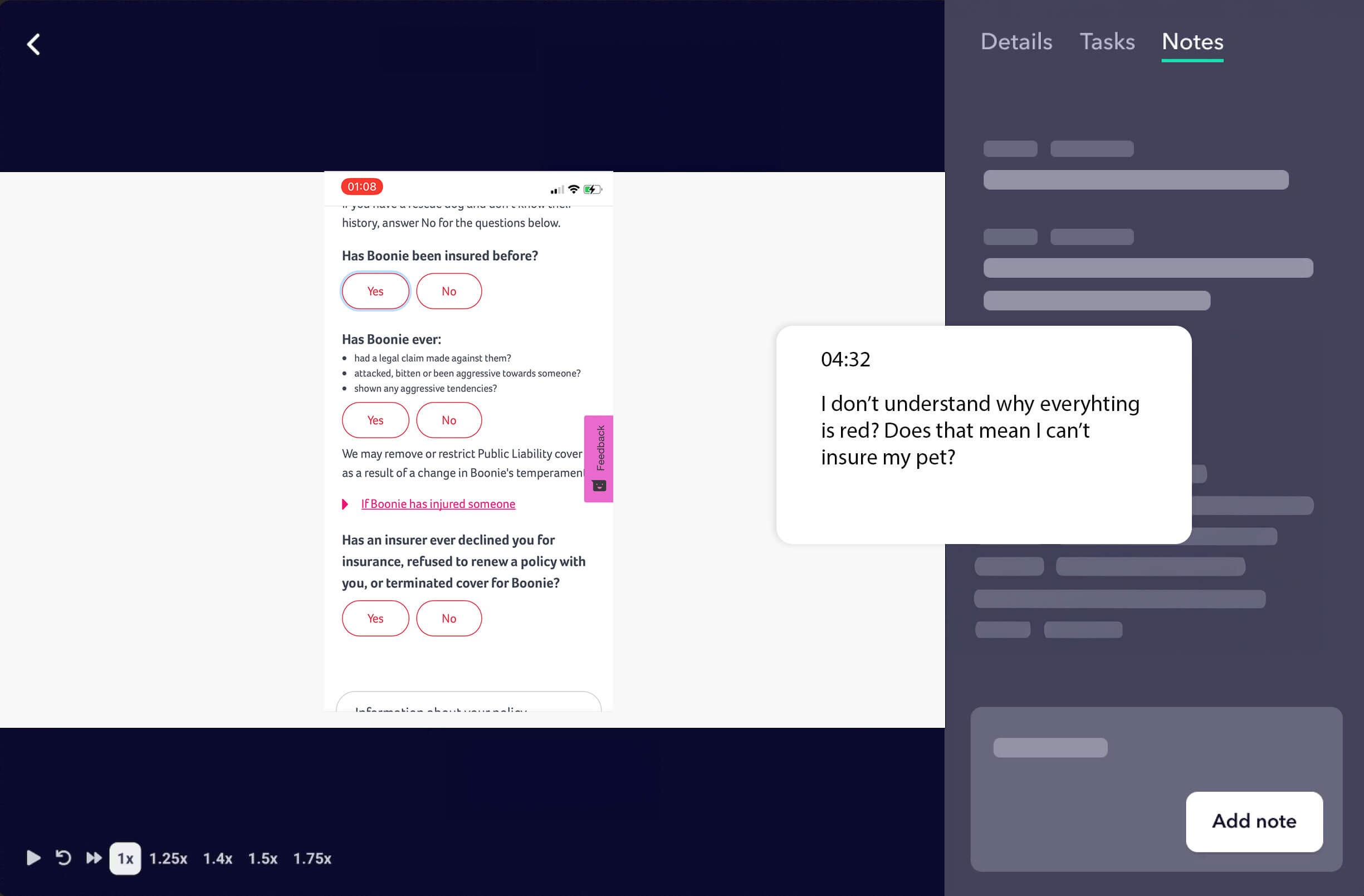
- The number and clarity of questions left users feeling overwhelmed and uncertain about what was being asked and how to respond appropriately.
- Unclear UI Feedback Driving Calls
- Grammar issues, including inconsistent use of capitalisation, appeared unprofessional to users.
- On mobile, small and poorly placed touch areas made interacting with the page frustrating and difficult to use.
Legacy design review
Pinpointing Barriers to Conversion
- Aggregator Users: Repeated information entry caused frustration.
Multi-Pet Policies: Lack of clarity on multi-pet options led to drop-offs. - Overwhelming Forms: Poor visual indicators and excessive questions left users uncertain.
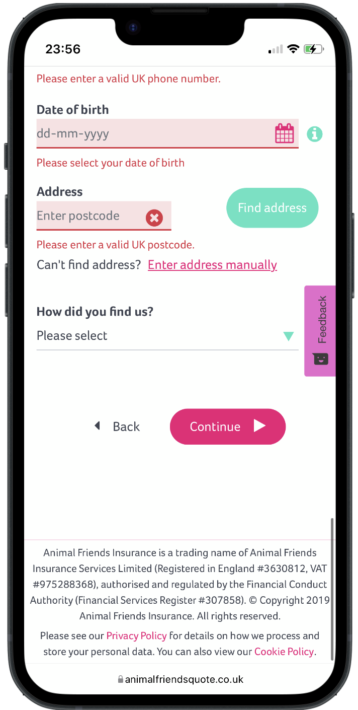
- Validation Errors: Insufficient feedback caused users to abandon the process.
- Payment Messaging: Unclear instructions on pending payments increased support calls.
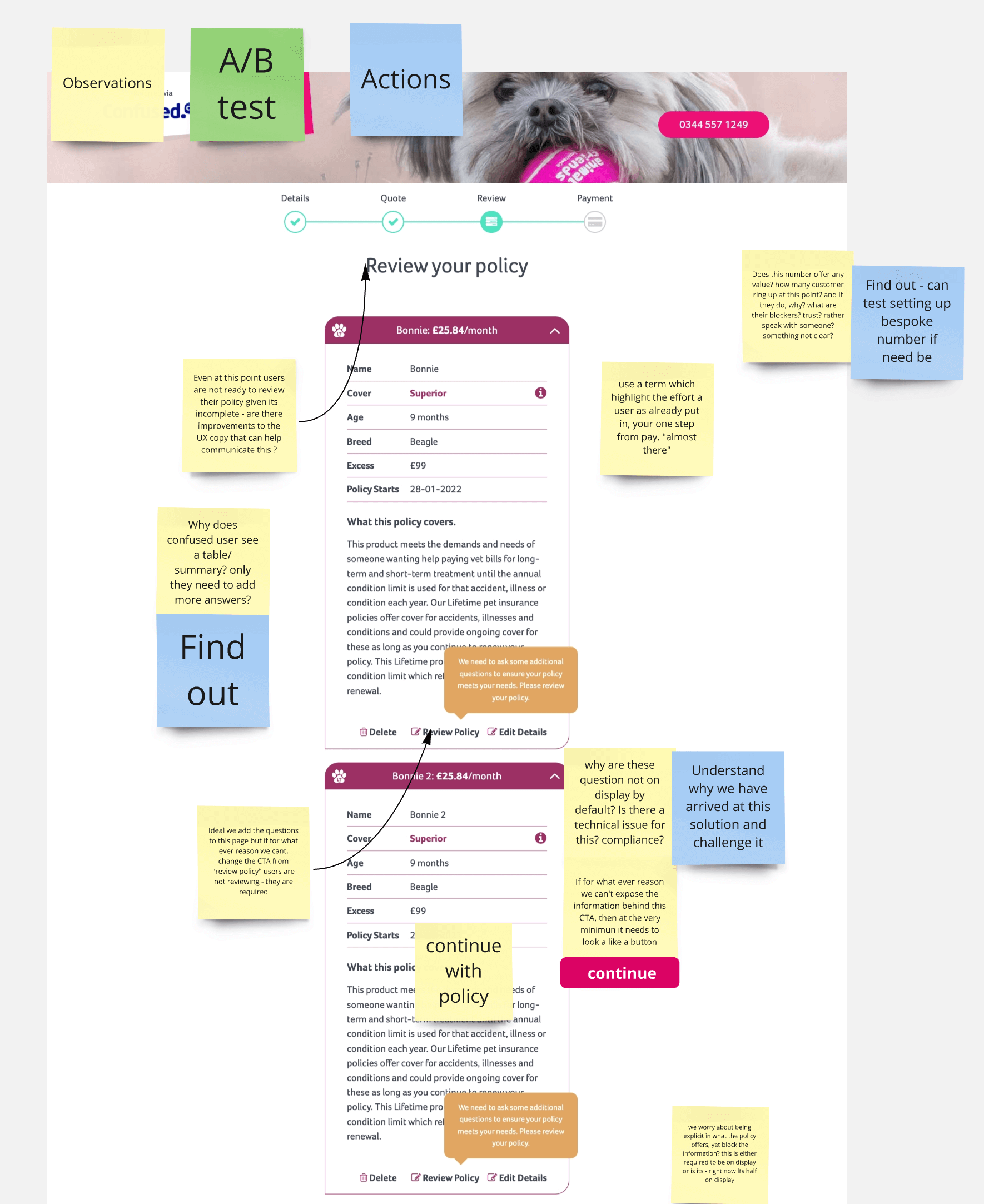
Users struggled to understand which options were selected due to poor visual indicators.
Feedback revealed that the number and clarity of questions left users feeling overwhelmed and uncertain about what was being asked and how to respond appropriately.
Grammar issues, including inconsistent use of capitalisation, appeared unprofessional to users.
On mobile, small and poorly placed touch areas made interacting with the page frustrating and difficult to use.
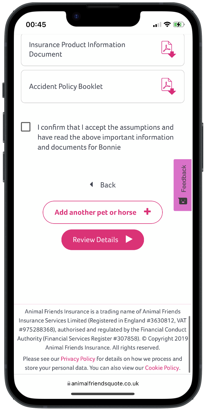
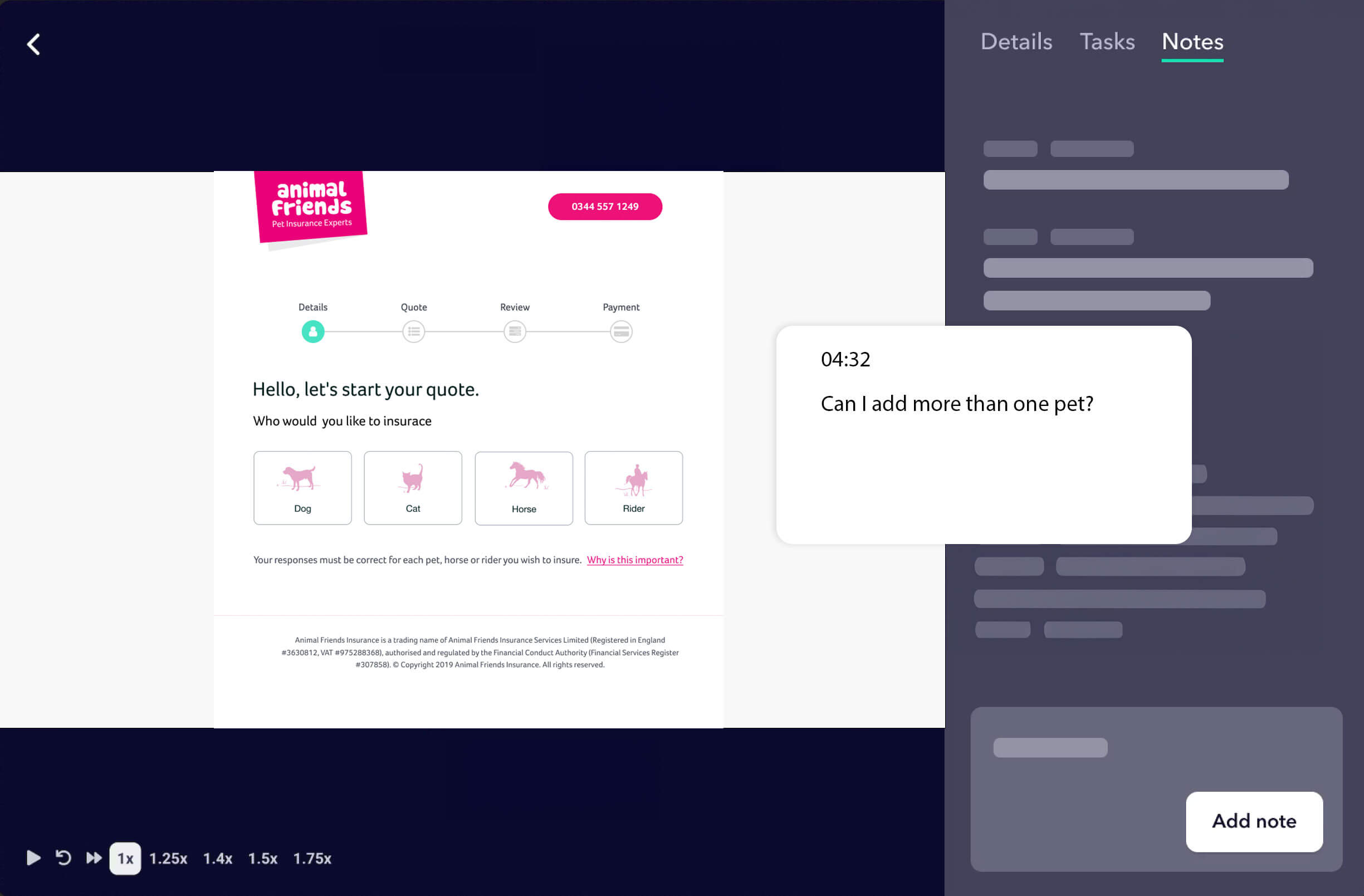
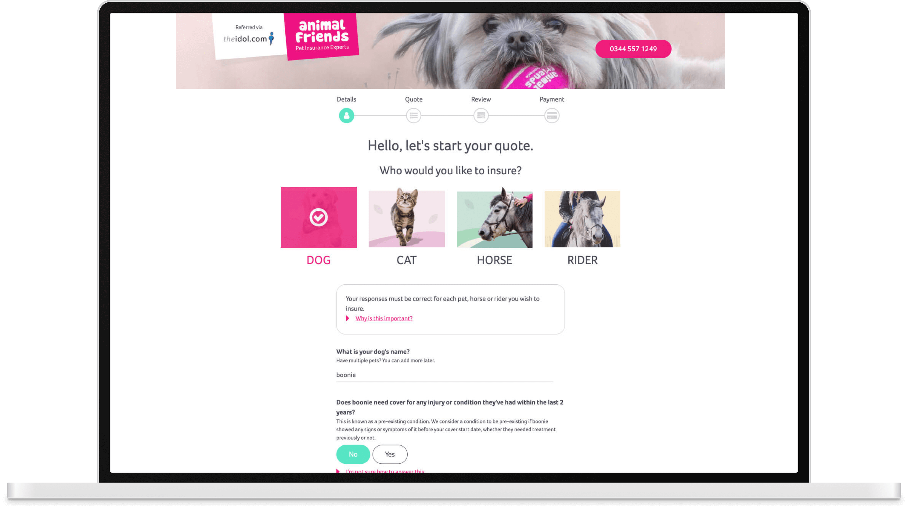
Users were unable to determine if we offered multi-pet policies
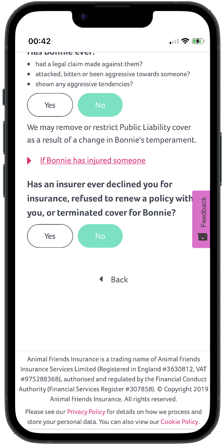
Due to the app’s design, users were only informed that they could add more than one pet at the final stage, just before purchasing a policy. This approach was ineffective, as users with multiple pets were unlikely to complete a quote for just one pet unless they intended to purchase separate policies.
This design also impacted conversion rates, as some users tried to explore this feature and, in doing so, lost all their previously entered data. This created a barrier to conversion and highlighted a potential A/B testing opportunity to delay this feature until after booking. We also requested user feedback at this stage, which acted as another barrier to conversion due to the distracting nature of capturing feedback mid-process.
One constraint we faced was a legacy backend system, we couldn’t ask users upfront how many pet policies they wanted. Addressing this would require a full backend rebuild, which was outside the current project scope but could be revisited later.
The way to progress wasn’t always obvious.
Users encountered what felt like dead ends. If a user failed to validate a question earlier on the page, there was no feedback to explain why they couldn’t continue.
As a result, some users assumed their pets were ineligible for a policy. These users needed to validate a question higher up the page but had no visual queue to do so.
Unclear Feedback Driving Calls
Some of our messaging left users uncertain about whether their policy had been processed, which drove up support calls. As customers sought insurance for security and peace of mind, our payment messaging created more confusion than reassurance.
Additionally, we displayed pending payments without clear instructions. Users were left unsure whether to wait for the payment to process or contact us for confirmation. The were numerous reasons for payments failing but we seem to have defaulted to the Transaction being cancelled by the customers.
Improving Validation
Finding the most suitable policy relies heavily on users’ ability to complete a series of forms, which proved challenging during our user testing sessions due to the nature of UI design.
To support users, we should reassess our current validation approach, ensuring both the UX writing and UI design adhere to standard accessibility conventions. Users often felt overwhelmed with the amount of errors, page orientation, and how the resolve the issues.
Wireframing
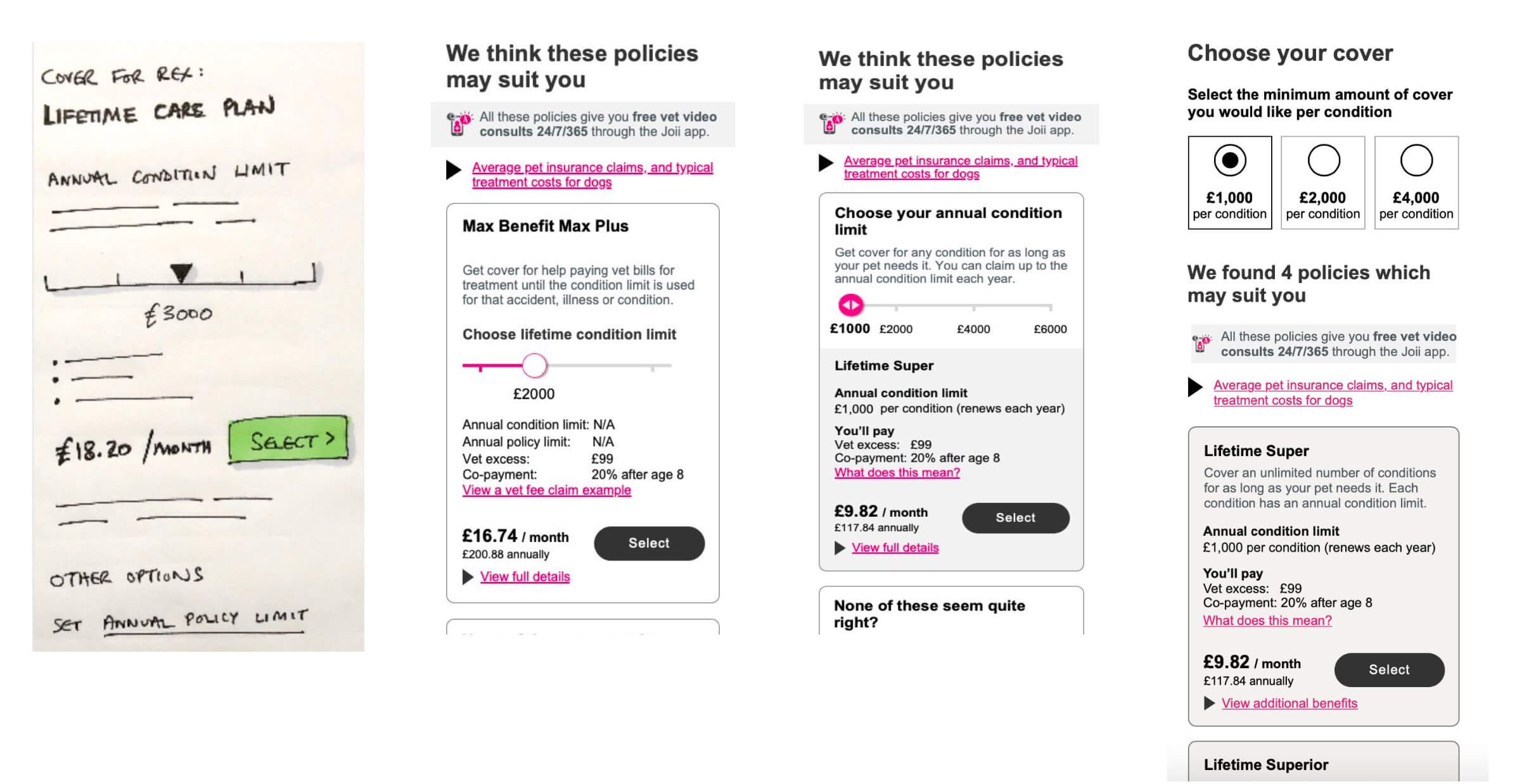
To quickly evaluate solutions to user pain points, we employed a rapid prototyping process, creating low-fidelity wireframes to test key hypotheses.
Simplifying navigation for aggregator users: We tested designs that eliminated redundant steps for users redirected from third-party comparison sites, ensuring a seamless transition and reducing drop-offs.
Improving task visibility: Prototypes incorporated clear progress indicators and validation feedback to reduce user confusion when completing forms.
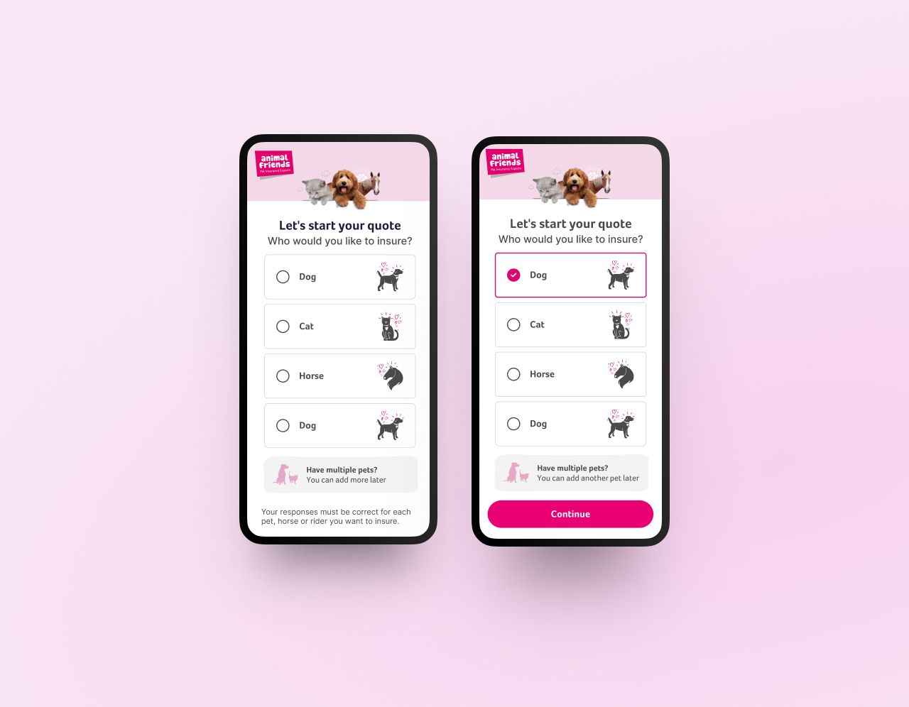
Streamlining the multi-pet quote process: We explored multiple layout options to make it intuitive for users to add additional pets early in the flow without disrupting the overall journey.
Analysis
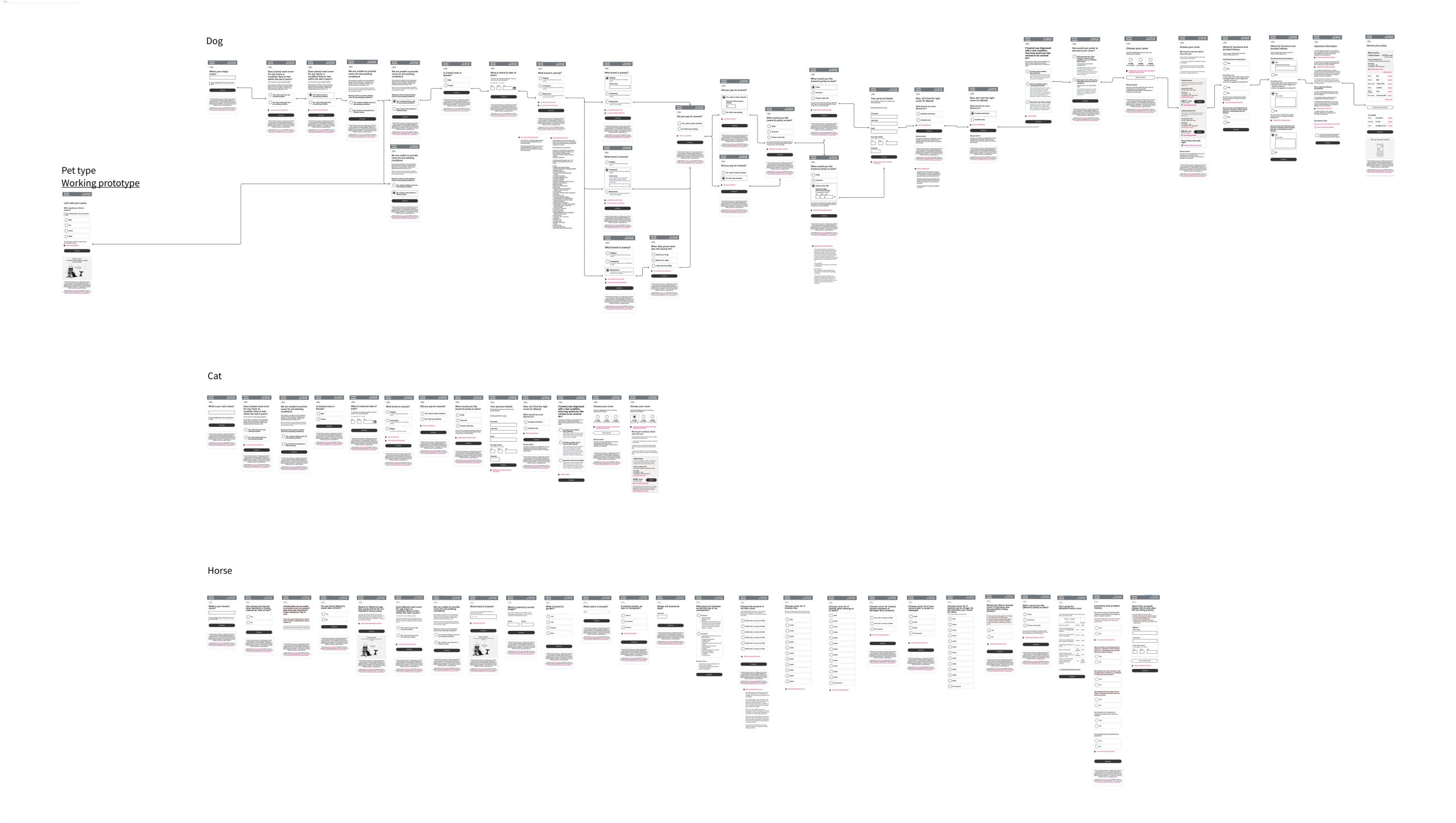
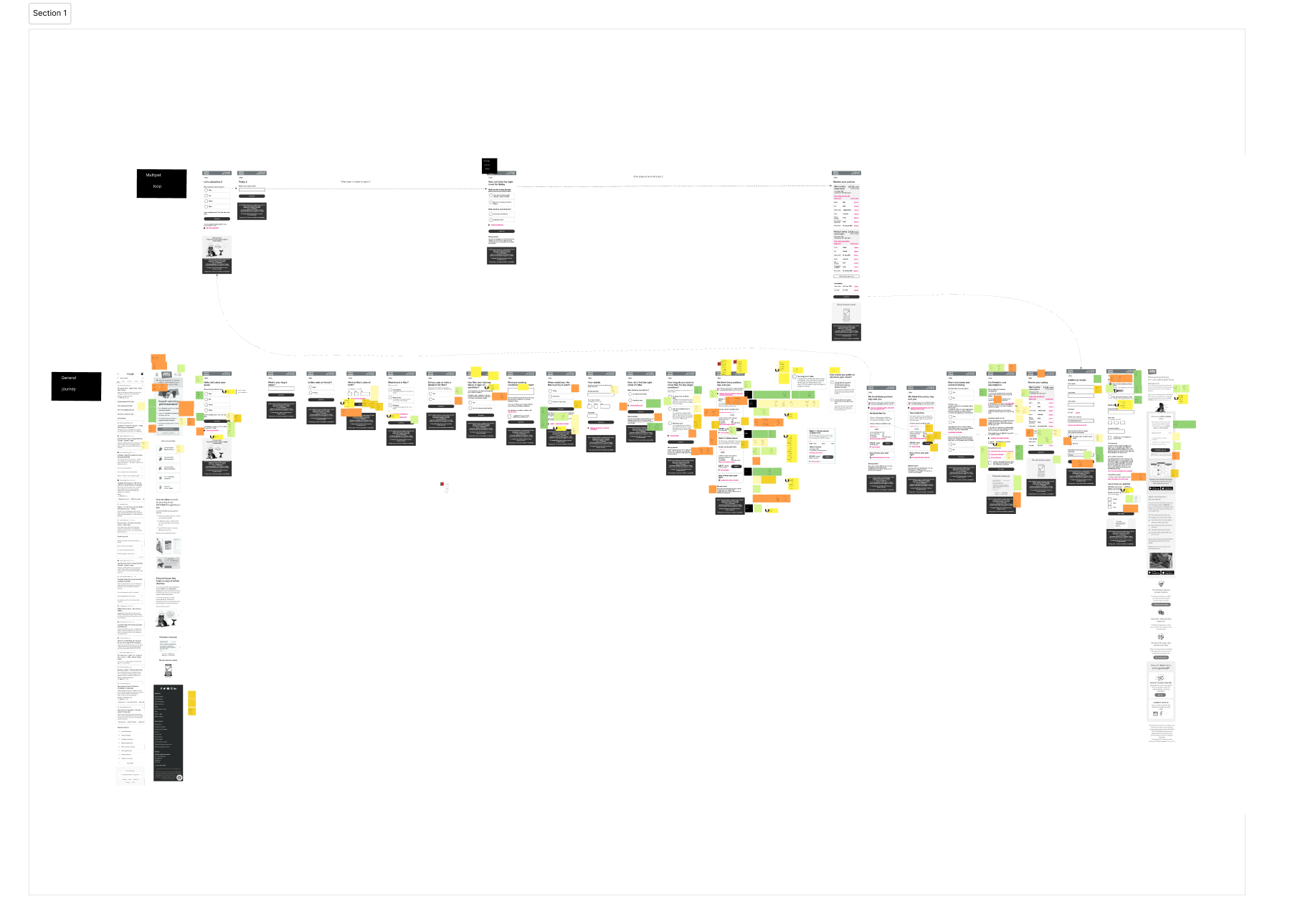
To ensure our redesign addressed user frustrations, we mapped the end-to-end journey for each user cohort.
Aggregator Users: Their journey often began with detailed input on a comparison site, requiring us to create a seamless handoff to our platform while avoiding redundancy.
Multi-Pet Users: A detailed mapping of their steps revealed confusion at the policy selection stage, which we addressed by introducing a clear multi-pet option upfront.
Overwhelmed Users: These users often abandon their journey due to cognitive overload. The map helped identify points where simplified, contextual assistance could make the experience more manageable.
Direct Users: abandon This group benefited from clearer pathways to discover policy benefits and explore options without feeling lost or overwhelmed.
Through mapping, we pinpointed opportunities to improve the flow at critical touchpoints, ensuring a smoother, more intuitive experience across devices and user types.
Ideation
In the prototype, test, and iterate phase, we developed clickable prototypes and conducted two rounds of usability testing, followed by design iterations and amendments based on the research findings.
This process also facilitated the product team’s brainstorming, making it easier to develop concrete design ideas as we transitioned into the ideation stage.
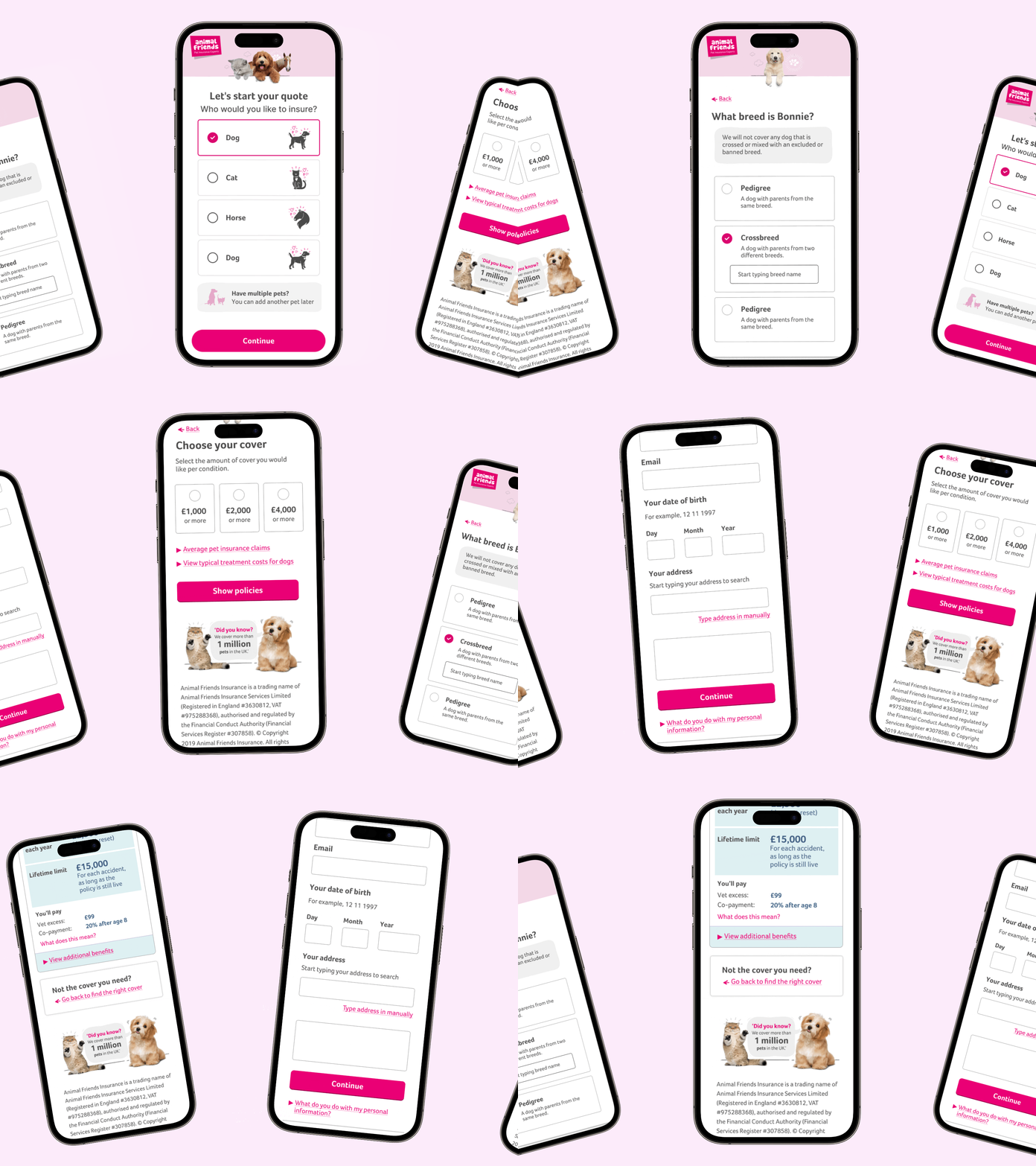
One task per page
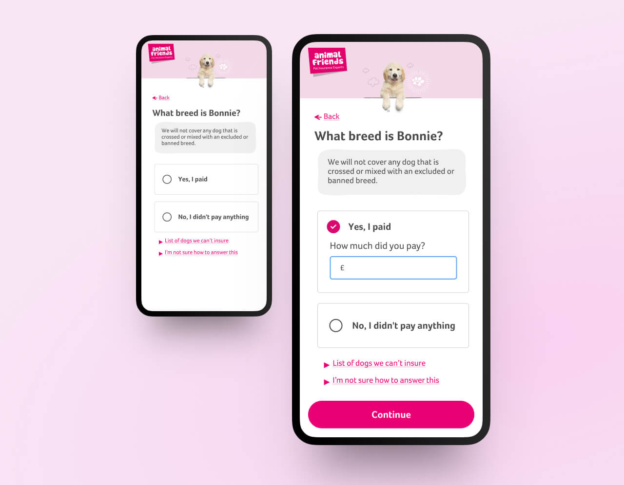
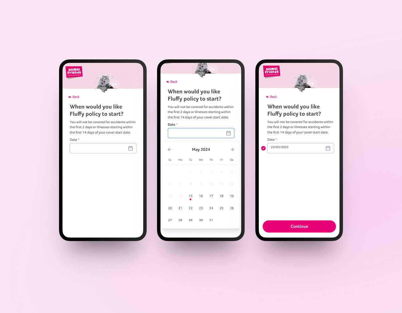
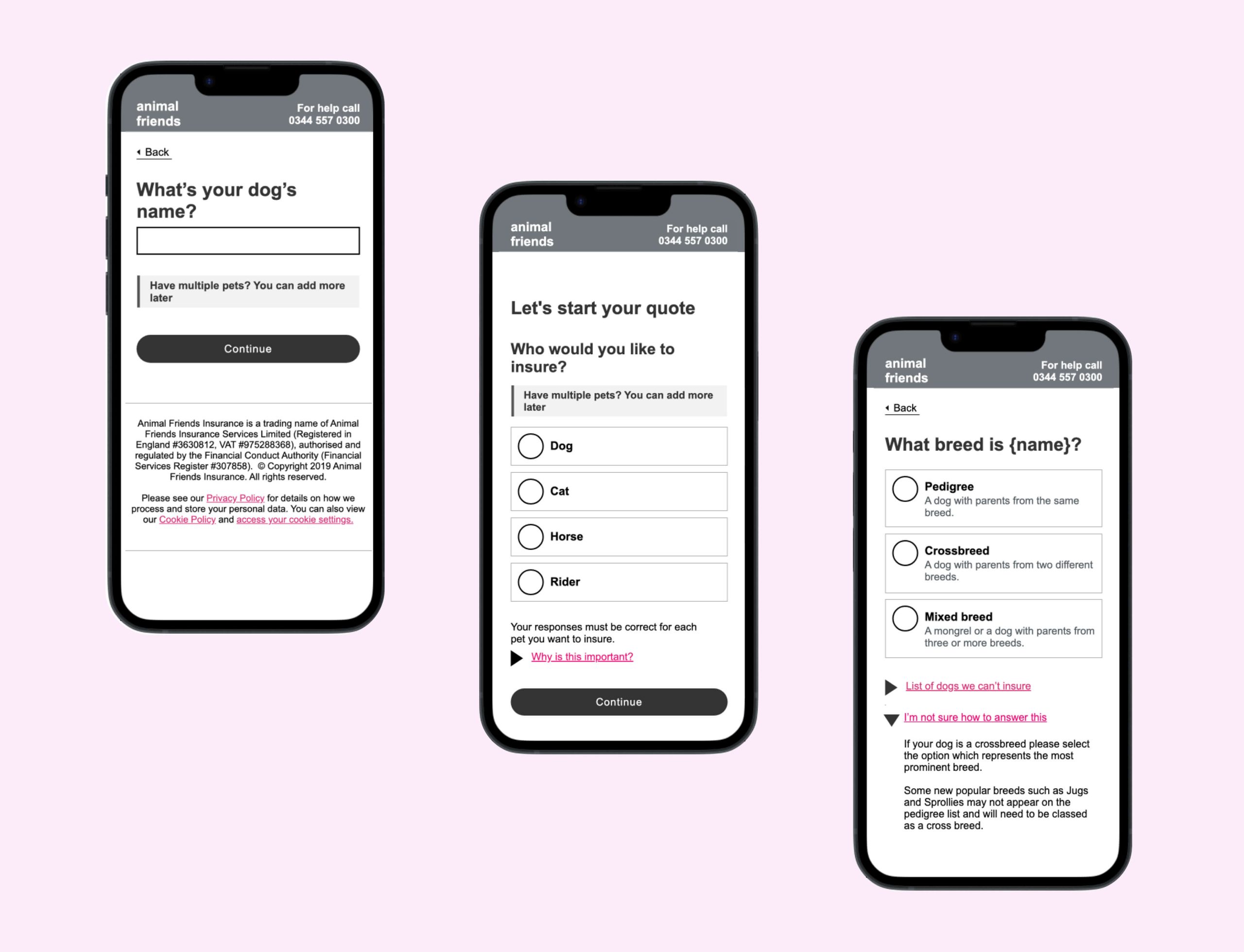
A one-thing-per-page approach helps focus the user on one specific task. The benefits, it reduces cognitive load dealing with a single task at a time, allows help information to be shown only when needed and gives a feeling of momentum and reduces scrolling Handles branching and errors well helping to address some of the concerns raised by our overwhelmed users.
Grammar issues, including inconsistent use of capitalisation, appeared unprofessional to users.
On mobile, small and poorly placed touch areas made interacting with the page frustrating and difficult to use.
Reduce questions before the quote to a minimum
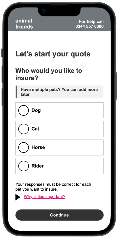
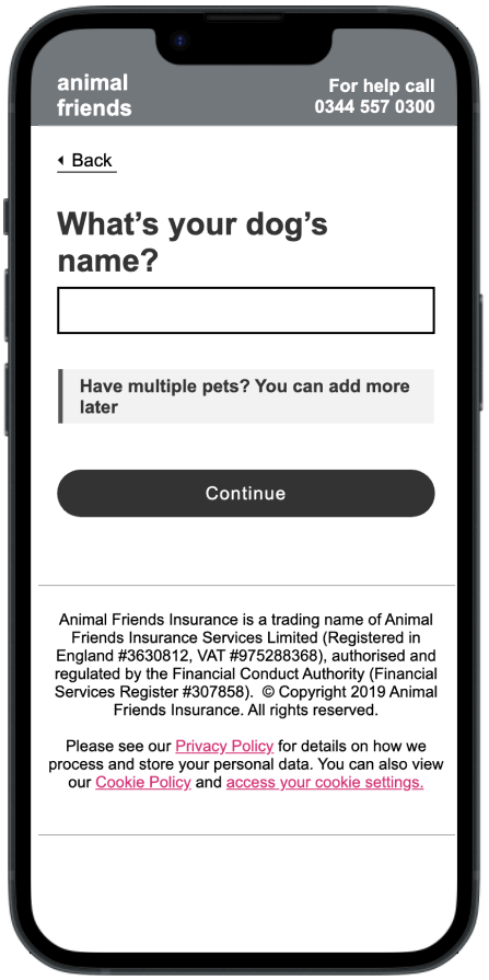
Users coming directly to our site are often hesitant to submit personal information, as they are primarily in the “window shopping” phase and fear that their details may lead to unwanted contact.
To address this, we aim to reduce friction by only asking for pet information needed to provide a quote, which users seemed less reluctant to give up in order to display policy options.
This approach helps users access the information they want more quickly and minimises their reluctance to proceed due to concerns about providing detailed personal information.
Contextual help and timely information
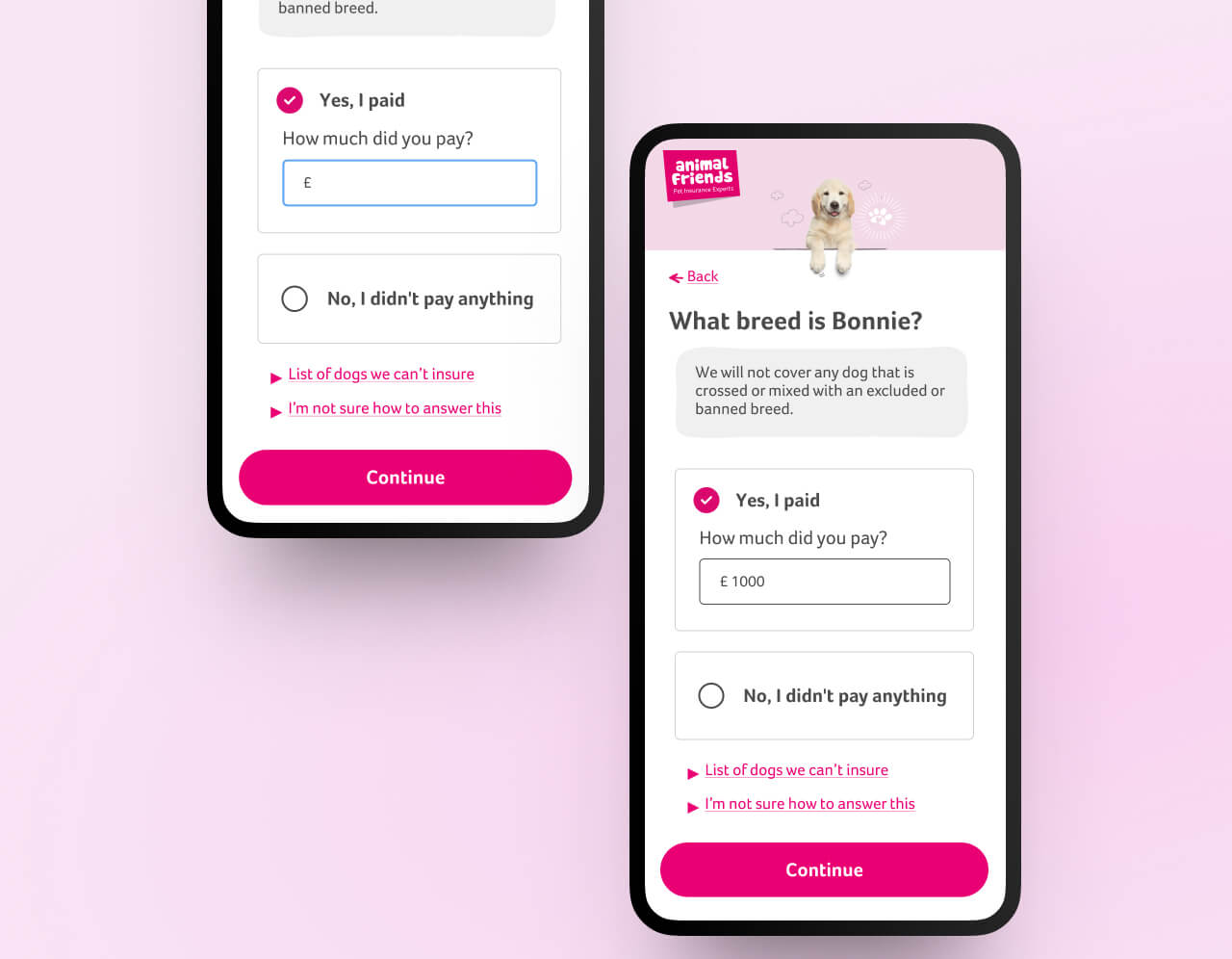
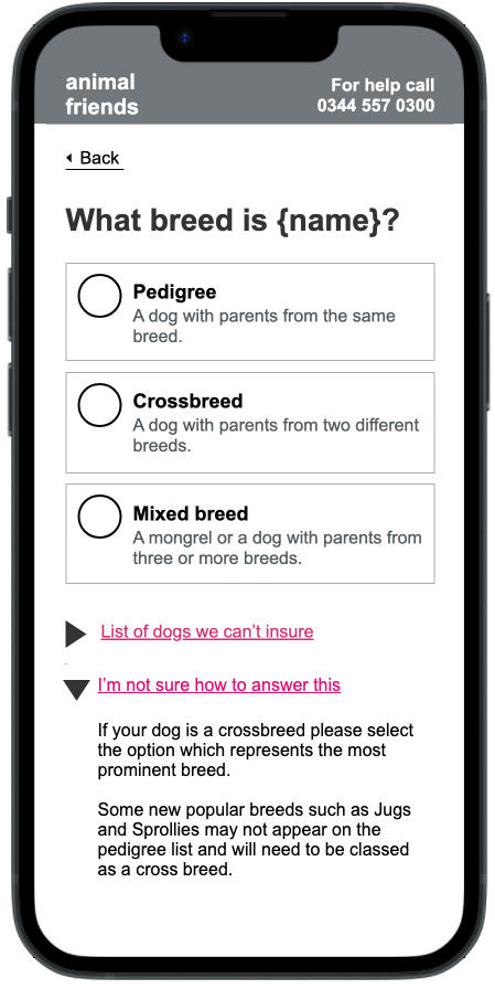
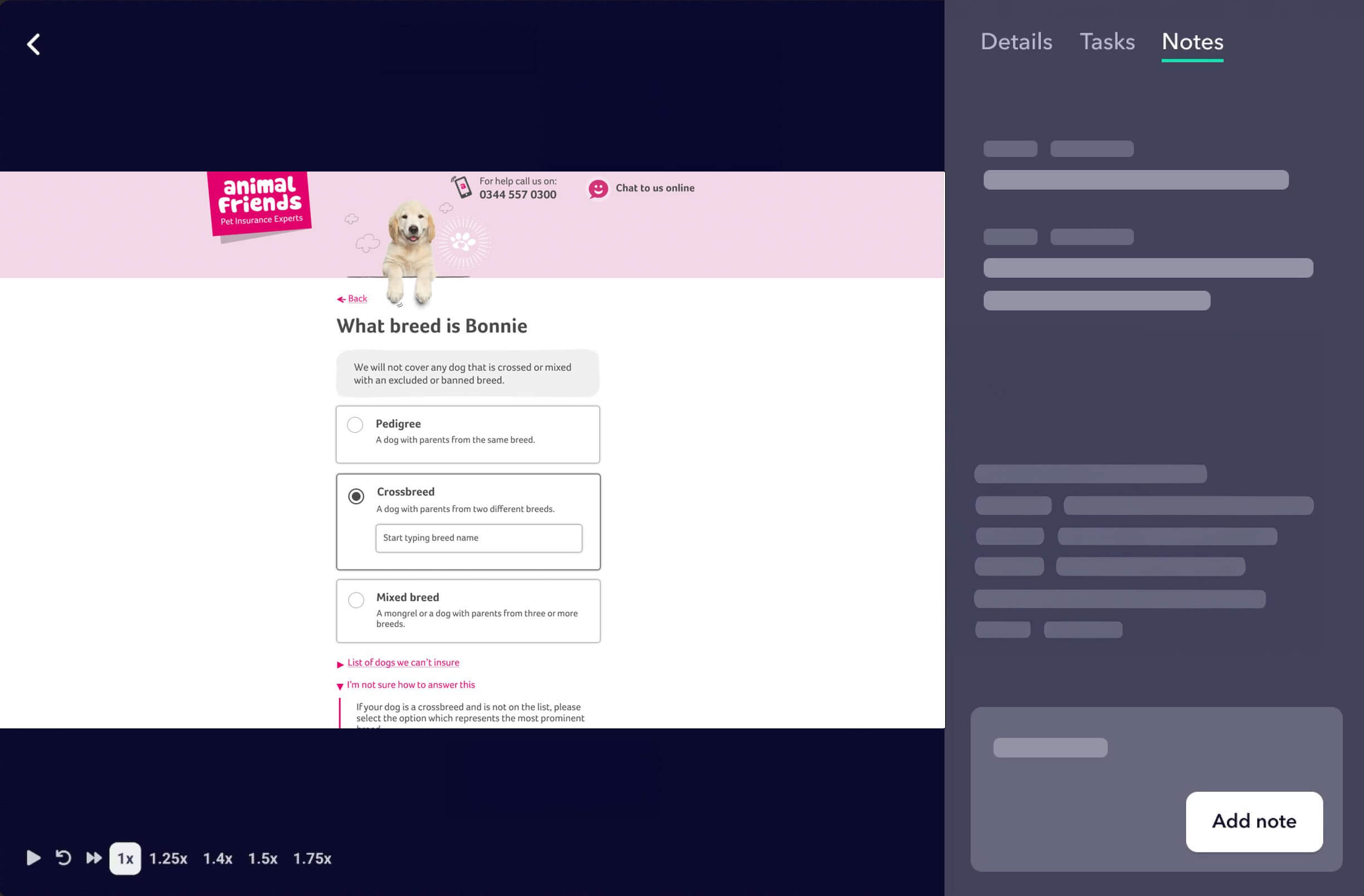
Utilising radio buttons positions, explanatory text directly alongside the choices, eliminates the need for users to cross-reference information from other parts of the page.
Using details components (rather than modals) helps to expose additional help text alongside the question the users need help with.
Bringing important information to the forefront at the right time allows users to act on it immediately, reducing surprises and enhancing their overall experience.
Self-promotion and reassurance
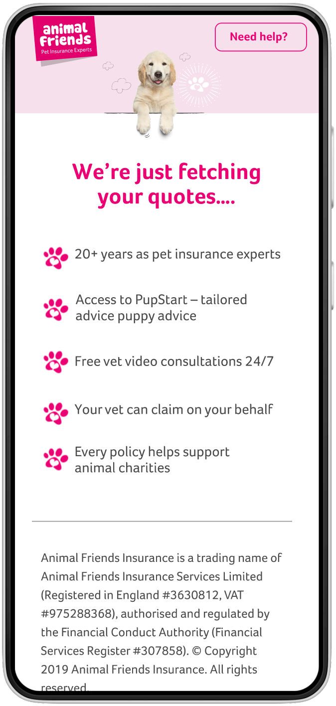
We engage in significant charity work that wasn't currently visible during the user journey. Users care about the organisation behind their policy and seek reassurance about its credibility.
Highlighting our charitable contributions can enhance trust, as users want to know that the company they are entrusting to protect their family members genuinely cares about animal welfare and well-being.
Design
In the prototype, test, and iterate phase, we developed clickable prototypes and conducted two rounds of usability testing, followed by design iterations and amendments based on the research findings. During our user testing, participants interacted with the updated version of our website, and their feedback highlighted several key strengths.
This process also facilitated the product team’s brainstorming, making it easier to develop concrete design ideas as we transitioned into the ideation stage.
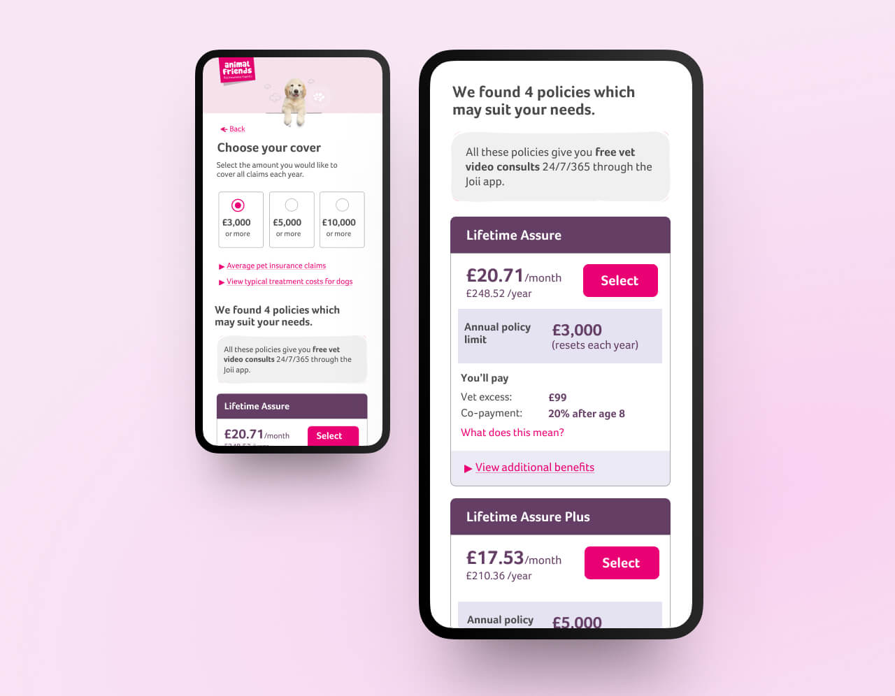
Simplified Policy and Coverage Selection
Users found the process of selecting policies and coverage options straightforward to navigate. The clear, step-by-step guidance was especially appreciated, helping users feel confident in their choices without feeling overwhelmed.
Expertise and Value Displayed at the Right Moments
Participants valued the well-timed presentation of information that showcased our expertise. They noted that the expert tips and advice were helpful and accessible, making them feel supported throughout the process.
Clear Multi-Pet Quote Requests
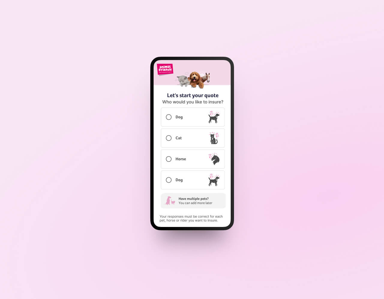
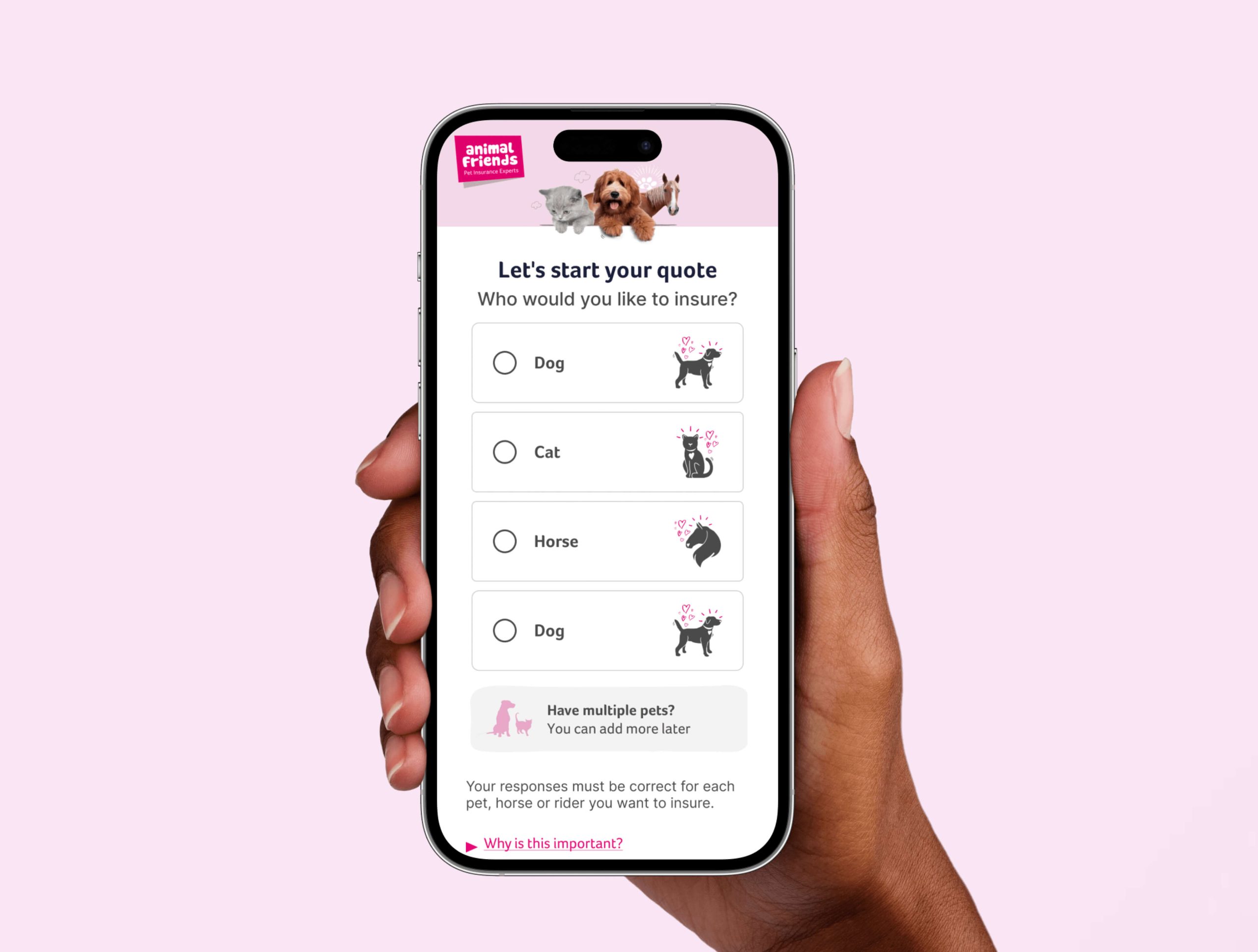
The ability to request quotes for multiple pets was communicated, and users recognized this as a valuable feature. Many testers mentioned that they were likely to use this option, thanks to its prominent and clear presentation.
Effortless Initial Quote Process
Users praised the ease of obtaining an initial quote, noting that the process was quick and required minimal effort. The smooth, engaging experience kept them interested and motivated to complete the steps, with many expressing satisfaction with how hassle-free it felt.
Overall, the feedback from users was highly positive, indicating that the updated design effectively met their needs and enhanced their overall experience on the website.
Validation
Users reported finding it easier to select and understand policies due to our “one-task-per-page” approach. The simplified, step-by-step layout reduced cognitive load, allowing users to focus on each decision and ultimately improving engagement rates.
Higher Multi-Pet Quote Requests
By prominently displaying the option for multi-pet quotes, we addressed a major user pain point. This enhancement led to a measurable increase in the number of multi-pet policy enquiries, catering to a key user need and supporting revenue growth opportunities.
Improved Trust and Brand Perception
Highlighting our charitable contributions and values around animal welfare contributed positively to users’ perception of our brand. This reassurance, along with timely expert advice, built trust and helped differentiate us from competitors in the insurance market.
Improved Trust and Brand Perception
Highlighting our charitable contributions and values around animal welfare contributed positively to users’ perception of our brand. This reassurance, along with timely expert advice, built trust and helped differentiate us from competitors in the insurance market.
Reduced Drop-off in Initial Quote Process
Streamlining the quote process by asking only for essential information significantly reduced user hesitation. The minimised form fields allowed users to quickly obtain initial quotes, resulting in fewer drop-offs and increased user satisfaction.
Positive User Feedback
Usability testing showed strong support for the new design, with users expressing satisfaction over the simplified journey and clearer information. Users appreciated the contextual help and minimal scrolling, both of which contributed to a smoother experience.
Conclusion
The project successfully addressed the primary objectives of improving user engagement, simplifying the quote process, and enhancing user trust.
Through our design-driven approach and user-centric iterations, we were able to deliver a streamlined, intuitive experience that met the diverse needs of our user base, including both direct and aggregator-driven traffic.
This project demonstrated the impact of a user-first approach: by empathising with our audience and addressing their specific challenges, we were able to design an experience that aligned with their behaviours and expectations. Moving forward, these insights will inform future enhancements, such as optimising email engagement strategies, refining the multi-pet policy flow, and exploring further ways to communicate our brand values.
In summary, our iterative, design-led process has not only improved the website’s functionality but has also strengthened the relationship between our users and our brand. The positive results underline the value of continuous improvement through testing, iteration, and empathy, establishing a foundation for future growth and innovation in our offerings.