
Building a health brand women can trust
Creating the identity, visual language and digital experience for Waves Women from the ground up.
Waves Women needed a brand that could make complex hormonal health feel clear, credible and human.
Working from the ground up, we created a visual identity and design language that could grow from a new women’s health proposition into a complete digital product.
Client
Waves Women
Year
2025 to present
Project Scope
Brand strategy
Visual identity
Digital product
Website design
Design system
Tools
Userbrain,
Figma,
FigJam
Adobe Creative Suite
WordPress
My Contributions
Brand development
UI & UX design
Art direction
Illustration direction
Design system
Prototyping
THE CHALLENGE
A new brand for a different conversation
Waves was a new product in a complex and often misunderstood space. We needed a brand that could make hormonal health feel clear, credible and human, not clinical or intimidating.
THE LOGO
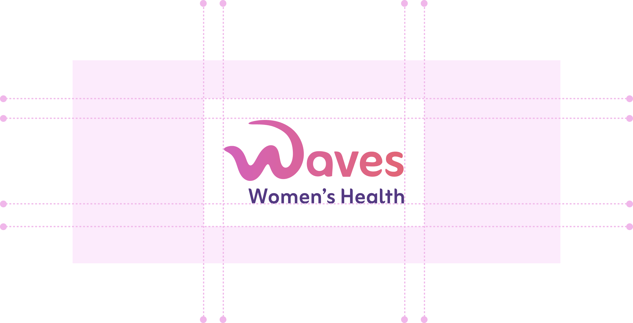
A symbol for progress, cycles and you
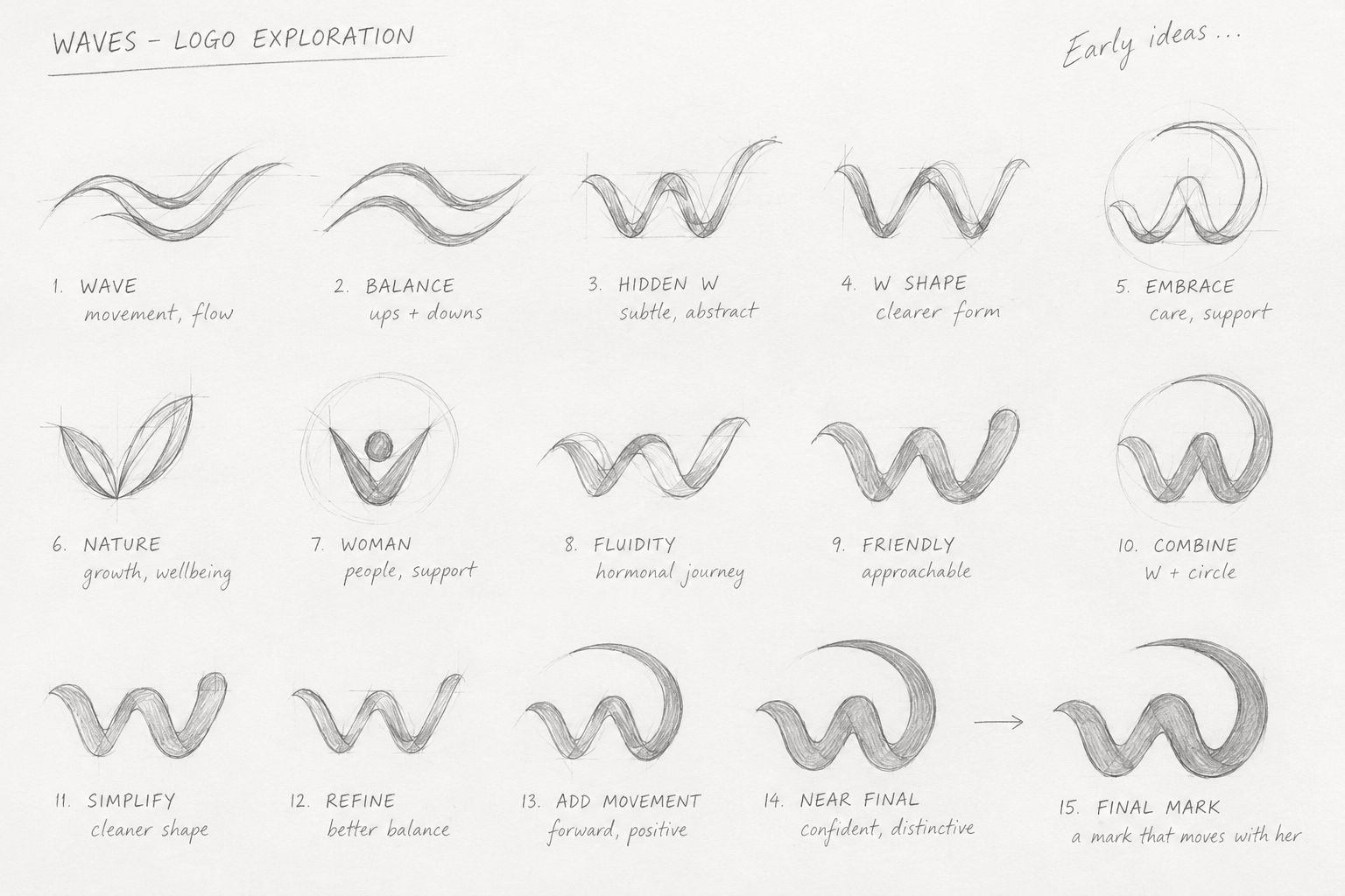
Waves started from a blank canvas. We wanted the identity to connect directly to how the product works, rather than simply creating a recognisable mark.
The W was built from a continuous, repeating form. It reflects the cycles and fluctuations of hormonal health, but also the repeated actions at the heart of Waves: observe, experiment, track and learn.
Those small actions happen again and again, building a clearer picture over time.
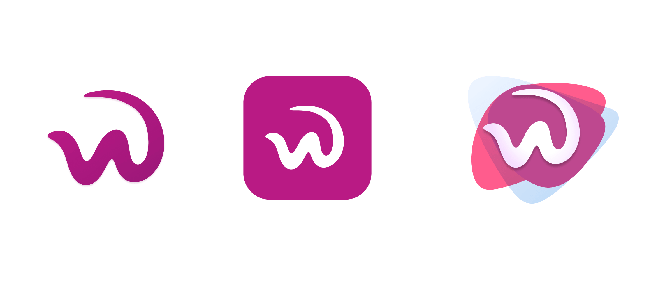
The result was a mark that represented both the Waves name and the cyclical behaviour behind the product, giving us a simple idea from which to build the wider identity.

MVP STRATEGY
Imagery that feels human
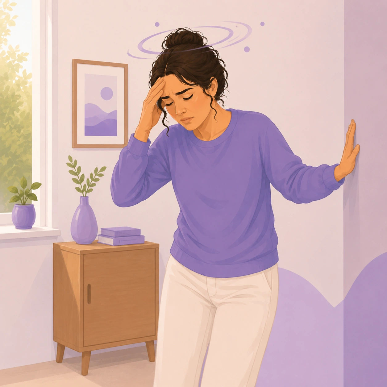
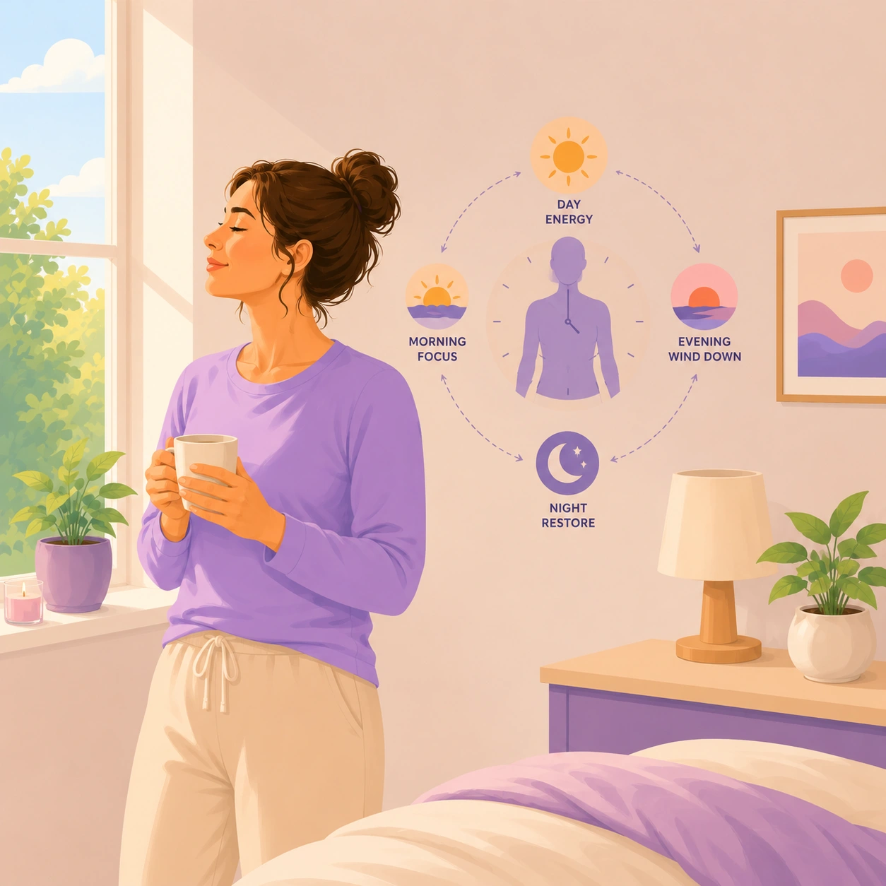
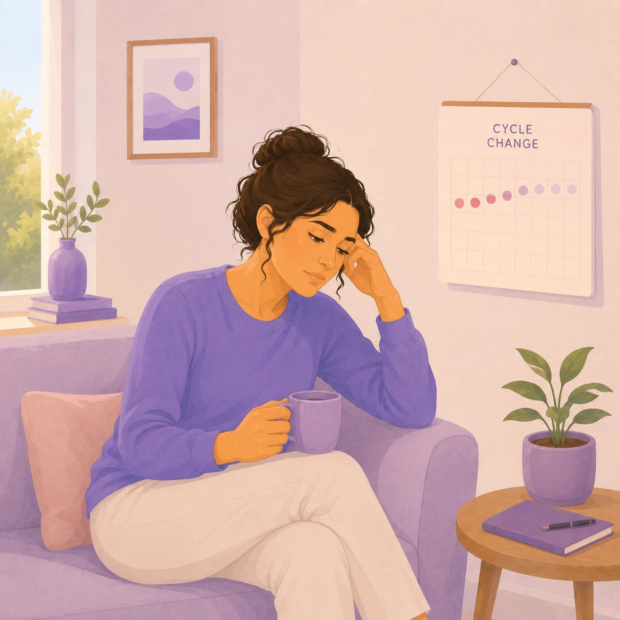
Hormonal health can be difficult to represent visually. We wanted to avoid both clinical medical imagery and the polished, unrealistic photography often associated with wellness brands.
We developed an illustration style centred around real women and everyday moments. Simple forms, soft colours and familiar situations helped make topics such as symptoms, sleep, stress, nutrition and hormonal change feel more approachable.
The style was designed as a system rather than a collection of individual images. Consistent composition, colour, character and level of detail meant we could create imagery for a growing library of experiments, symptoms and educational content while keeping Waves recognisable.
The result was imagery that could explain difficult subjects while still feeling warm, relatable and distinctly Waves.






TONE OF VOICE
Supportive, clear and non patronising
Our tone of voice is warm, empathetic and straight talking. We avoid medical jargon, focus on evidence over hype, and always put the woman at the centre.
Hormonal health can be confusing, personal and difficult to navigate. From the beginning, we wanted Waves to feel different from both traditional healthcare and the increasingly crowded wellness space.
We created five principles to give the brand a clear character. They helped guide everything from product copy and educational content to visual design, illustrations and everyday interactions within the app.
The aim was simple: make complex health information easier to understand, while treating women with warmth, intelligence and respect.
Brand Pillars: W.A.V.E.S.
Our brand is grounded in five principles that shape how Waves looks, speaks and behaves.
W - Warm & Witty:
We sound friendly, human, and relatable. We never sound cold, clinical, or sarcastic.
Quick check: Would I say this to a friend?
E Empathetic:
We name feelings and offer comfort. We never guilt-trip, shame, or dismiss.
Quick check: Does this line ease a burden or add one?
A - Approachable:
We use plain English and a clear structure. We steer clear of jargon or filler.
Quick check: Could a tired Brenda understand this on the first read?
S - Smart & Supportive:
We ground our claims in science and clarity. We never hype, oversell, or pretend to have all the answers.
Quick check: Could we cite this if asked?
V - Valued:
We show we respect her time and intelligence. We never pad with fluff or vague promises.
Quick check: Does the value show up in the first sentence?.
Design system
Turning the identity into a system
As the product grew, we translated the brand into reusable foundations, components and patterns.
This gave the team a consistent way to build new programs, experiments, insights and educational experiences while keeping the character of Waves intact.
MVP STRATEGY
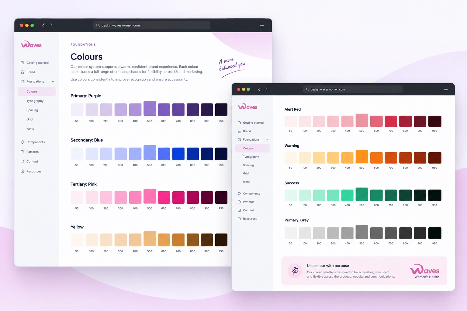
A palette with purpose
We created a flexible colour system with core brand colours, supporting shades and semantic colours for content, status and data visualisation. The palette keeps the warmth of the Waves brand while making the product clear, accessible and easy to use.
Pantone® 7679 C
C60 M56 Y22 K49
#533982
Pantone® 674 C
C0 M56 Y21 K20
#CB59A0
Pantone® 663 C
C2 M4 Y0 K2
#F4F0FA
MVP STRATEGY
Clear, modern and accessible
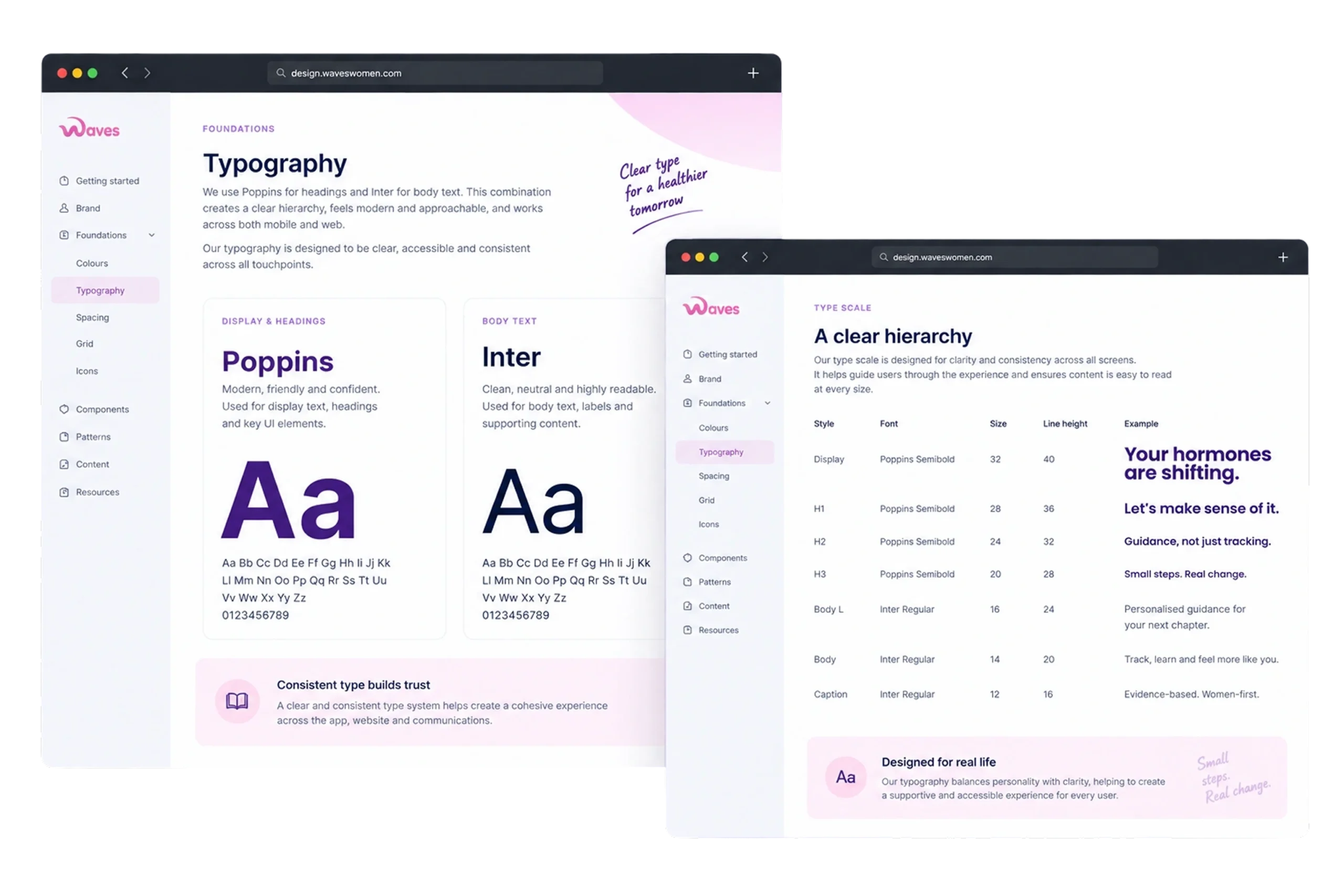
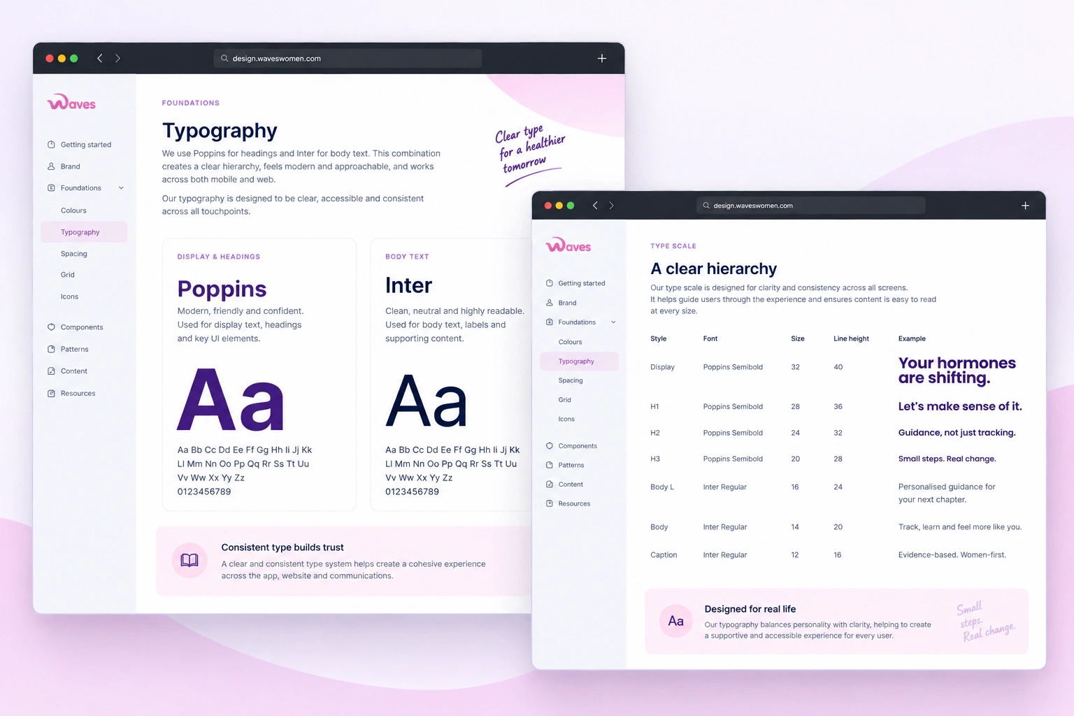
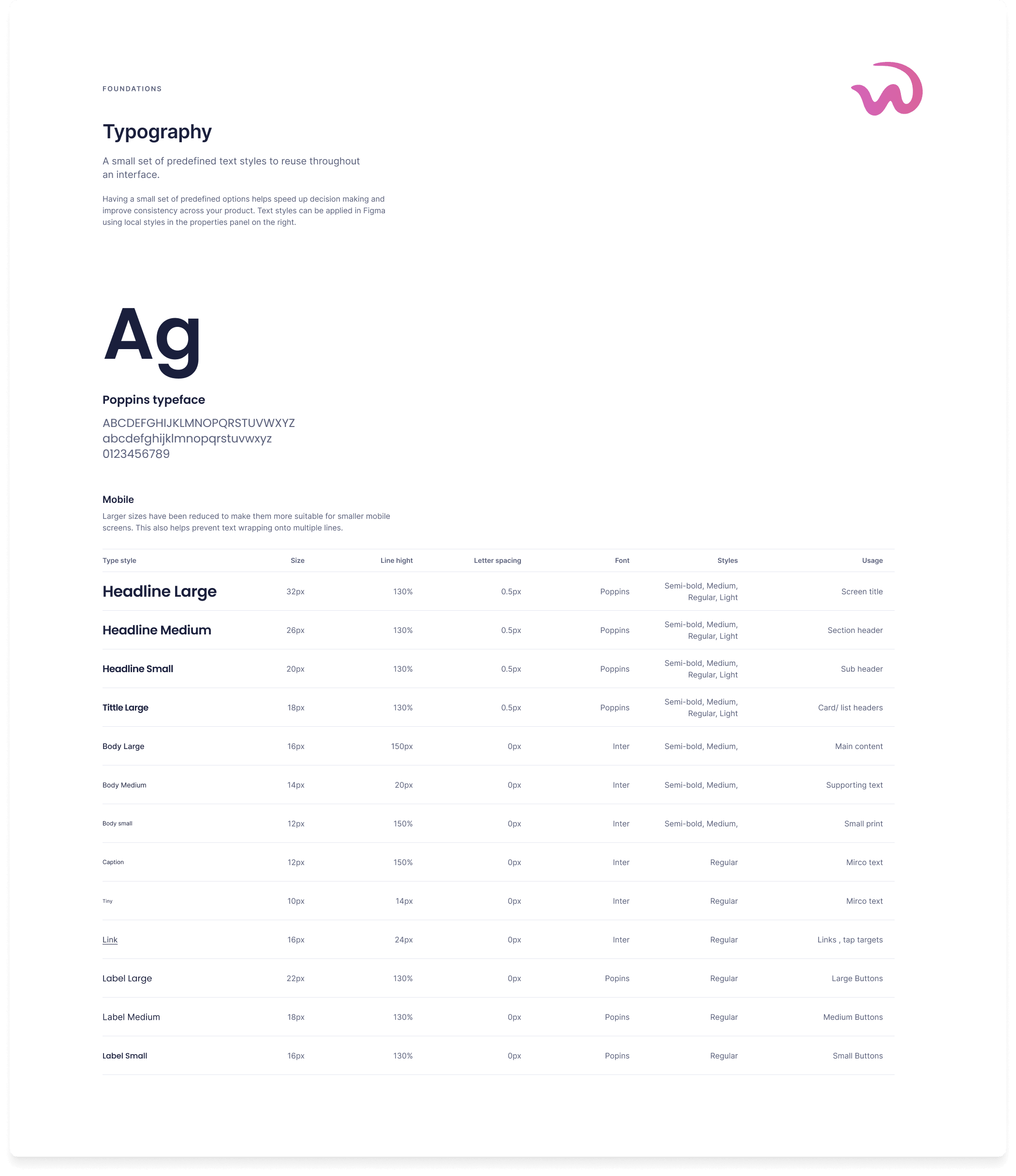
We use Poppins for headings and Inter for body copy. Together they create a clear hierarchy that feels modern, approachable and easy to read across both mobile and web.
Headlines:
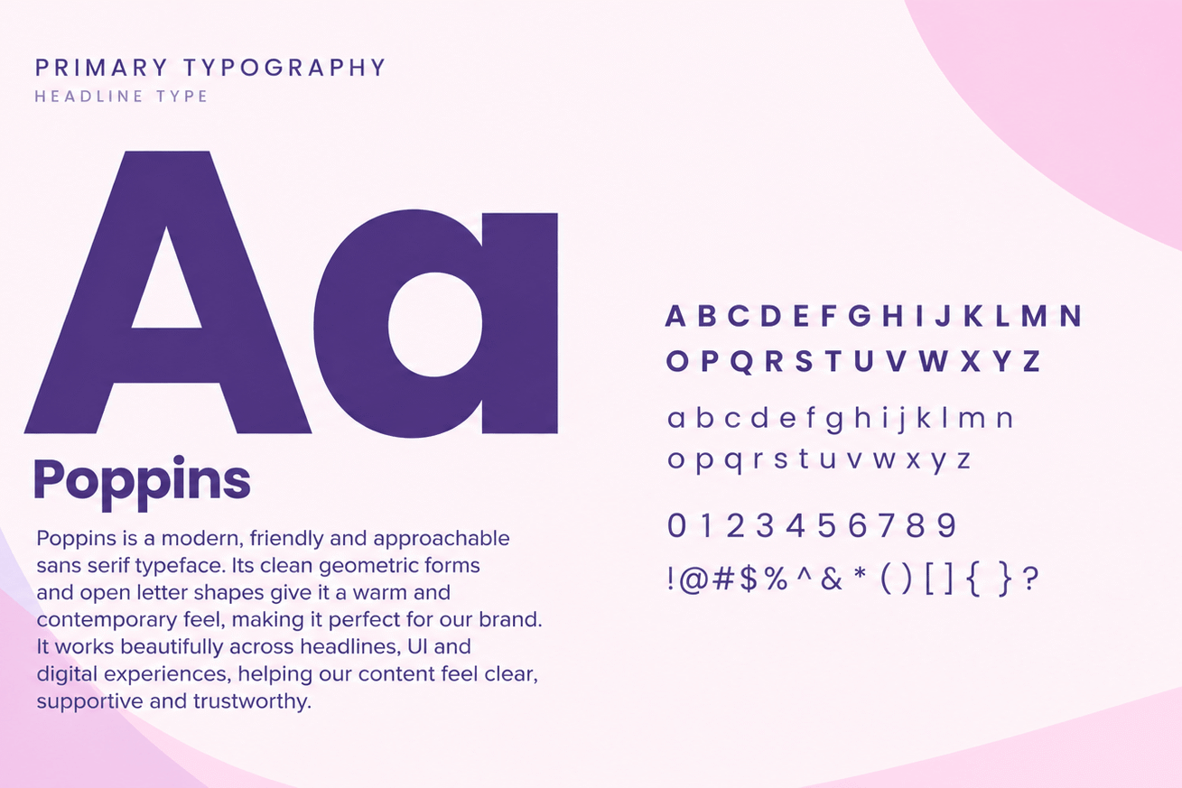
Google Font Poppins
A B C D E F G H I J K L M N O P Q R S T U V W X Y Z 1 2 3 4 5 6 7 8 9 0 a b c d ef g h i j k l m n o p q r s t u v w x y z
Paragraphs:
Google Font Inter
Lorem Ipsum is simply dummy text of the printing and typesetting industry. Lorem Ipsum has been the industry's standard dummy text ever since the 1500s, when an unknown printer took a galley of type and scrambled it to make a type specimen book. It has survived not only five centuries, but also the leap into electronic typesetting, remaining essentially unchanged. It was popularised in the 1960s with the release of Letraset sheets containing Lorem Ipsum passages.
Selecting fonts that feel supportive
We chose Poppins for its friendly, modern and highly readable letterforms. Its clean geometry feels approachable and optimistic, while remaining clear and accessible across the app, website, content and marketing.
A consistent experience, everywhere
MVP STRATEGY
Reusable, consistent and flexible
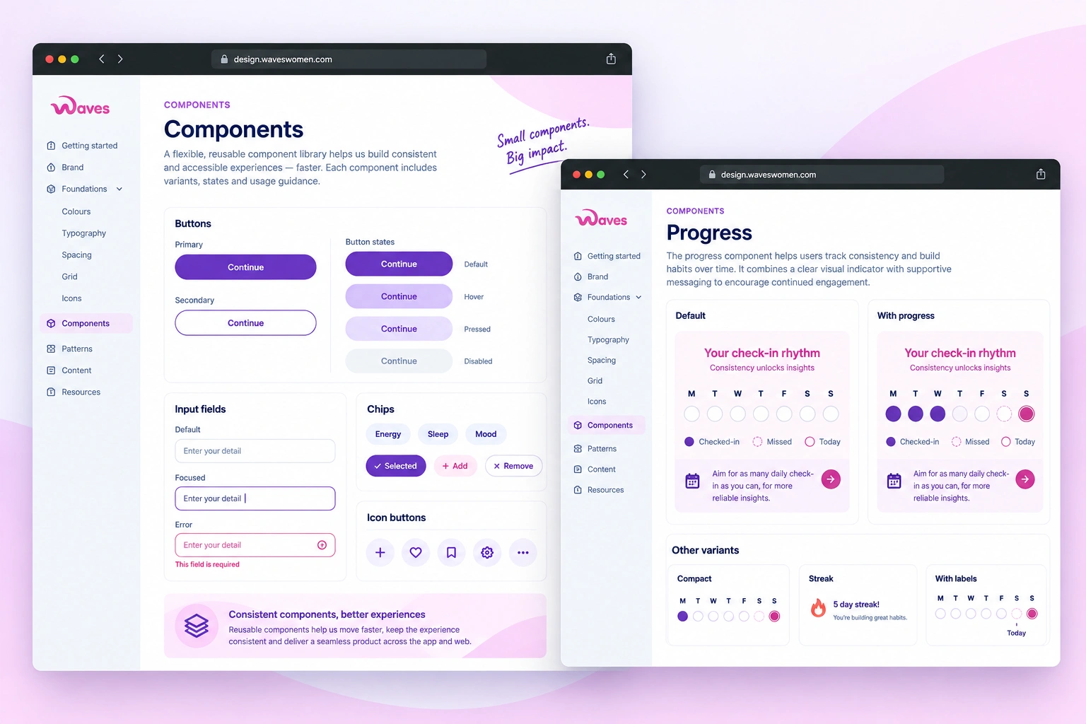
We built a reusable component library covering buttons, inputs, cards, lists, navigation and selection controls. Each component includes clear states and usage guidance, helping the team design faster while keeping the experience consistent.
MVP STRATEGY
A consistent structure
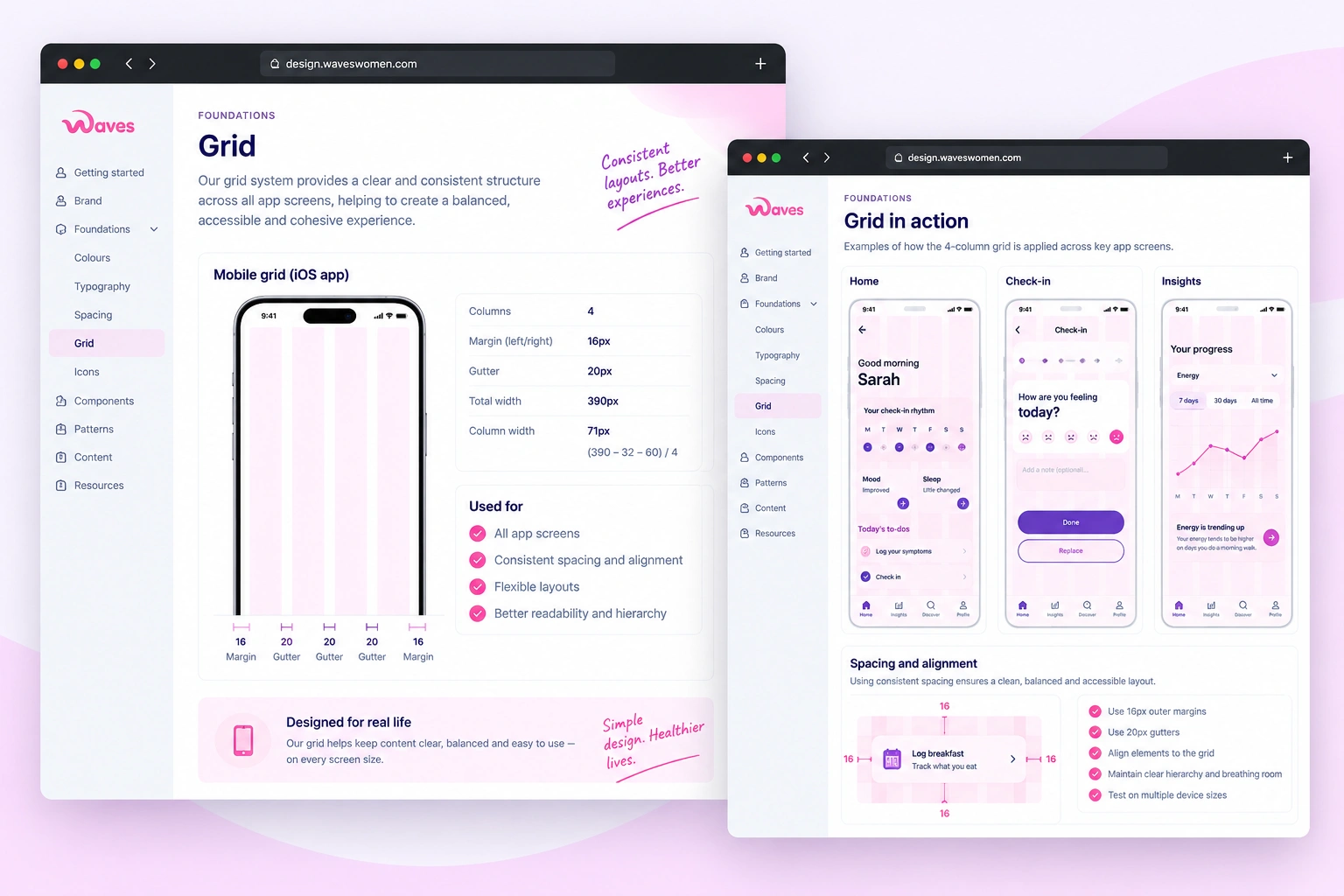
We defined layout rules, spacing and a mobile grid to create a consistent structure across the product. These foundations make it easier to design new screens and features without having to solve the same layout problems each time.
Brand in practice
From identity to experience
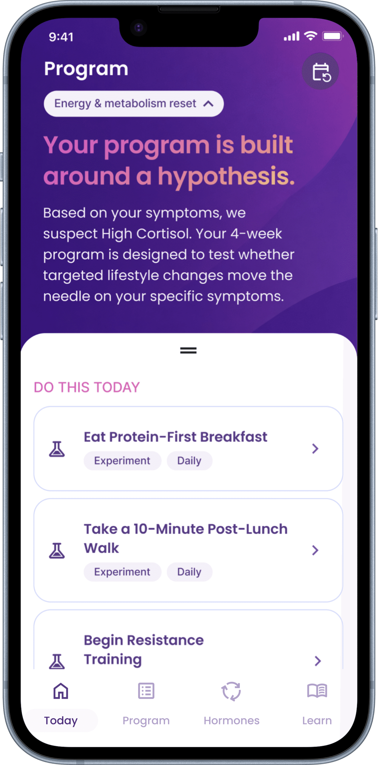
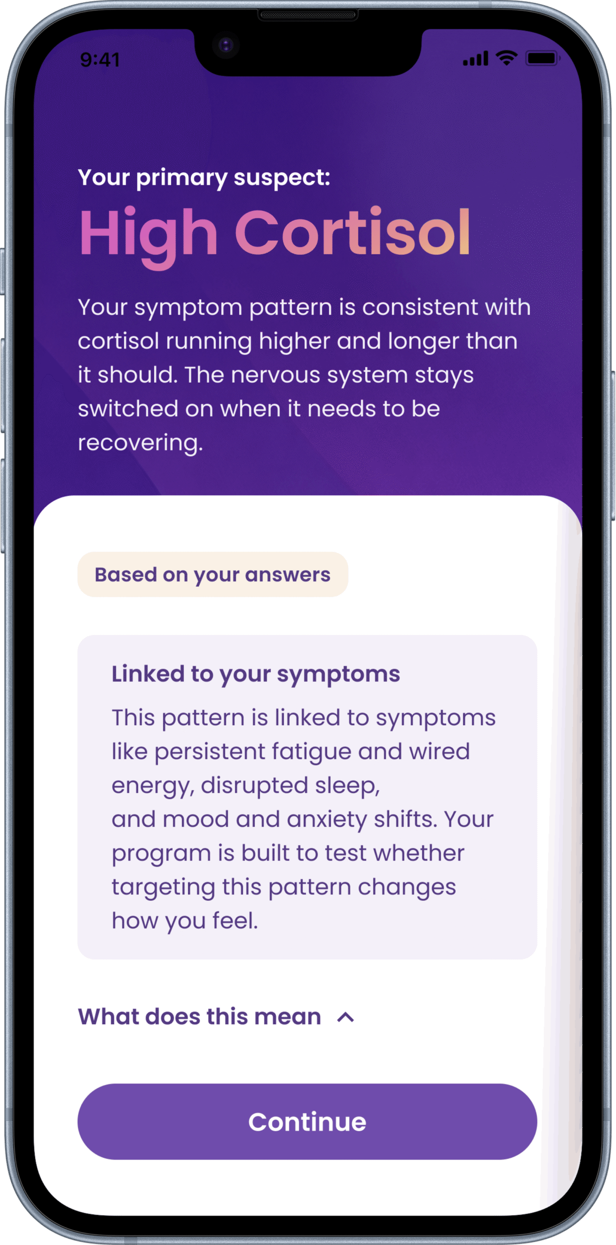
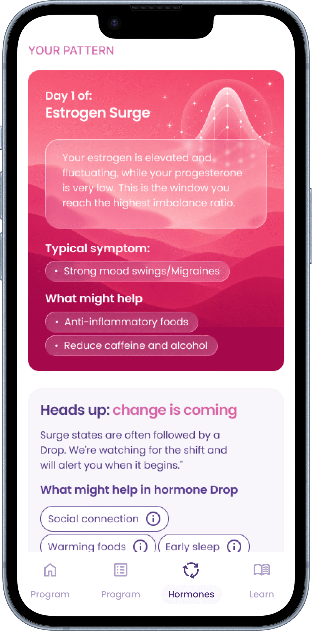
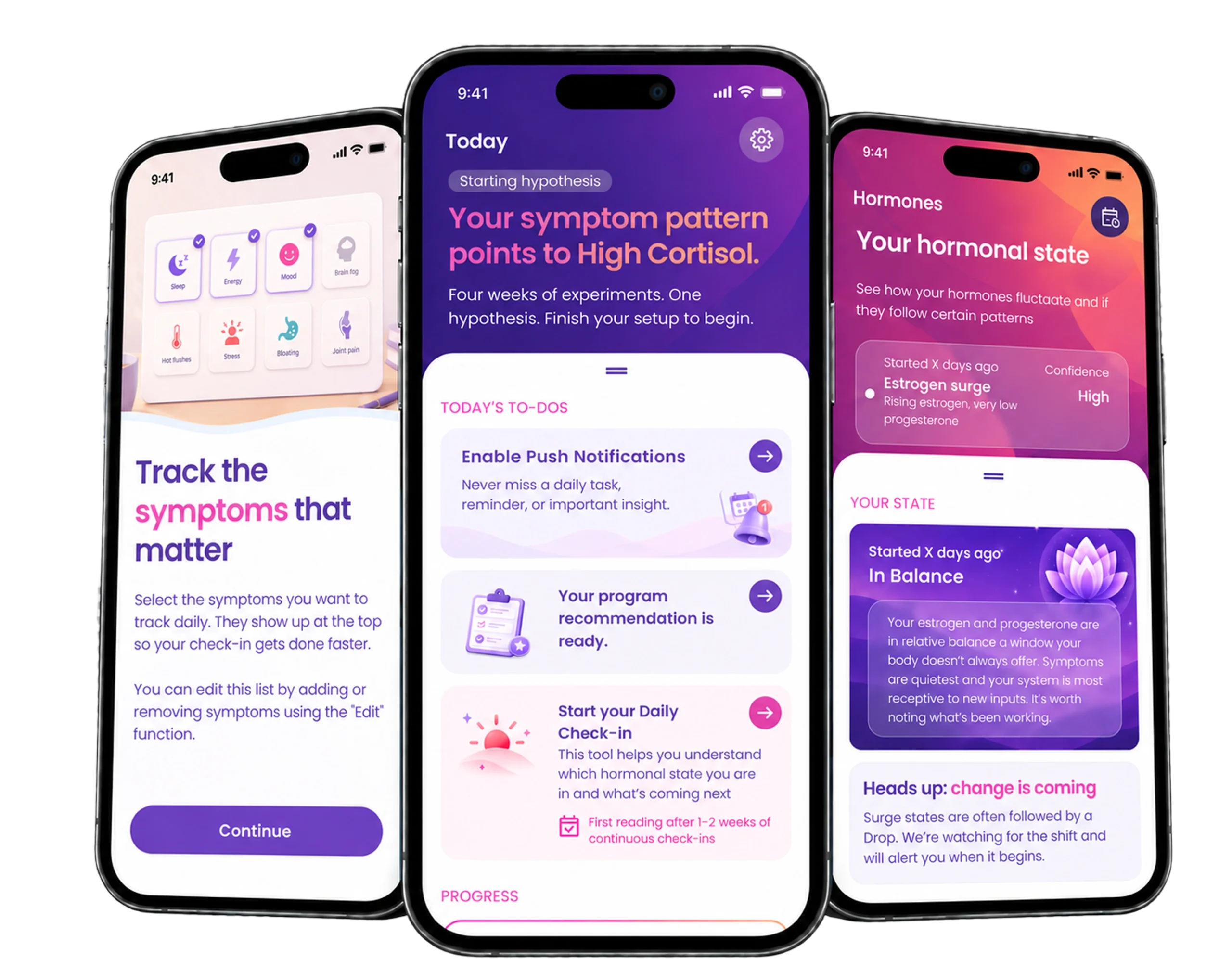
The brand was never intended to live only in guidelines. As the Waves product took shape, the visual language became part of how women experienced it every day.
Colour created hierarchy, typography made complex information easier to scan, and imagery brought warmth to moments that could otherwise feel clinical.
MVP STRATEGY
A strong foundation for what comes next
The design system gives Waves a shared foundation that can grow with the product. It helps the team move faster, keep quality consistent and connect the brand, content and product into one coherent experience.
Design system
Taking Waves beyond the app
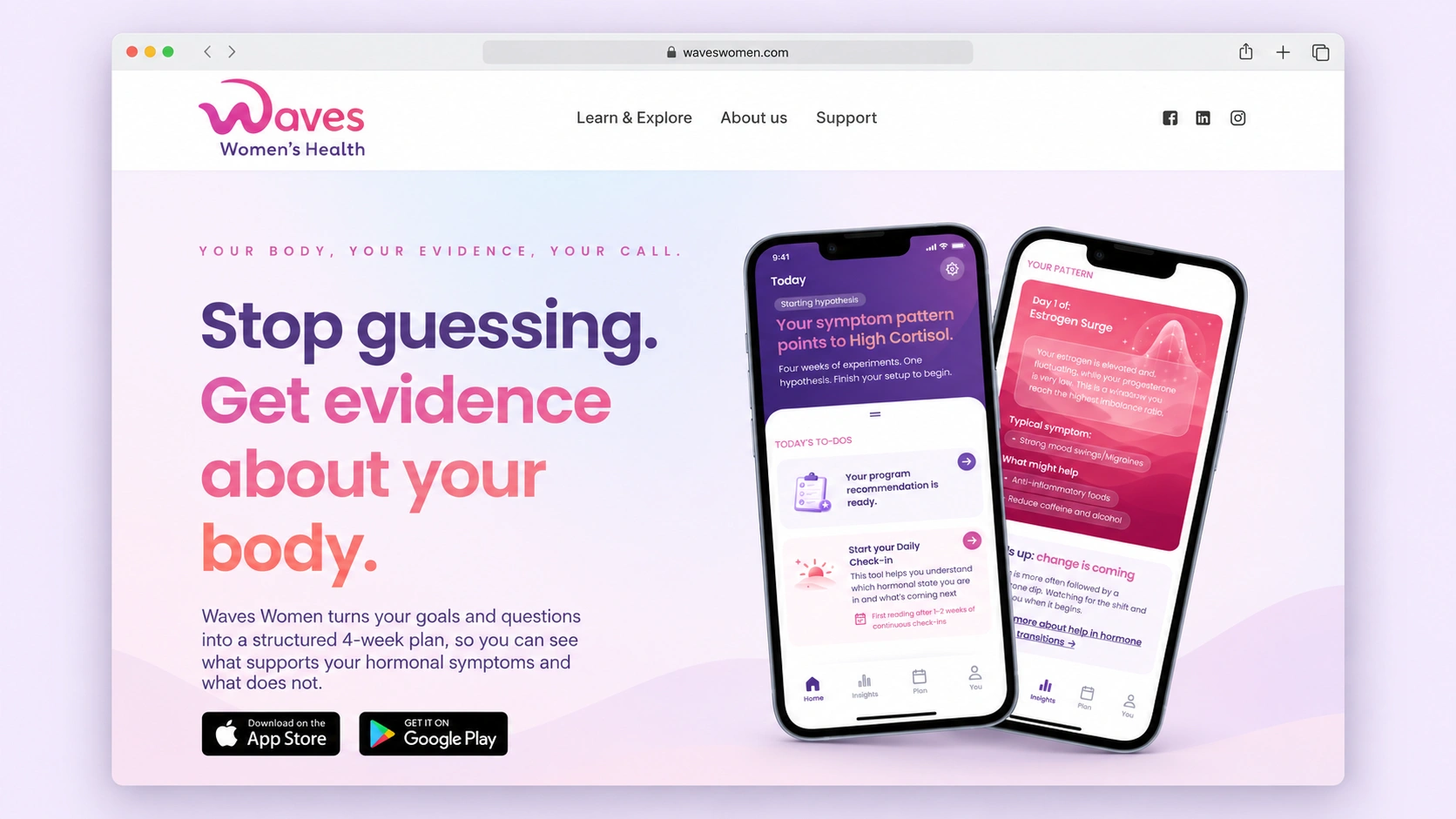
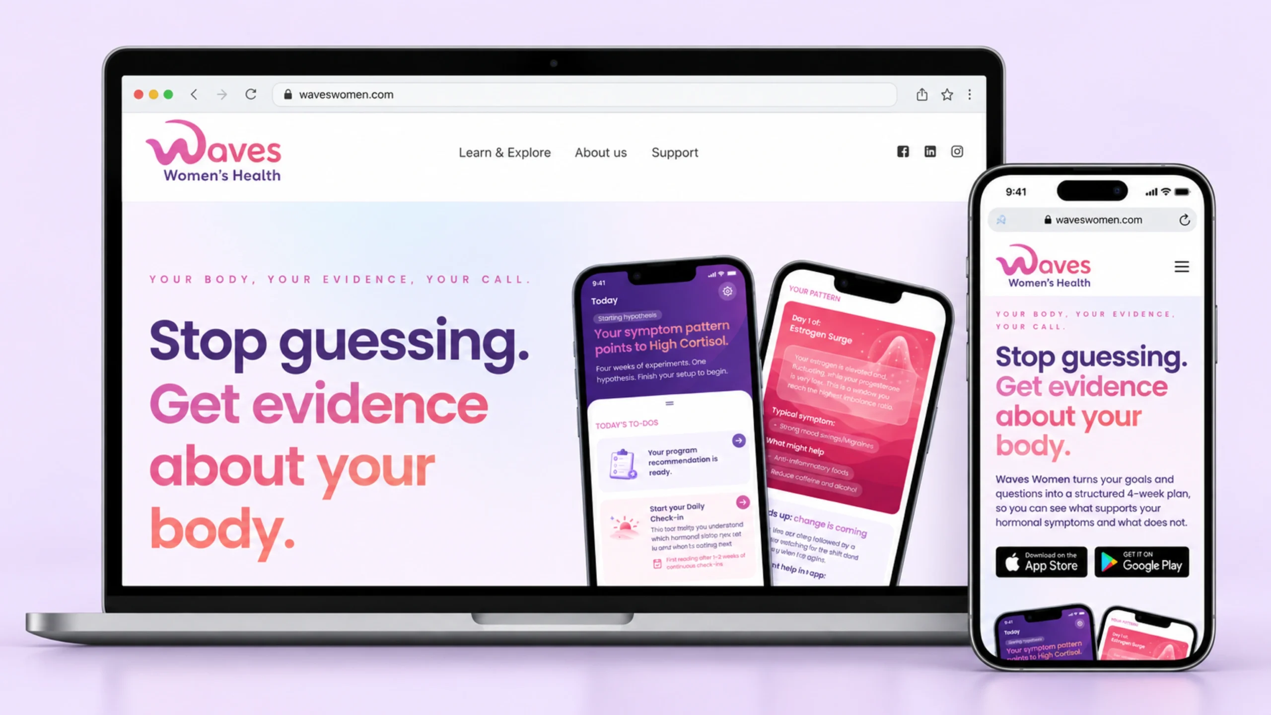
As Waves grew, the identity also needed to work outside the product. We carried the same principles into the website, creating a clearer connection between the brand, educational content, science and the product itself.
Design system
More than a visual identity
What started with a blank canvas became a complete language for Waves. The identity now stretches across the app, website, educational content, personalised programs, health insights and communications, giving the team a consistent foundation for growing the product.