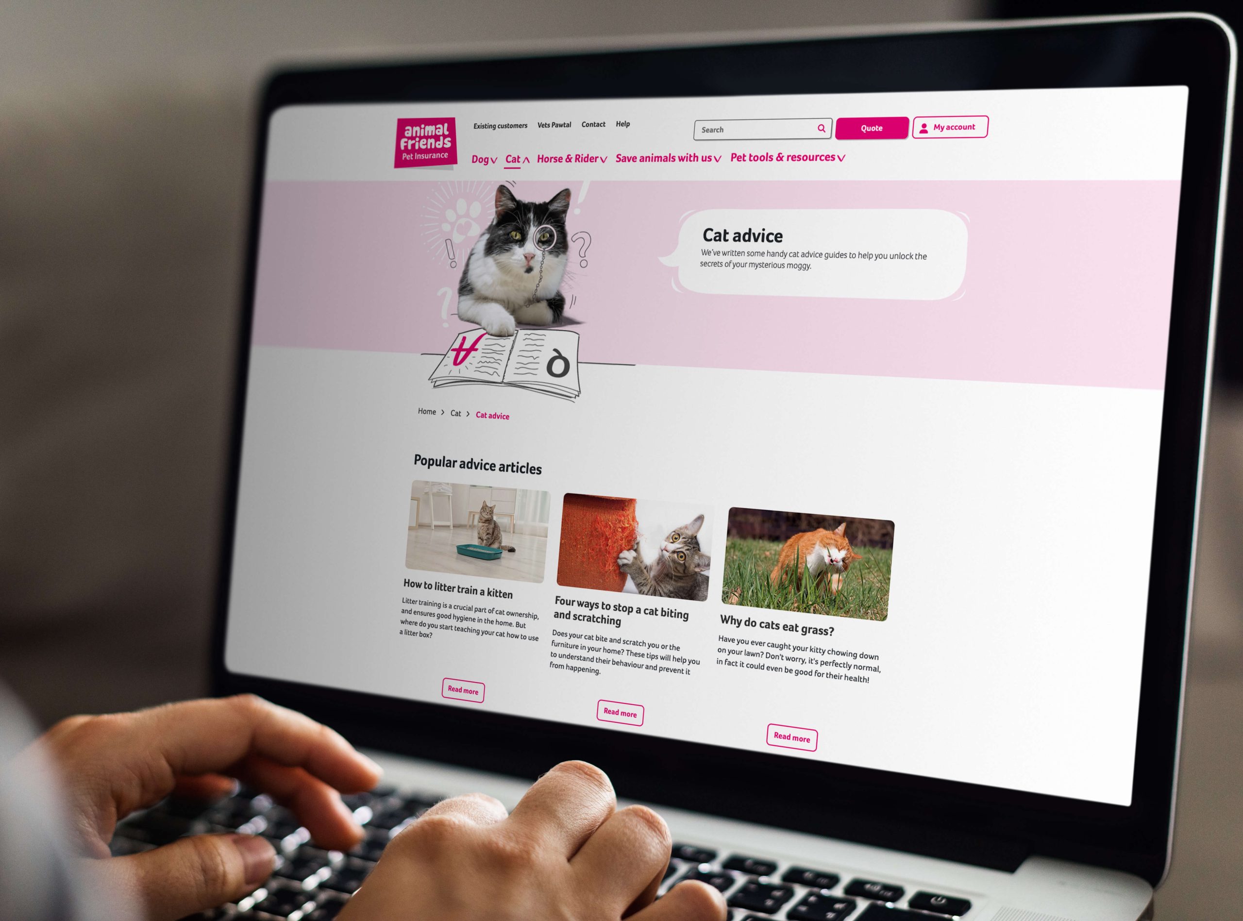
Site redesign and CMS platform upgrade
Read the case study on how we re-platformed and redesigned the website at Animal Friends
Business context
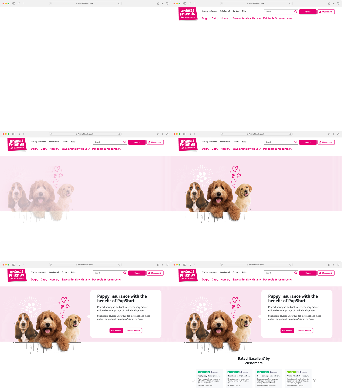
AFI completed a comprehensive website redesign, transitioning from a WordPress CMS burdened by significant technical debt to a more robust and flexible platform, Optimizely CMS (formerly Episerver).
The previous WordPress system had become a major obstacle, slowing release cycles and introducing a higher volume of bugs with each update. Additionally, the website functioned largely as a portfolio site, with users needing to access a separate in-house system called the “quote engine” to view and manage their policies.
This project, delivered in partnership with Asspius, aimed to improve site performance, user experience, and internal team autonomy, all within a tight three-month timeline.

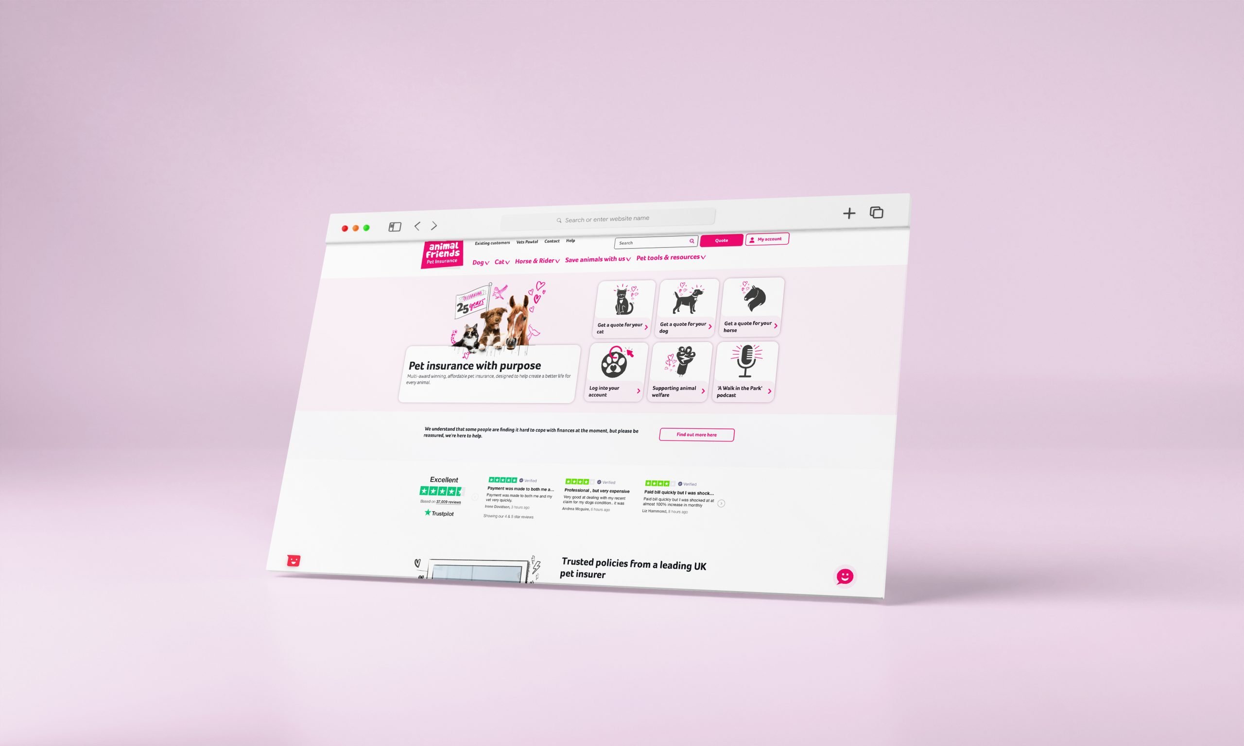
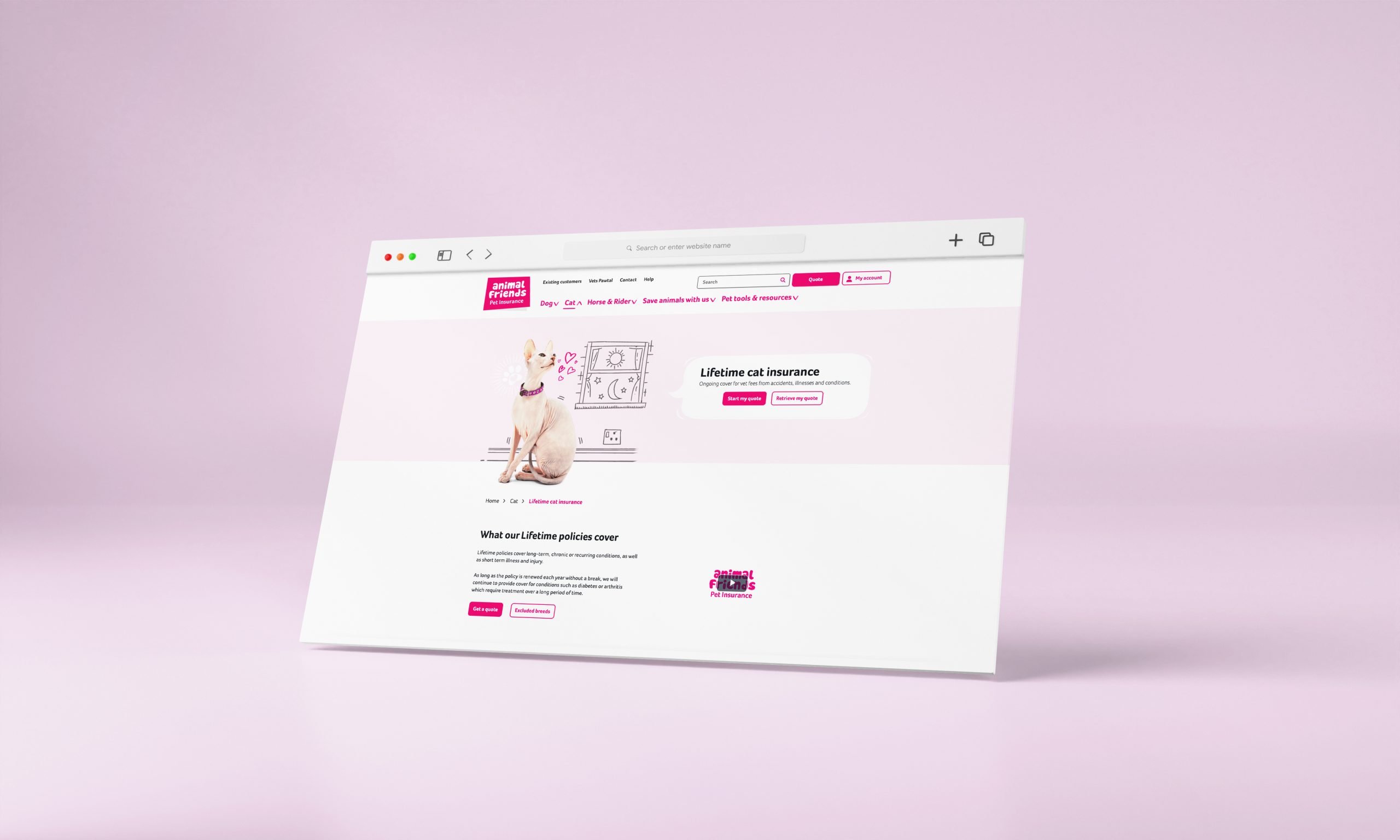
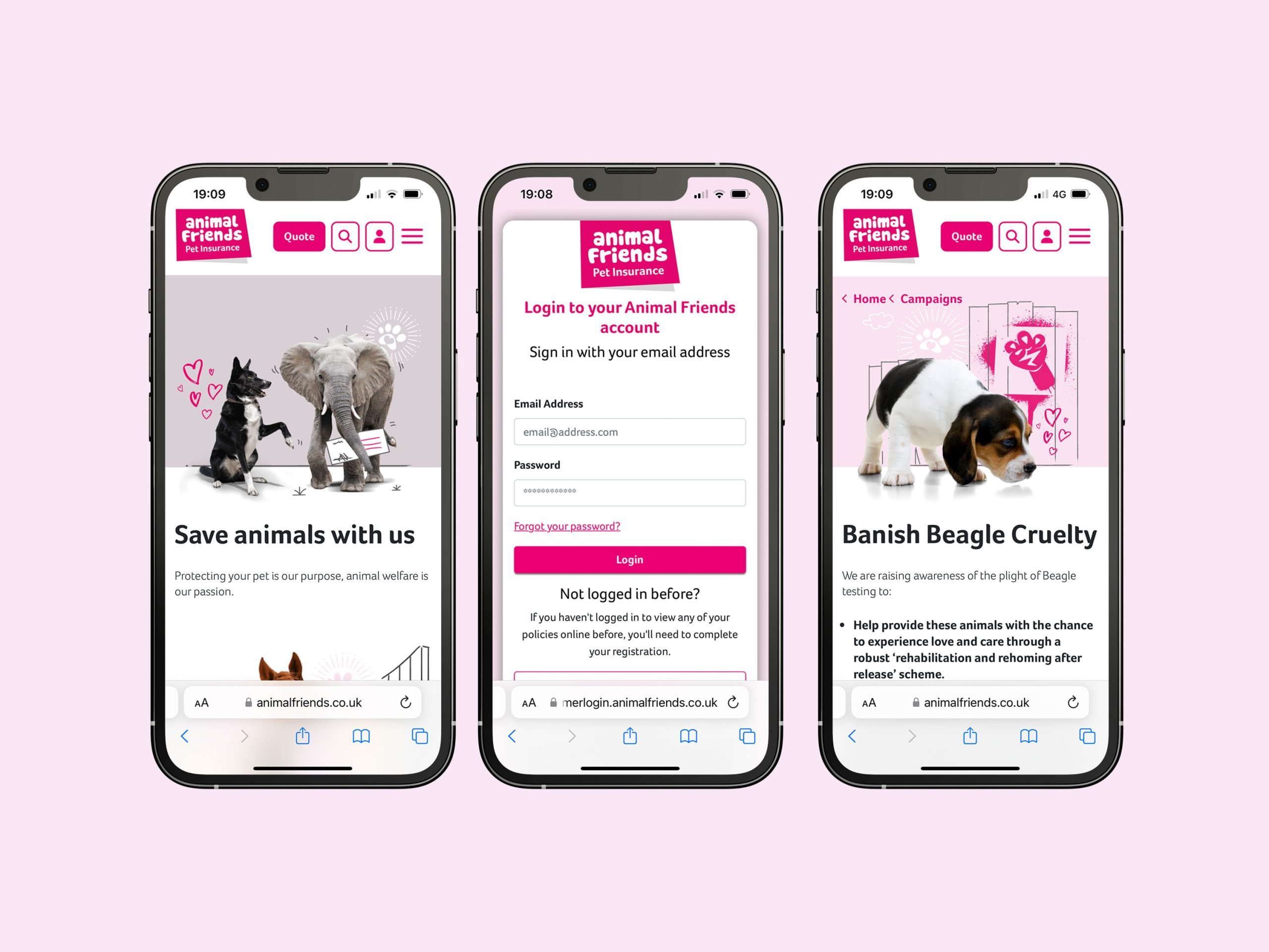
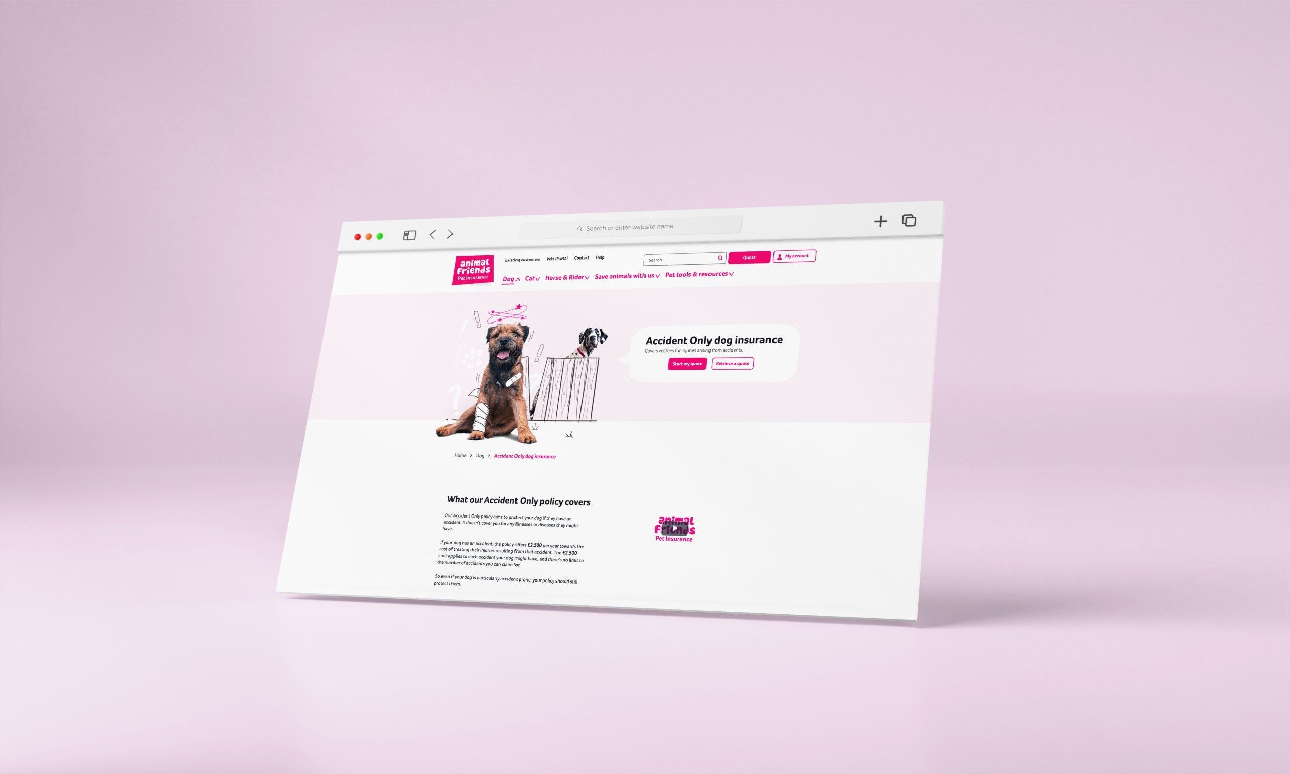
My Role
In my role as the project owner and head of digital design, I was the primary contact for Asspius, me and my team defined the project scope, set the delivery roadmap, and ensured that the redesign met AFI’s objectives. A key part of my role was creating a streamlined process for change requests and feature prioritisation, providing internal teams with greater control over content updates while balancing the regulatory protocols inherent to our industry.
Client
Animal Friends
Project scope
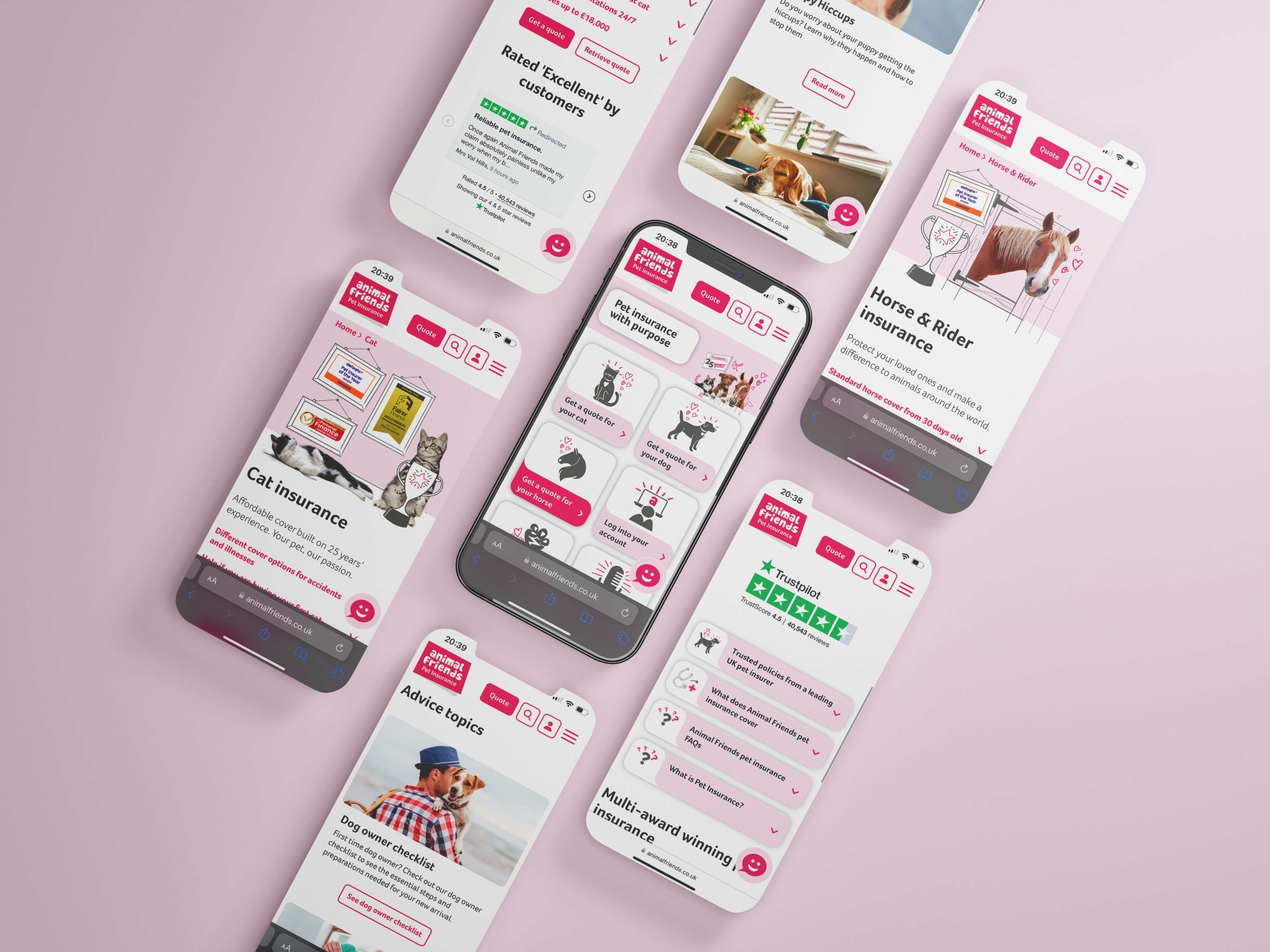
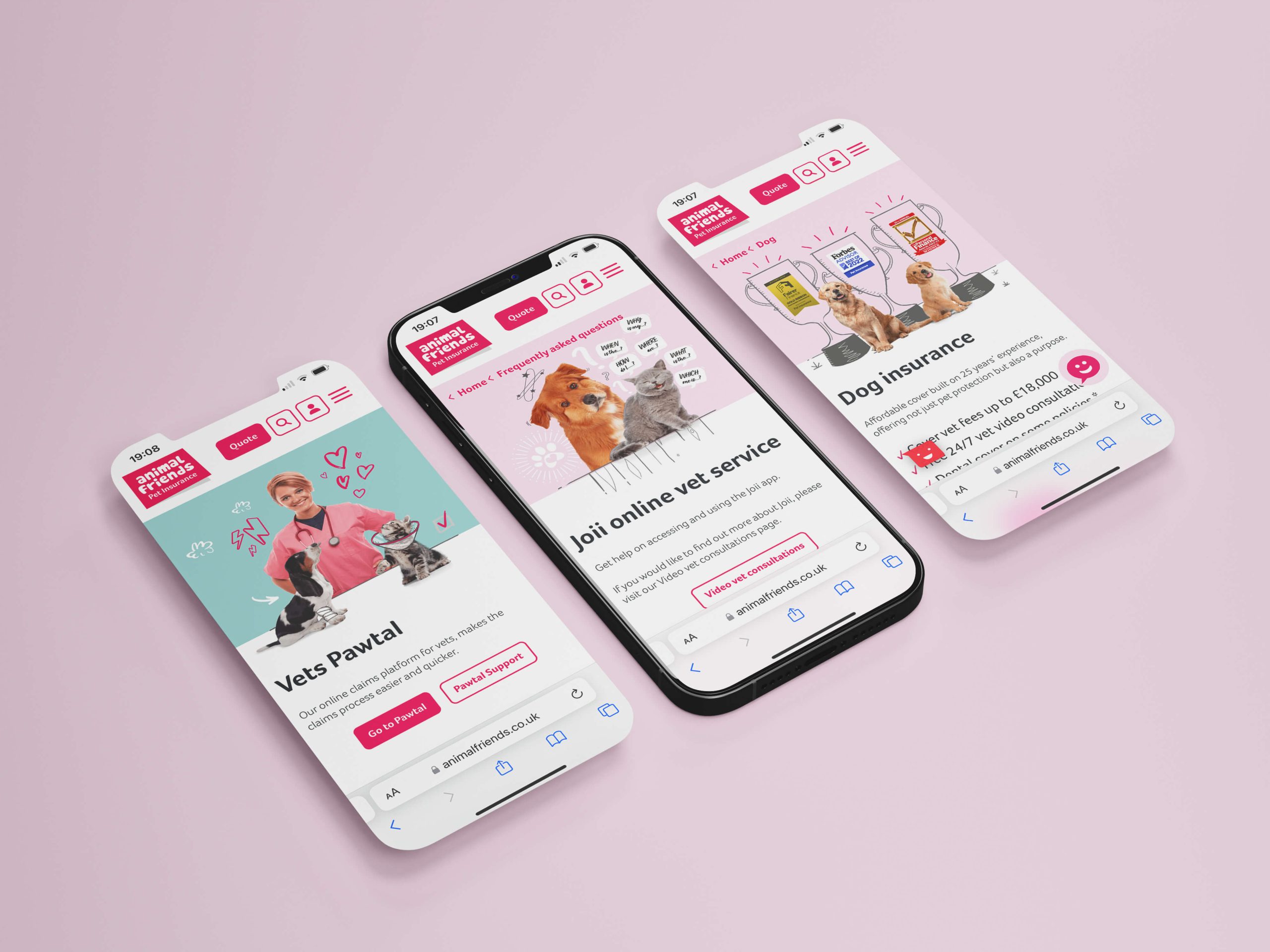
Mobile-first redesign
Seo best practices
Go-live for peaks
Autonomous platform empowered internal teams
Project Scope
Figma, Adobe CC, Trello, Miro, Axure, Jira, Teams, User interviews
Key Achievements
Delivery from start to go-live, in 3 months
Understanding & Planning
An important skill for any designer is to know how to scope out a project and then the ability to keep within the scope. We kicked off this collaboration with the team at Appius by flushing out what Animal Friends’ specific needs were and estimating time to find a solution.
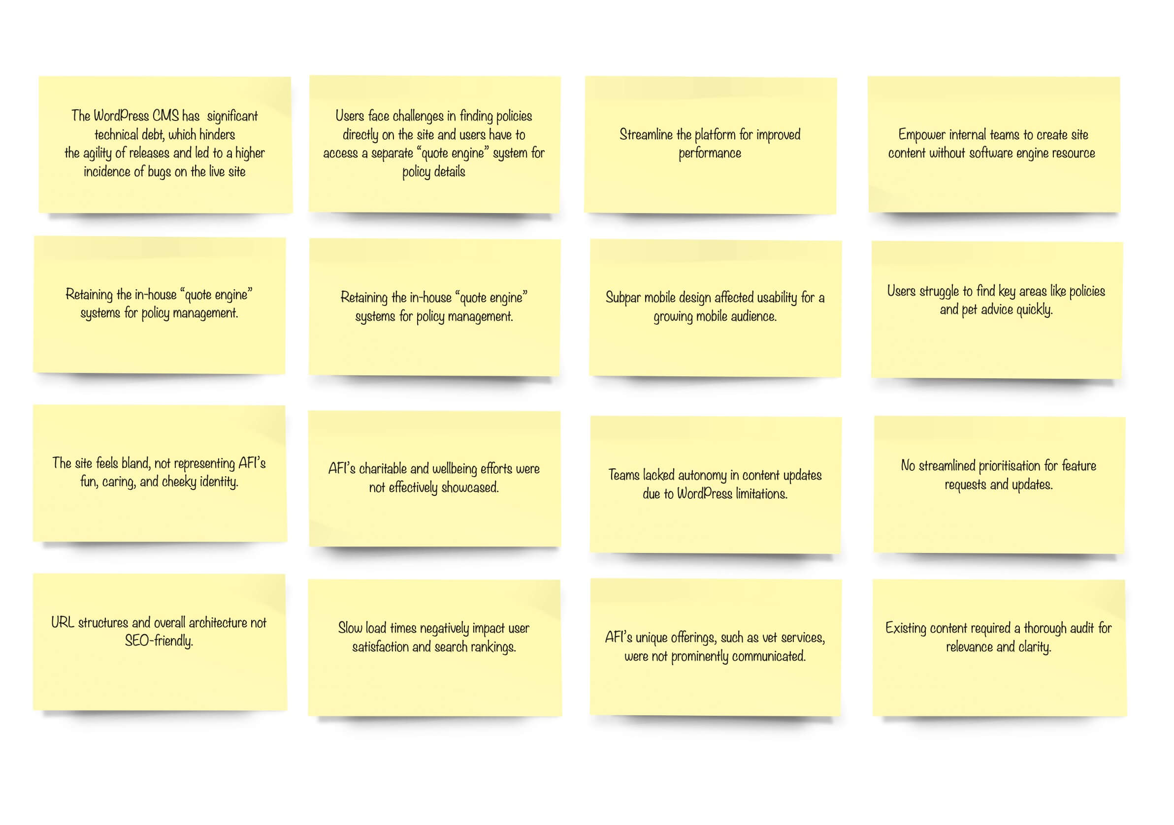
The WordPress CMS had accrued significant technical debt, which hindered the agility of releases and led to a higher incidence of bugs on the live site. Users faced challenges in finding policies directly on the site and users had to access a separate “quote engine” system for policy details.
Our goals included establishing a streamlined platform that improved performance, enhanced the user journey, and empowered internal teams, all while retaining the in-house “quote engine” systems for policy management.
Gathering Requirements
To ensure the redesign would effectively serve AFI’s internal needs, we conducted a series of in-depth interviews with heads of departments, including the internal development team, which played a major role in the project.
Our approach centred on understanding the “why” behind each requirement, rather than focusing solely on specific execution ideas. This helped us uncover the core needs of each team, spanning marketing, compliance, content management, customer service, and development.
The internal development team had unique requirements, needing a platform that supported robust management of integrations, efficient release cycles, high security, and adherence to the latest industry standards.
By focusing on these needs during our interviews, we ensured that the platform would support a seamless workflow for ongoing maintenance and development. When departments suggested specific execution ideas, we encouraged them to articulate the reasons and desired outcomes behind these solutions.
This approach allowed us to clarify the underlying objectives, which we then took into collaborative workshops with Asspius. Together, we explored each requirement in the context of our project scope and constraints, determining the best execution strategies to align with our goals and ensure operational efficiency across all teams.
Define
Goals, Objectives, and Key Results
⸺ SEO and Speed Optimisation
Achieved a PageSpeed score of up to 92, a substantial improvement aimed at driving more organic traffic.
⸺ Internal Control through CMS Autonomy
Replaced WordPress with Optimizely CMS, empowering internal teams to update content without developer support.
⸺ Mobile-First Design Approach
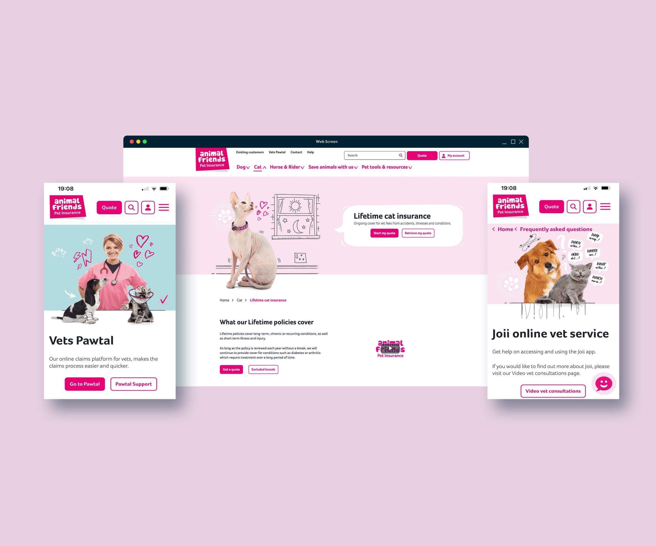
Prioritised mobile usability to meet the needs of a growing mobile audience.
⸺ Improved Feature Development Process
Implemented a prioritised request process for content changes, giving internal teams greater control while adhering to regulatory standards.
⸺ Enhanced Navigation and User Flows
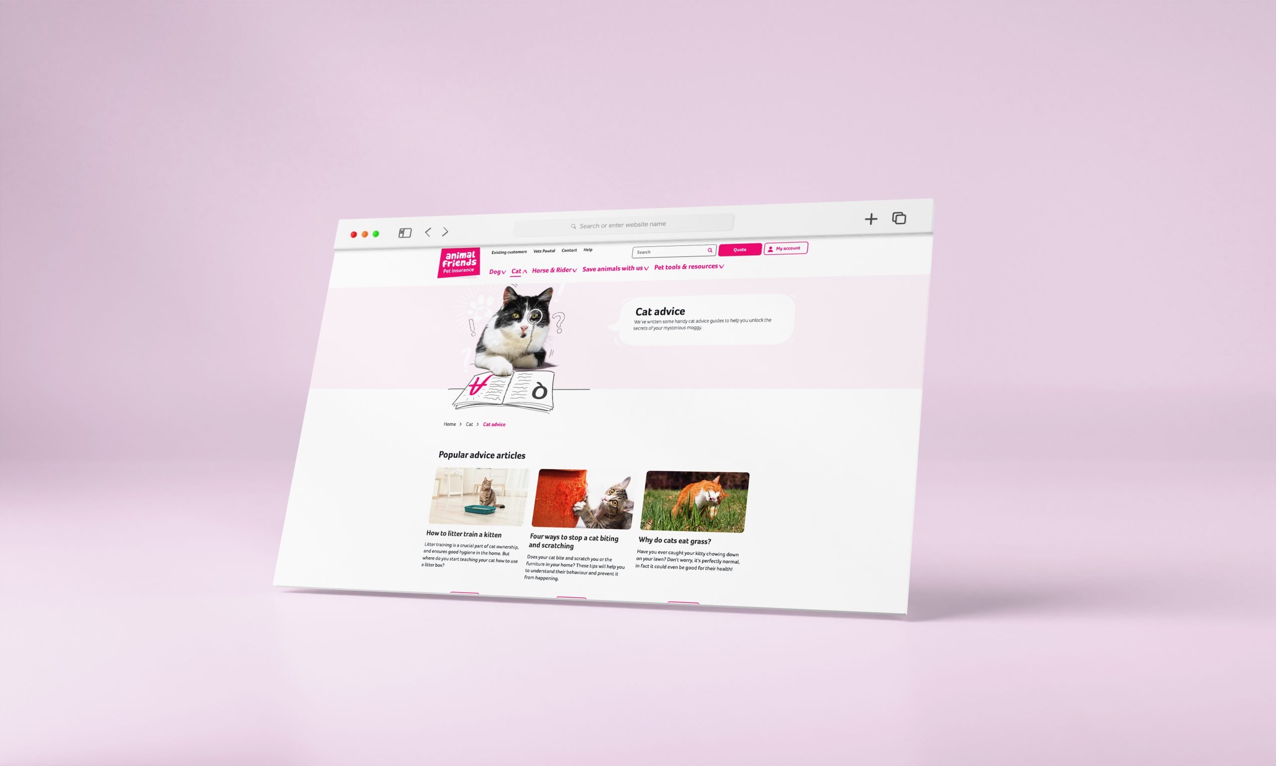
Simplified the user journey to key areas, like My Account and Pet Advice, improving accessibility and user experience.
⸺ Represent the brand's fun, caring and responsible identity
...
Hypothesis
We anticipated that transitioning from WordPress to Optimizely, optimising page speed, and empowering internal teams with CMS control would enhance both user engagement and site performance, ultimately driving a higher volume of organic traffic and improving internal efficiency.
Analysis
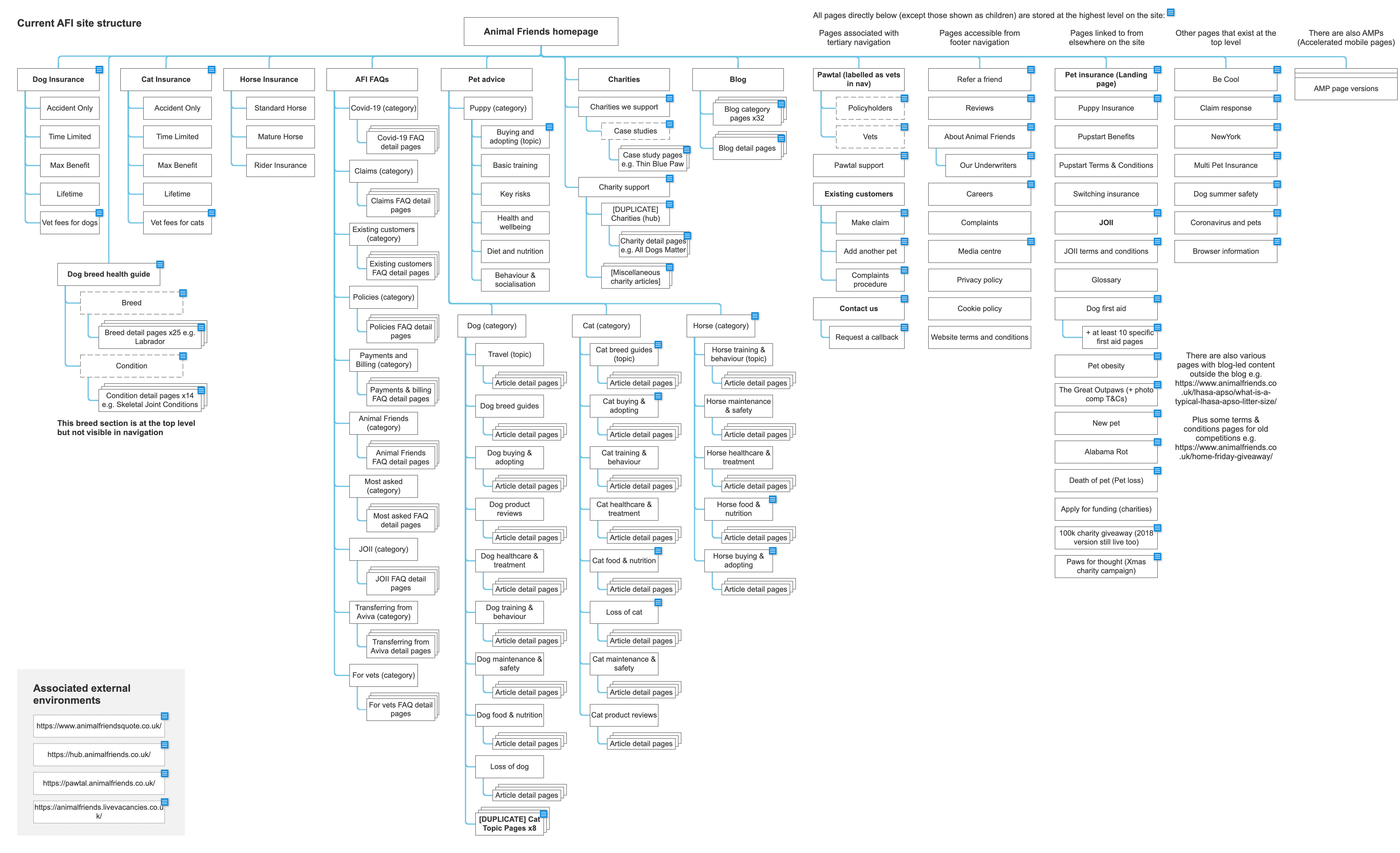
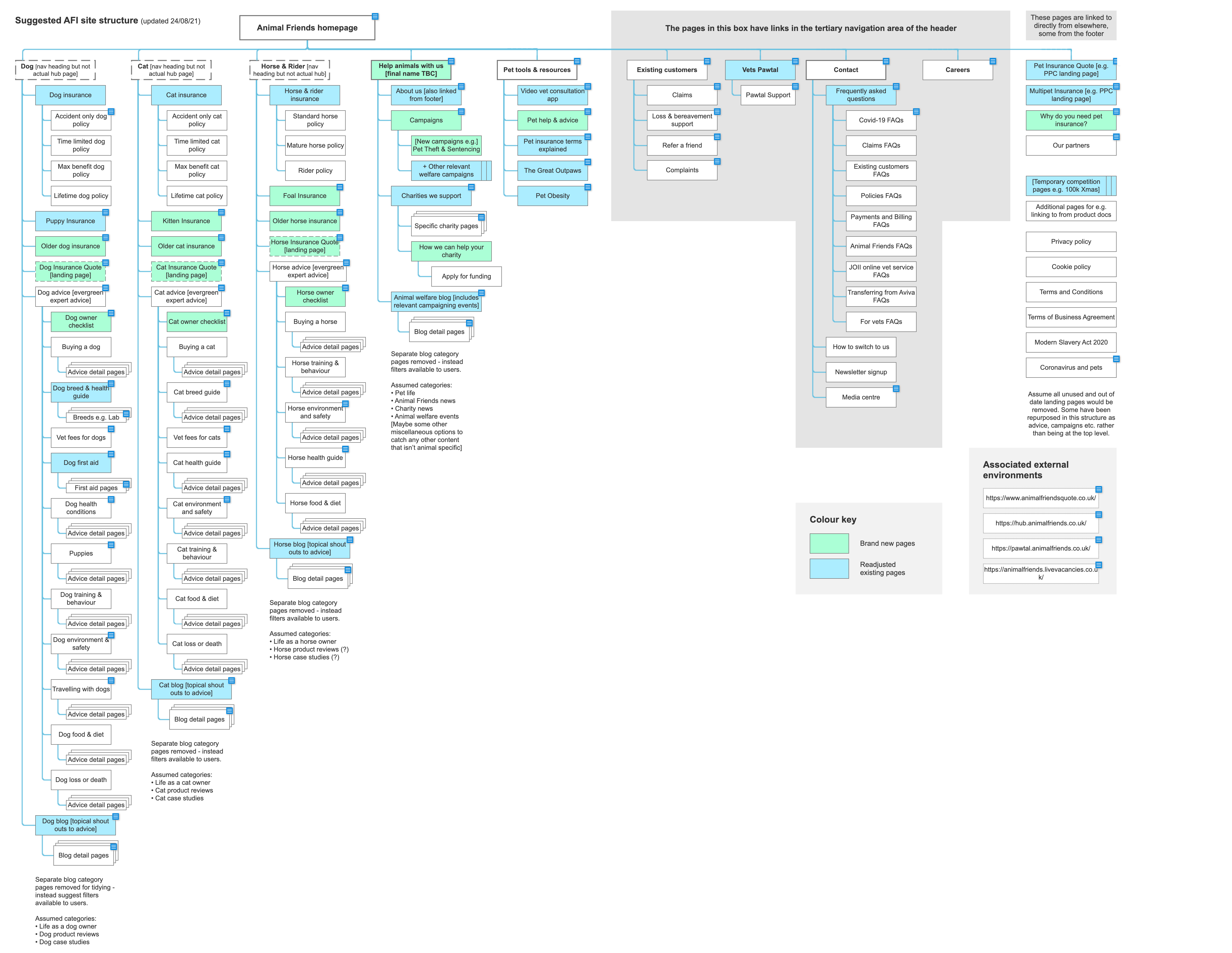
A critical part of the redesign involved a thorough review of the existing site architecture to ensure it adhered to SEO best practices and supported our product integrations.
Working closely with the SEO team, we identified and implemented improvements to optimise the site’s structure for search engine performance, which included a comprehensive overhaul of the URL structure. This restructuring aimed to create clearer, more SEO-friendly URLs, making it easier for search engines and users alike to navigate and understand the site’s content. This allowed us to improve the level of organic traffic and reduce our reliance on meta partners.
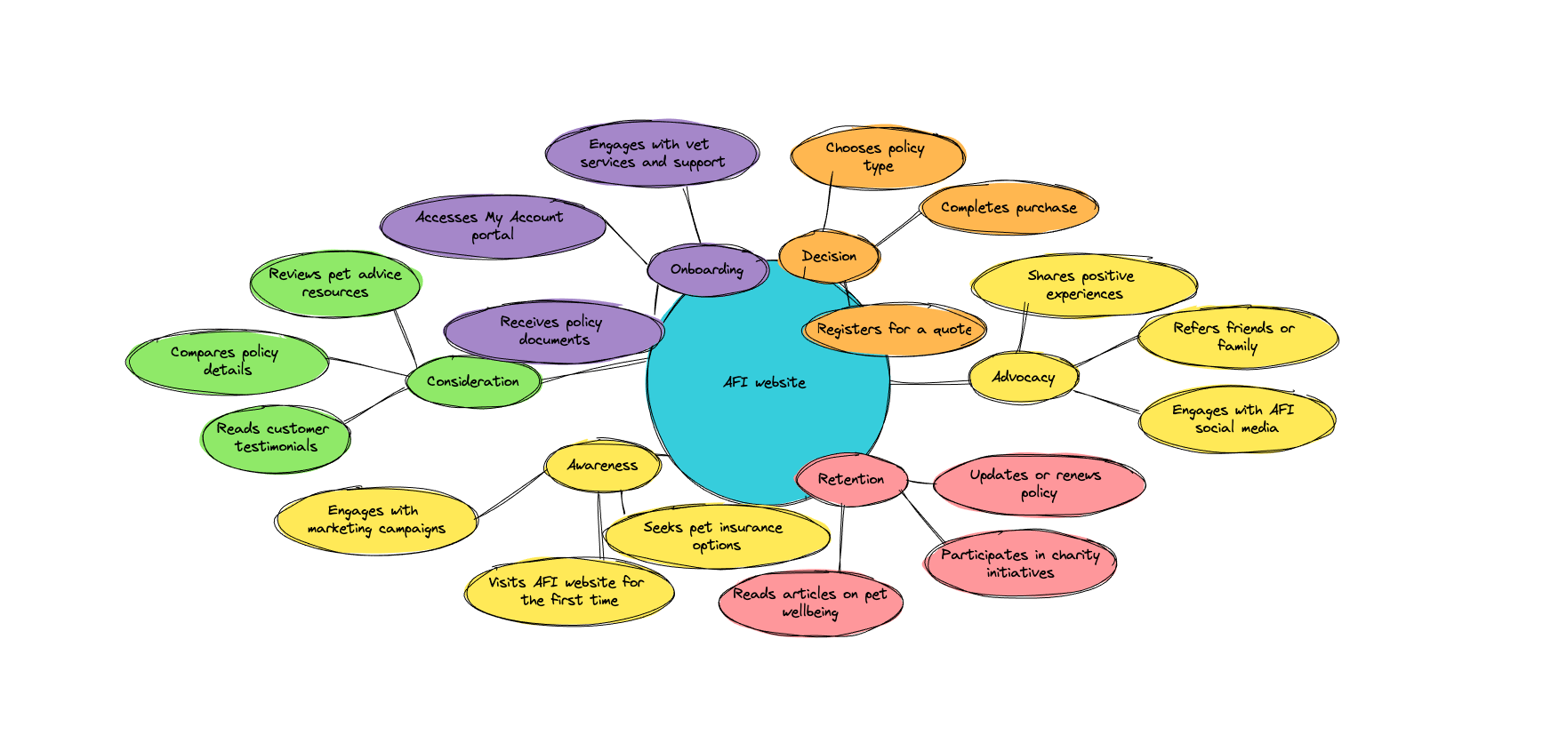
In addition to architectural and SEO improvements, we integrated other key AFI products, such as the post-booking account area, veterinarian portals and our animal heath-checking app partner Joii. These integrations created a more seamless user life cycle, allowing customers to manage their policies, appointments, and pet health needs within a unified platform.
By aligning our structural updates with SEO requirements and operational needs, we enhanced both site discoverability and user engagement, setting a strong foundation for AFI’s digital growth.
User research
Website Review and User Testing Insights
As part of the redesign process, we conducted a series of user testing sessions to identify pain points and areas of confusion on the existing AFI website. The feedback highlighted several key issues affecting both user perception and usability:
…
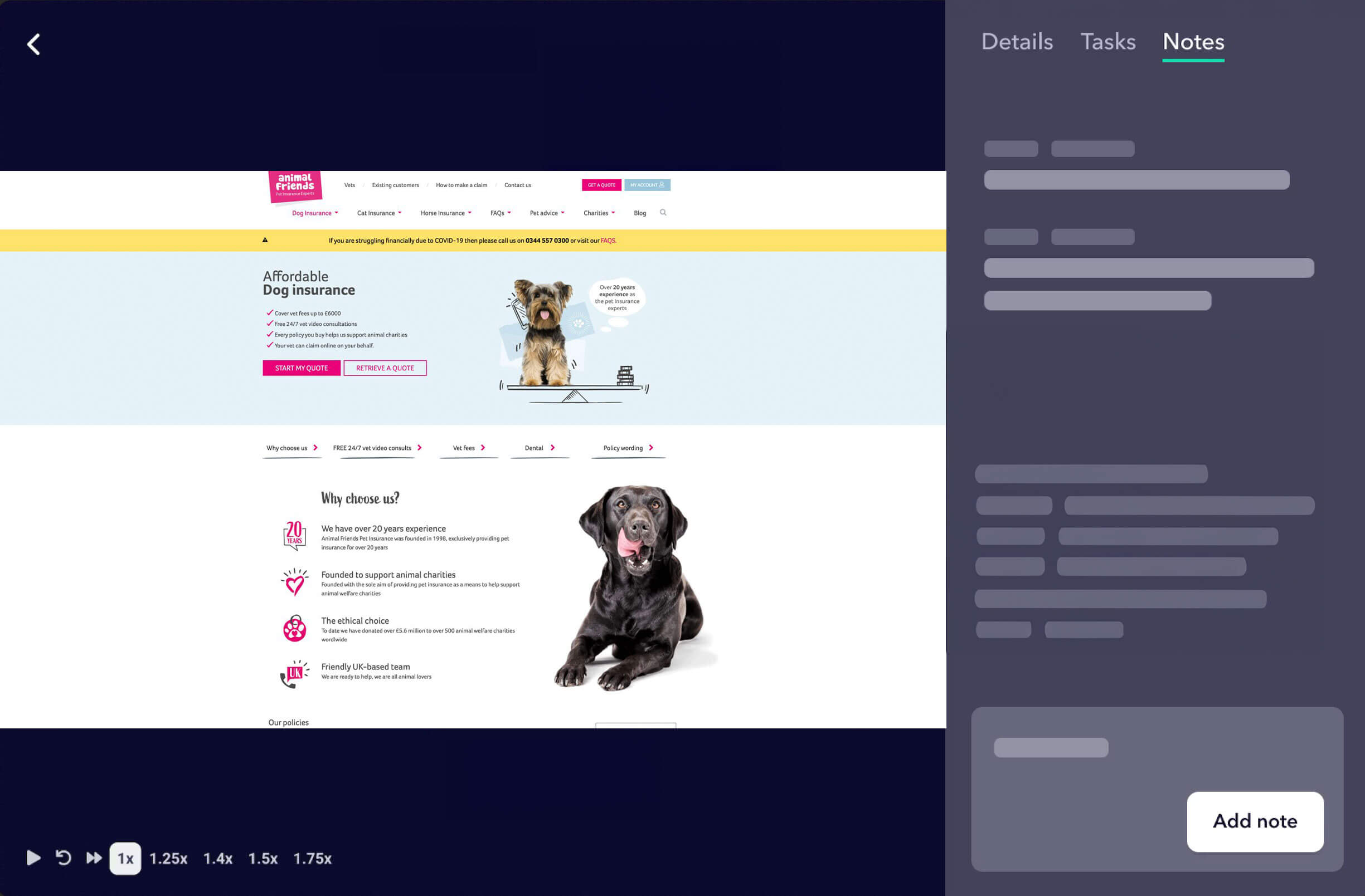
Policy Confusion and Inconsistencies: Users reported difficulty in distinguishing between various policies due to inconsistent use of colours and visual elements. This lack of clarity led to confusion about the options available and hindered their ability to select the most appropriate policy for their needs.
Limited Awareness of Charity and Wellbeing Resources: Many users were unaware of the range of resources and initiatives available through Animal Friends, including the company’s extensive work for charity and the wealth of articles on animal wellbeing and support. These valuable aspects of AFI’s offerings were not readily visible or promoted effectively on the site.
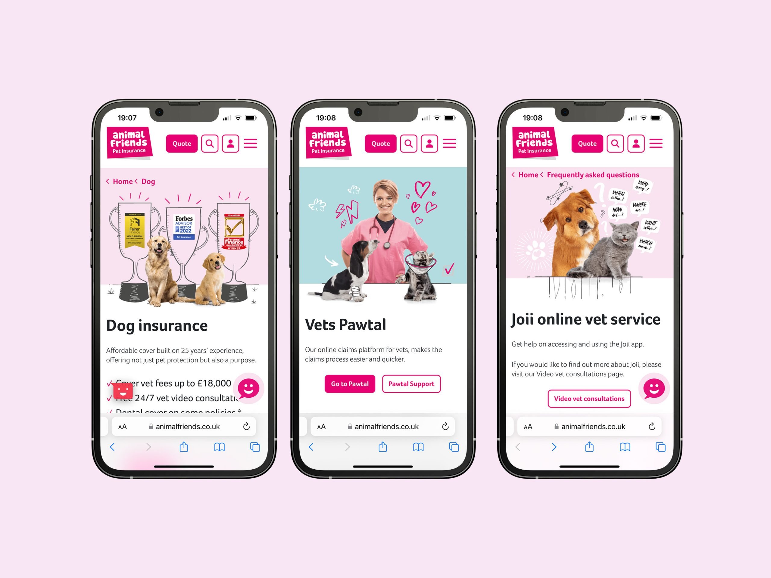
Poor Mobile Experience: The site did not render well on mobile devices, affecting accessibility and usability for a growing base of mobile users. Feedback indicated a need for a more responsive, mobile-optimised design that would provide a seamless experience across devices.
Lack of Brand Personality: Both user and internal feedback suggested that the site felt bland and uninspiring. Internally, the site was seen as failing to represent Animal Friends’ unique brand personality—a caring, cheeky, and fun company dedicated to improving animal welfare. Users noted that the current site lacked warmth and engagement, which affected their overall perception of the brand.
These insights informed our approach to the redesign, guiding our efforts to create a more vibrant, user-friendly, and brand-aligned website that showcases AFI’s mission and values while meeting the needs of its users.
User research
Content Audit, and Wireframing
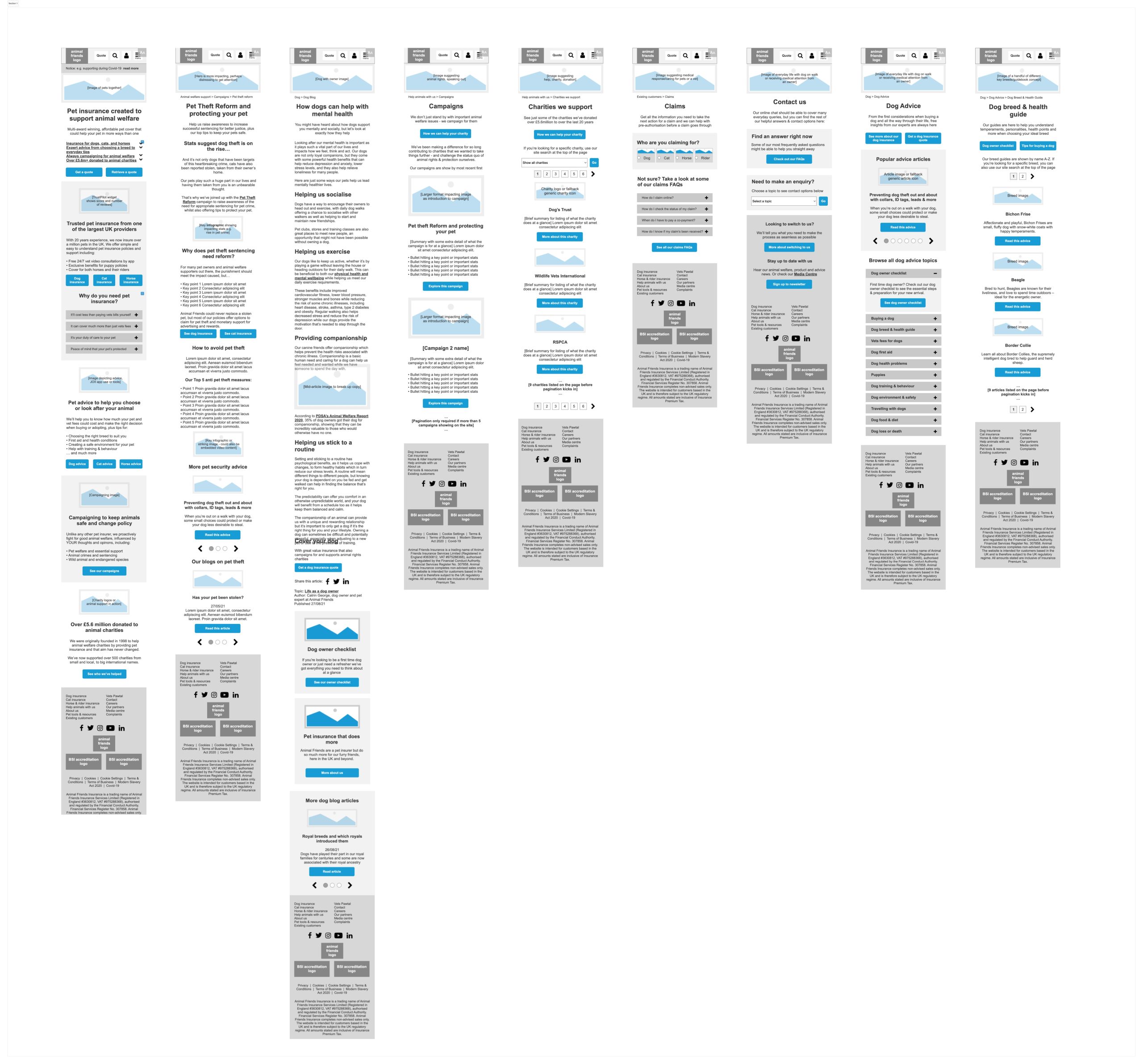
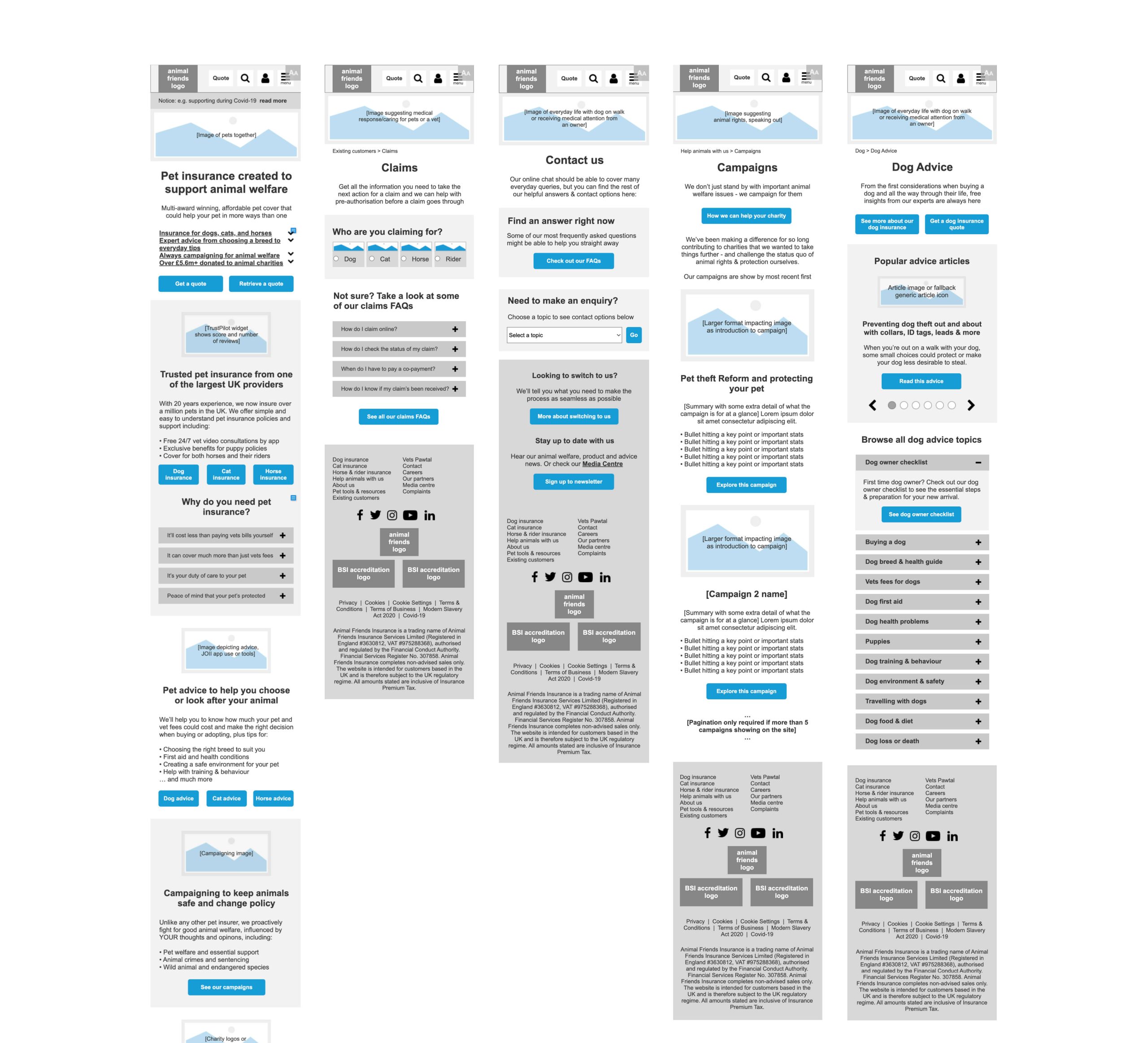
To create a user-centred and brand-aligned website, we began with a comprehensive content audit, evaluating each piece for relevance and clarity. This process unfolded collaboratively in co-run workshops with Asspius, where we assessed content appropriateness and identified areas for improvement.
Representatives from various departments across AFI, including marketing, compliance, customer service, and development, joined the workshops to contribute insights that would shape the design and structure of the website.
Following the audit, we systematically reviewed every page, creating detailed wireframes that incorporated feedback from all departments. This methodical approach allowed us to address each team’s requirements while prioritising the most impactful elements for the MVP launch. By focusing on the essential features and content for MVP, we ensured that the redesign met core business needs while setting a strong foundation for future enhancements.
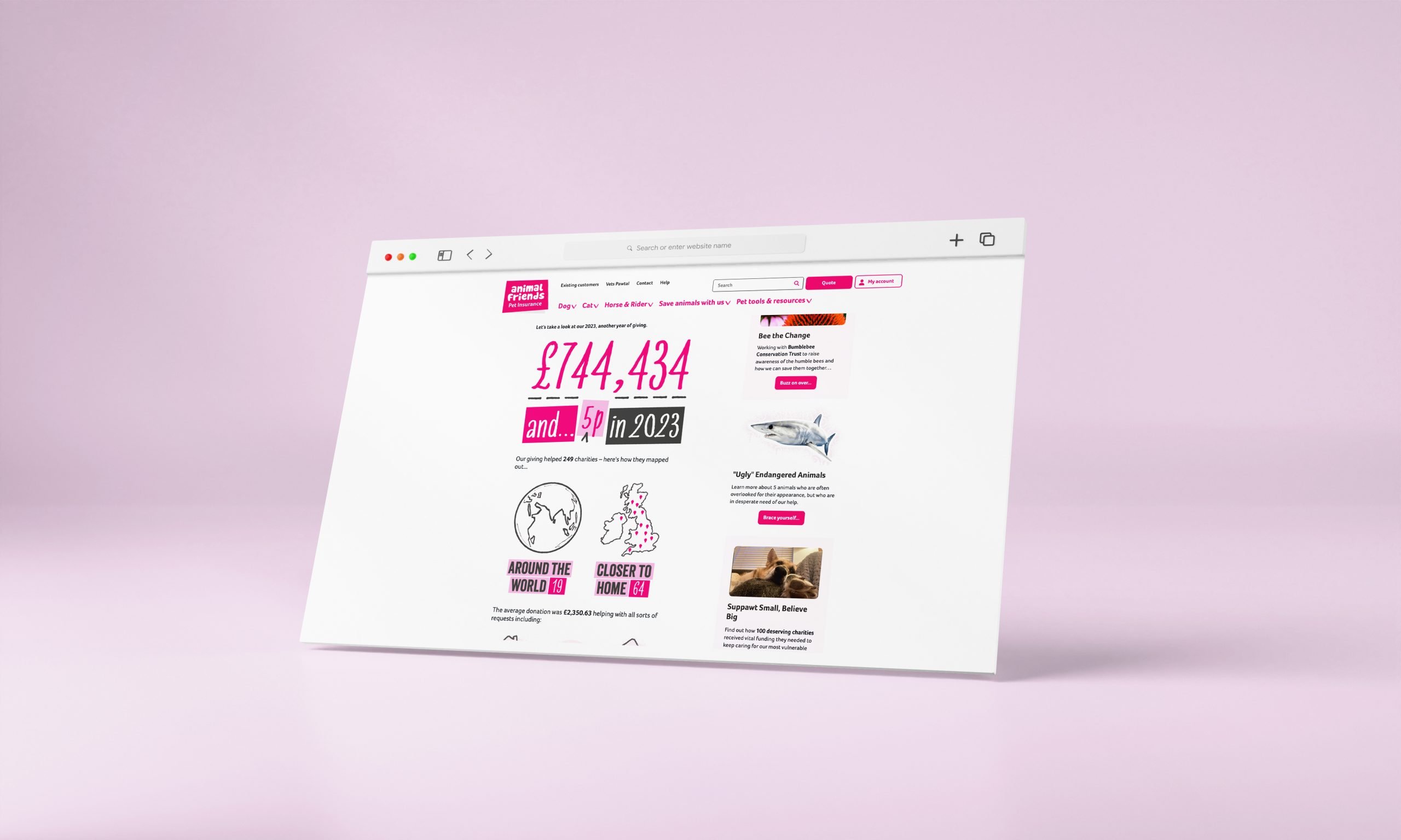
These wireframes and prototypes guided the design process, enabling us to align AFI’s content strategy with its mission and brand personality. The result was a structured, intuitive layout that reflects AFI’s caring, cheeky, and fun brand identity while delivering a streamlined, user-friendly experience.
Design
High-Fidelity Design Development
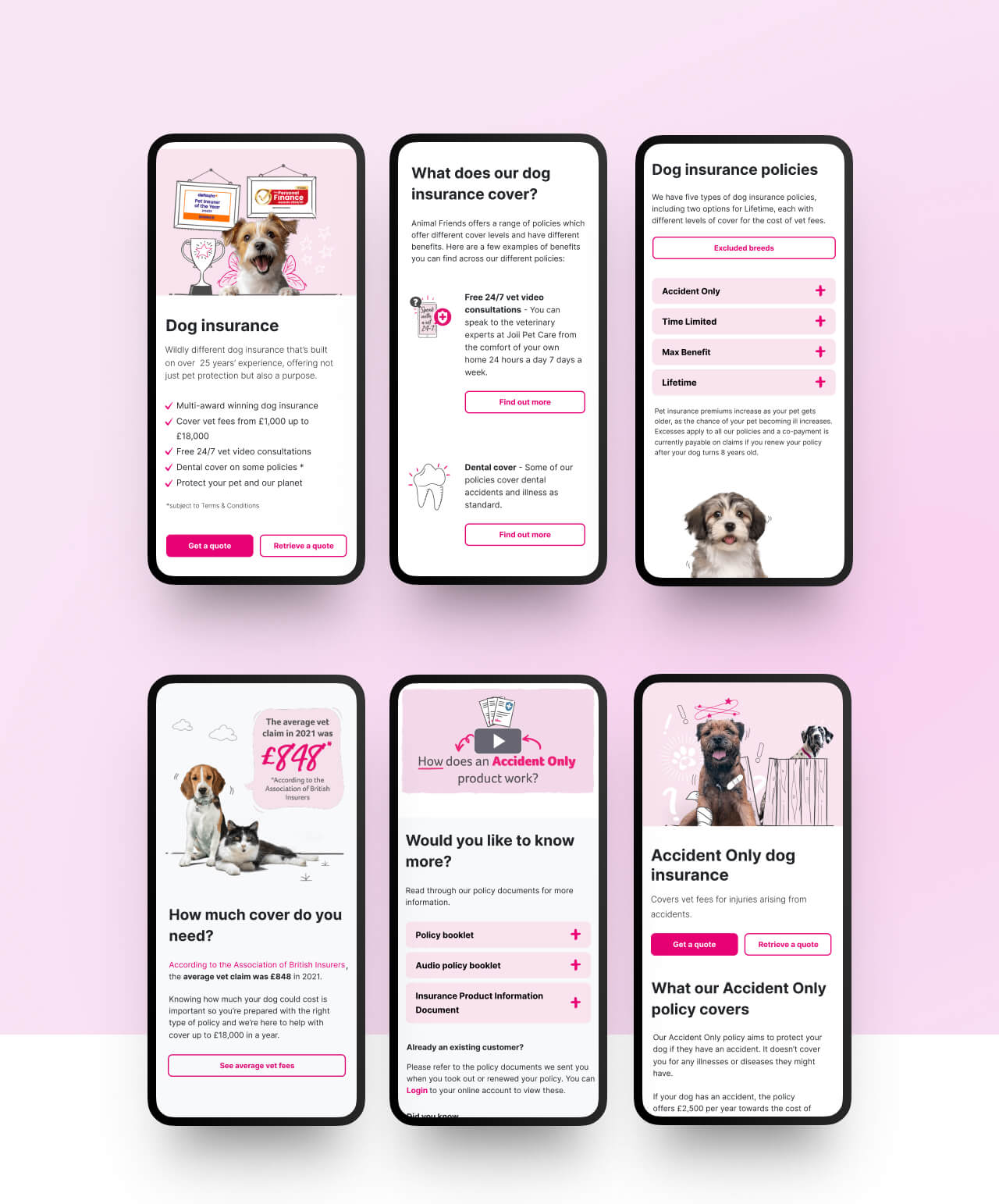
With wireframes and prototypes established, we moved into the high-fidelity design phase, collaborating closely with both AFI’s internal branding team and Asspius’s branding team. This stage was crucial for translating our structural and content strategies into a visually cohesive, brand-aligned experience.
Working alongside the branding teams, we ensured that the high-fidelity designs reflected AFI’s unique identity—caring, cheeky, and fun—while maintaining a professional and user-friendly interface. The combined expertise allowed us to refine key visual elements, such as colour schemes, typography, and iconography, ensuring consistency across the site and addressing previous user feedback regarding brand alignment.
This collaborative approach enabled us to create a polished, engaging design that captured the essence of AFI’s mission. The high-fidelity prototypes served as a final blueprint, guiding the development team toward a site that balances brand personality with functional usability.
These insights informed our approach to the redesign, guiding our efforts to create a more vibrant, user-friendly, and brand-aligned website that showcases AFI’s mission and values while meeting the needs of its users.
These wireframes and prototypes guided the design process, enabling us to align AFI’s content strategy with its mission and brand personality. The result was a structured, intuitive layout that reflects AFI’s caring, cheeky, and fun brand identity while delivering a streamlined, user-friendly experience.
Conclusion
What Impact Did It Have?
Increased Organic Traffic and SEO Benefits: Higher page speed scores contributed to improved SEO rankings, increasing the volume of website traffic.
Greater Operational Efficiency: Internal teams gained CMS independence, reducing dependency on developers and enabling faster, more accurate content updates.
Enhanced User Engagement: Users reported a more intuitive experience due to improved page speeds, simplified navigation, and better accessibility on mobile.
Improved Deployment Reliability: Transitioning from WordPress reduced bug incidences, allowing for more stable releases and quicker turnaround times.